Aplos, Greek yogurt with fruits

The client —
Aplos (Απλώς) means “simply” in Greek. The brand name reflects the purity and superior quality of the products in a direct and modern way. These fast-moving consumer goods (FMCG) are produced on the island of Rhodes and sold through all major retailers in Greece. Aplos is a successful new brand, as it has already gained popularity and a share of the market. The target group is quite wide and the competition is all the yogurt market leaders as well as smaller brands.
Aplos (Απλώς) means “simply” in Greek. The brand name reflects the purity and superior quality of the products in a direct and modern way. These fast-moving consumer goods (FMCG) are produced on the island of Rhodes and sold through all major retailers in Greece. Aplos is a successful new brand, as it has already gained popularity and a share of the market. The target group is quite wide and the competition is all the yogurt market leaders as well as smaller brands.
The creative concept —
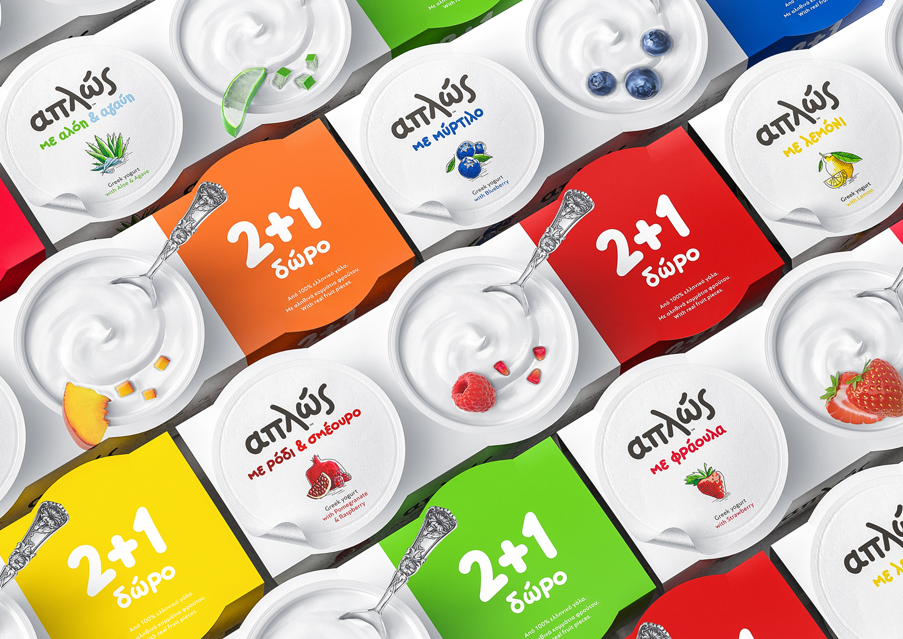
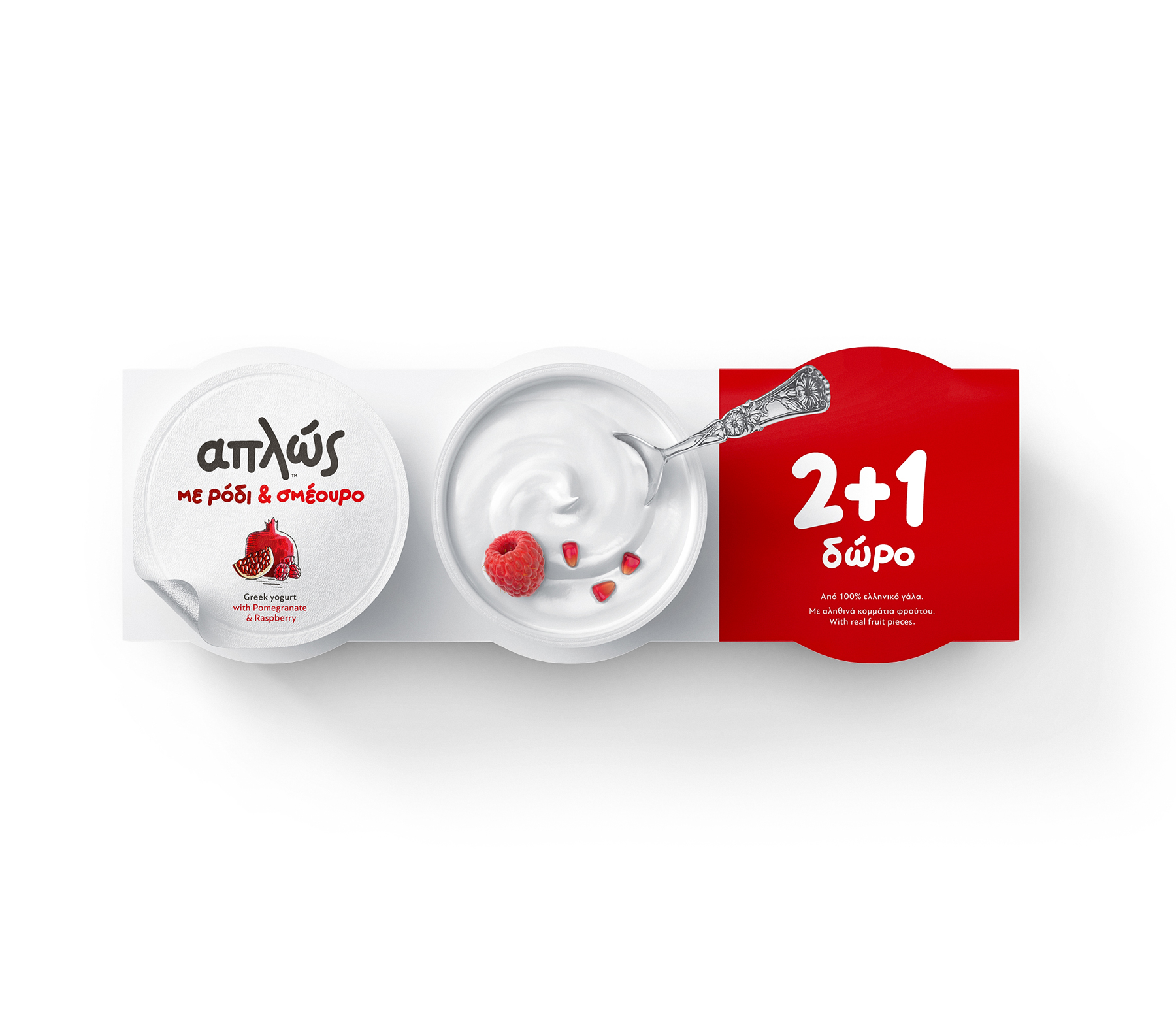
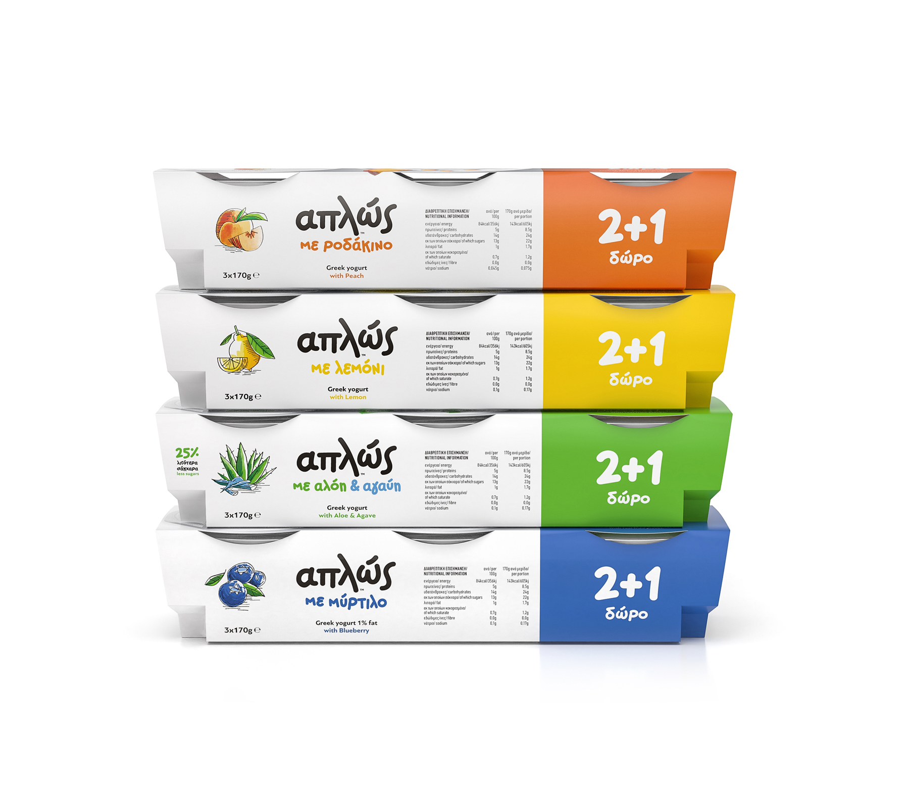
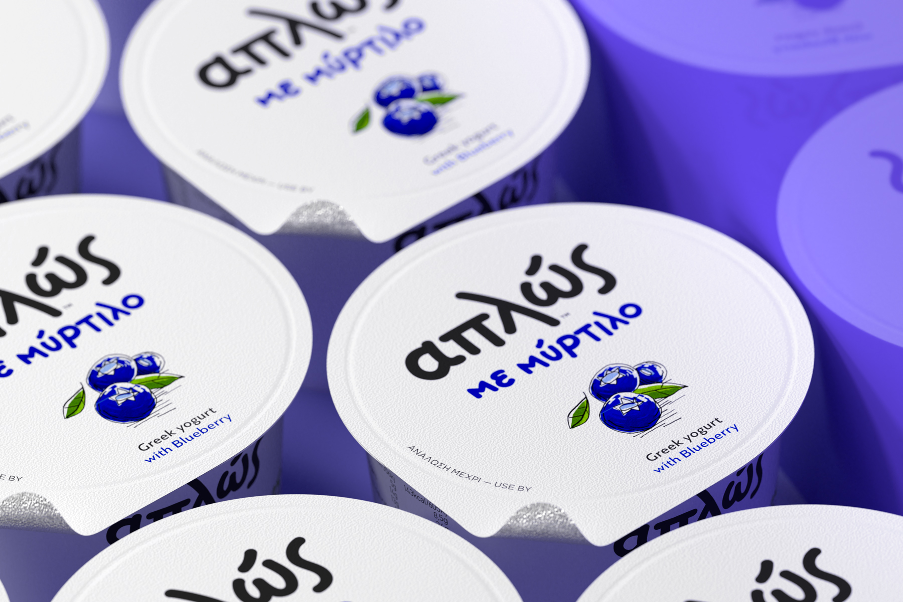
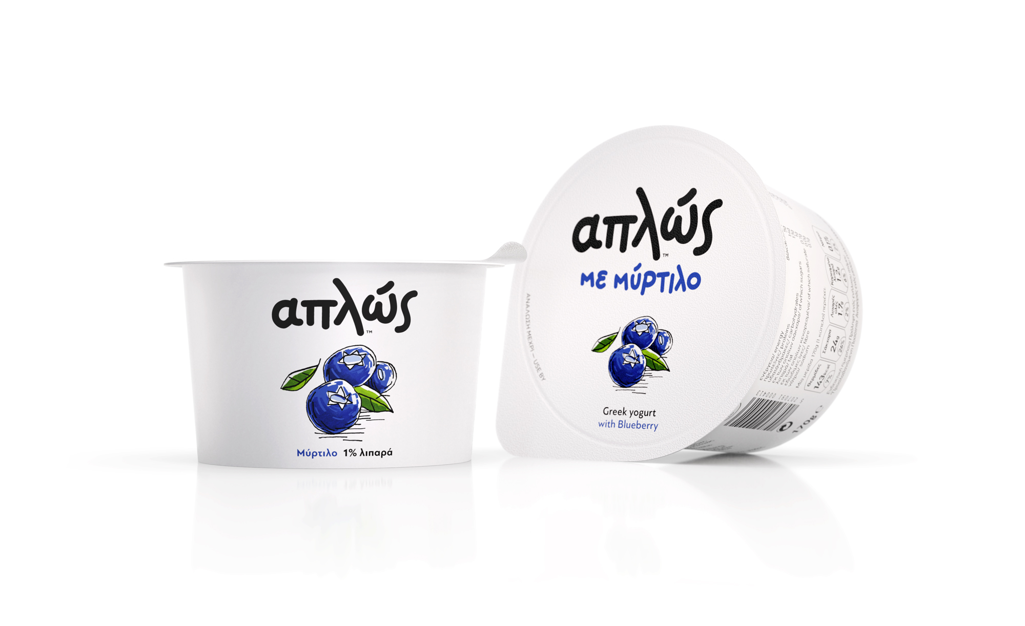
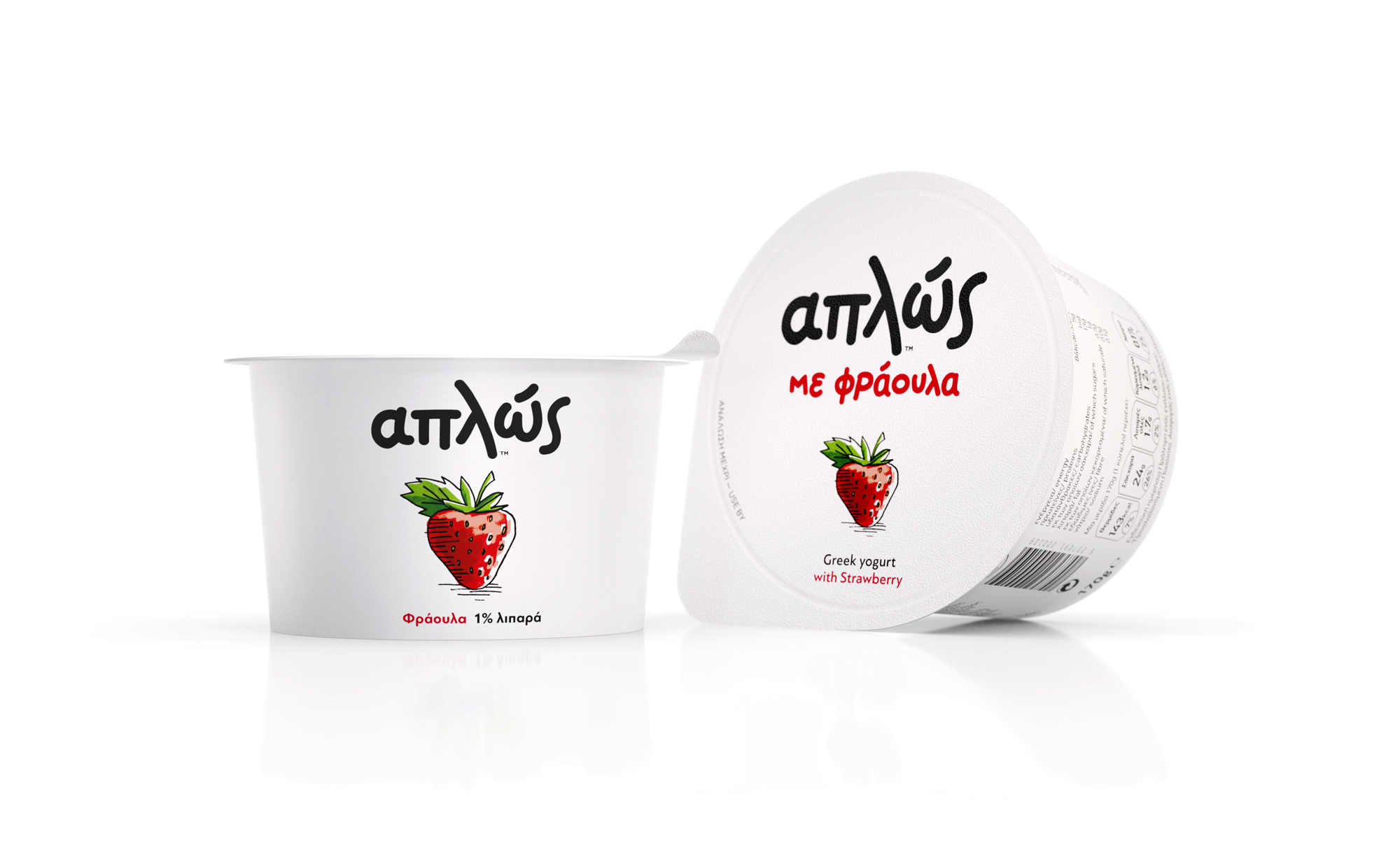
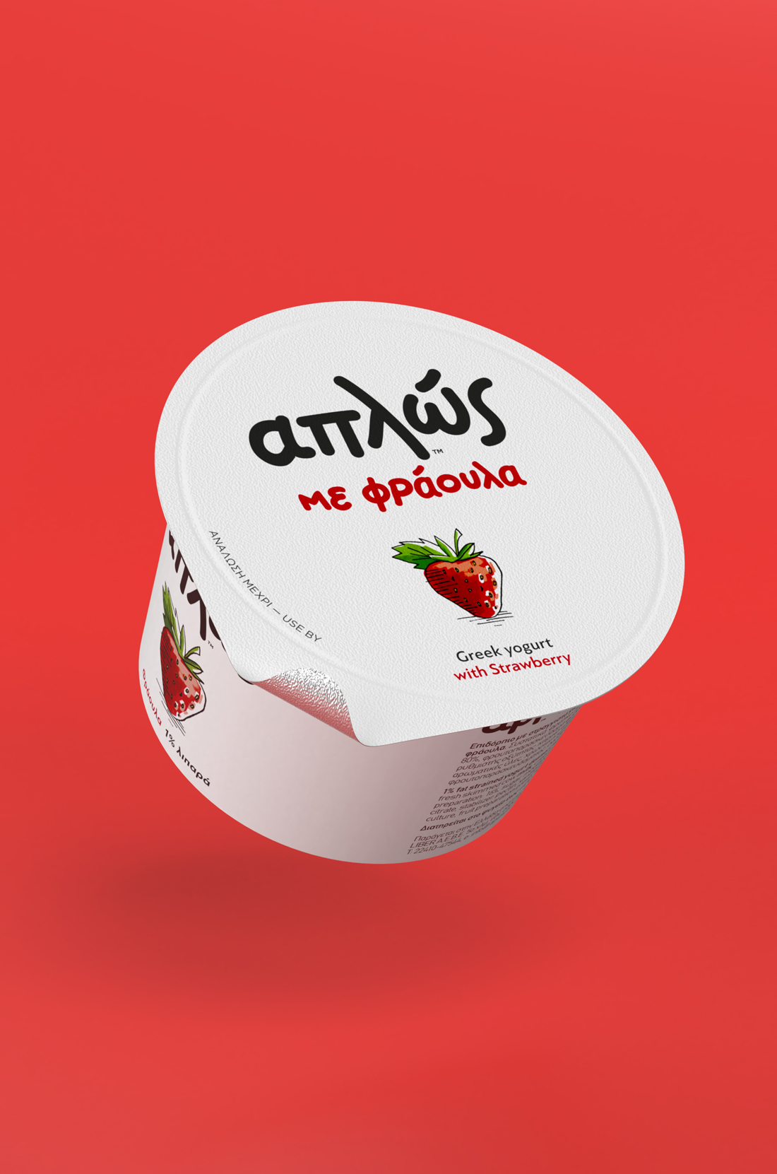
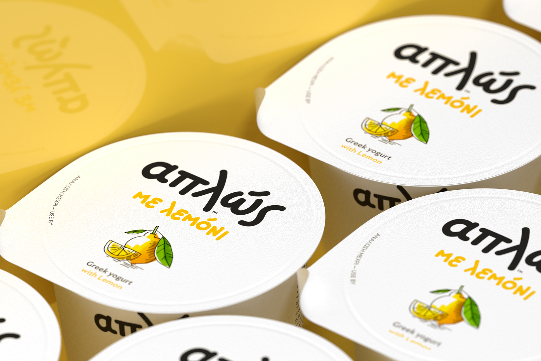
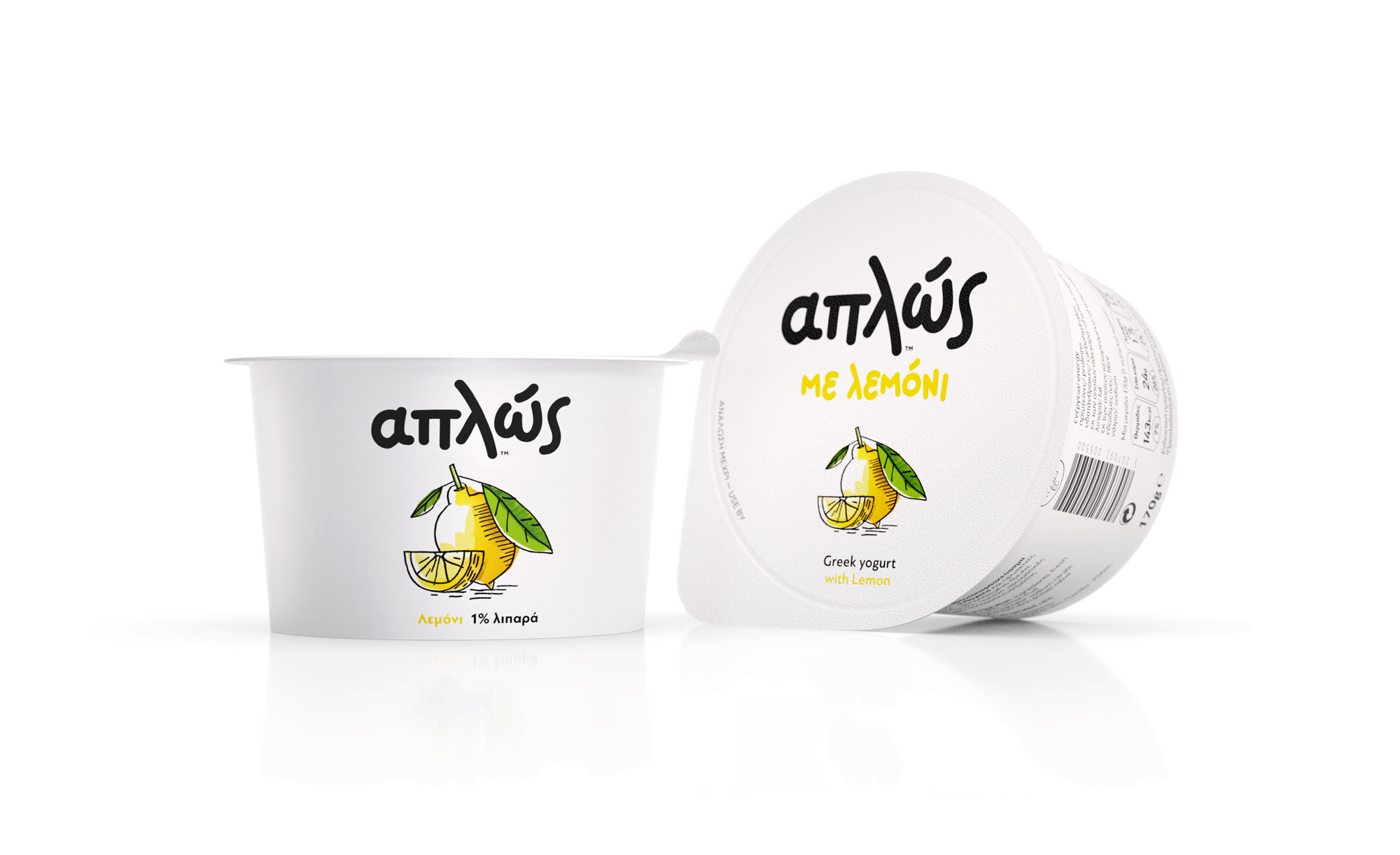
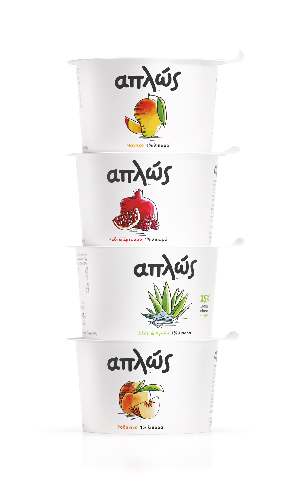
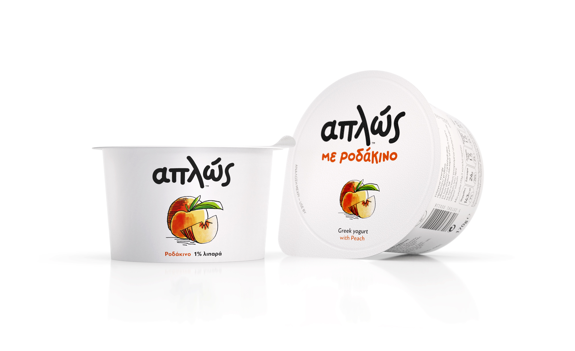
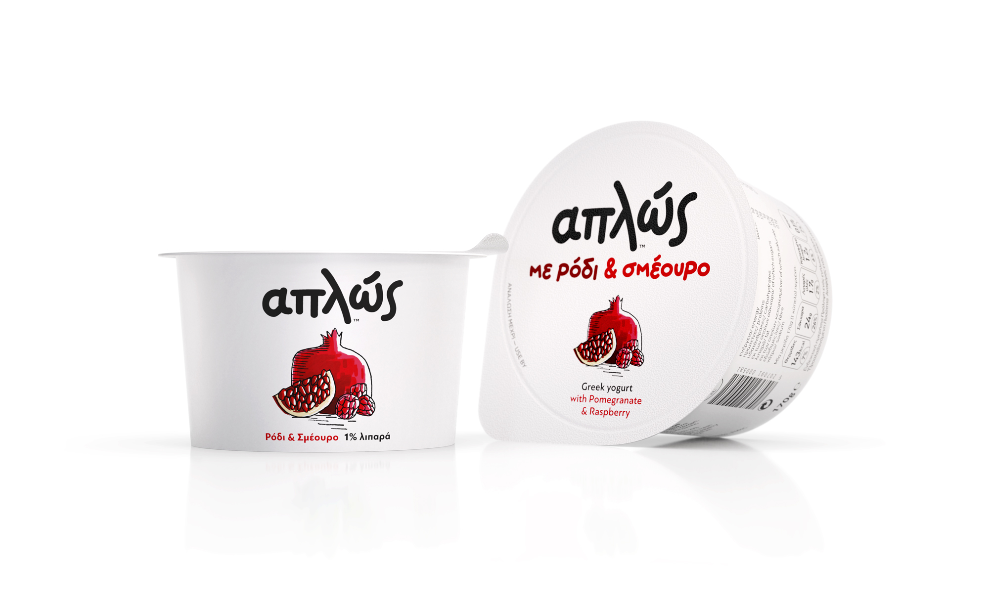
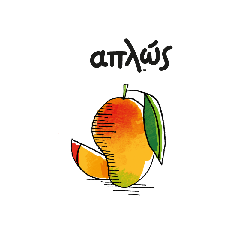
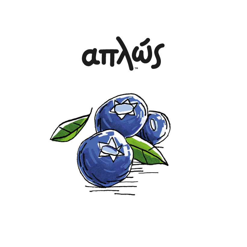
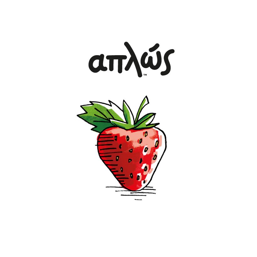
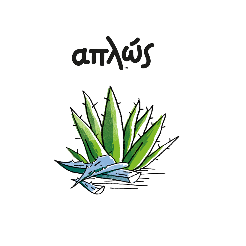
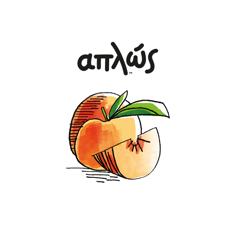
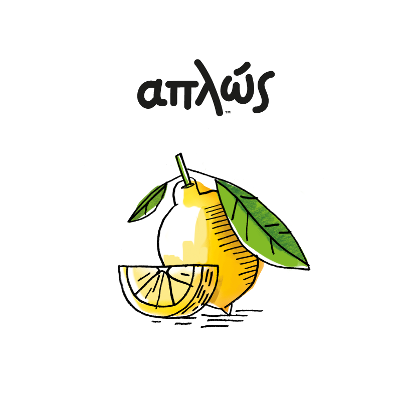
We were commissioned to redesign the standard fruit range and the new superfruit range of products. The new brand range introduces to the Greek mass market special fruits combined with yogurt made from 100% fresh Greek milk. The basic yogurt range, other dairy products and the brand ID were designed by the mousegraphics studio. To empower the core concept of the brand and the simplicity aspect, we designed fruit illustrations on the tabs, in a way that reflects a raw and natural feel.
We were commissioned to redesign the standard fruit range and the new superfruit range of products. The new brand range introduces to the Greek mass market special fruits combined with yogurt made from 100% fresh Greek milk. The basic yogurt range, other dairy products and the brand ID were designed by the mousegraphics studio. To empower the core concept of the brand and the simplicity aspect, we designed fruit illustrations on the tabs, in a way that reflects a raw and natural feel.
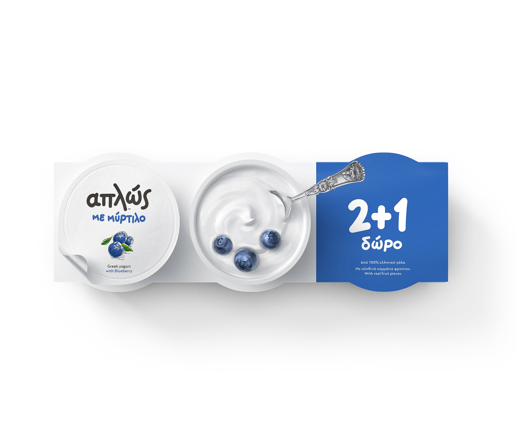
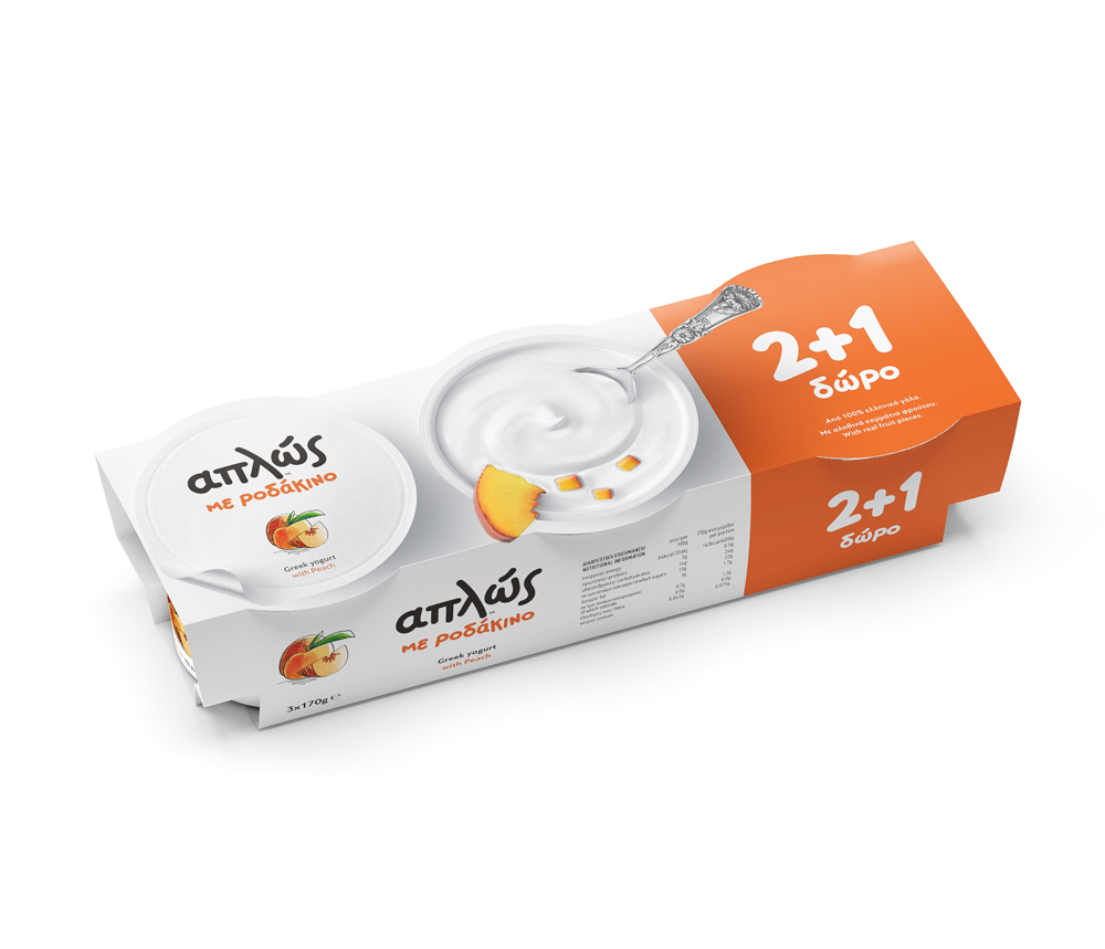
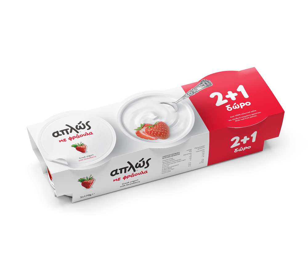
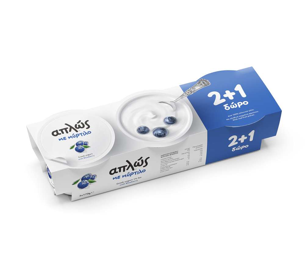
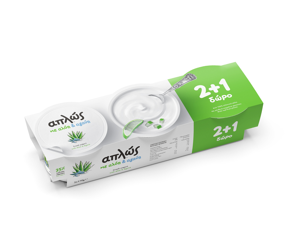
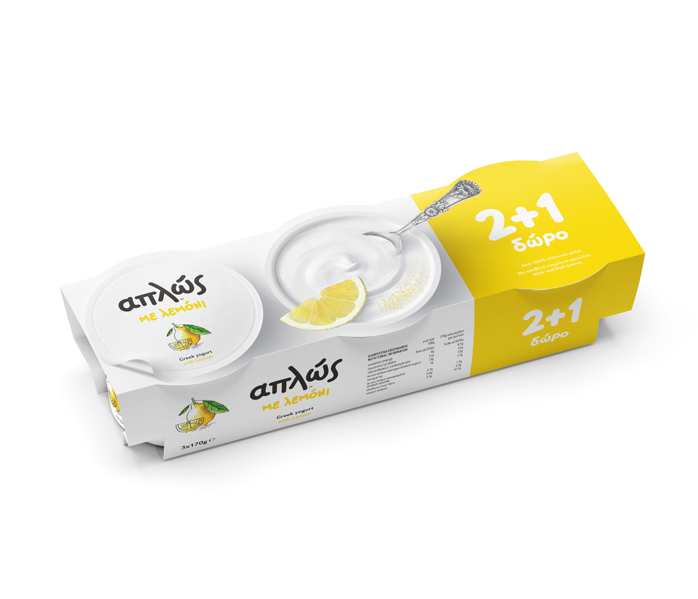
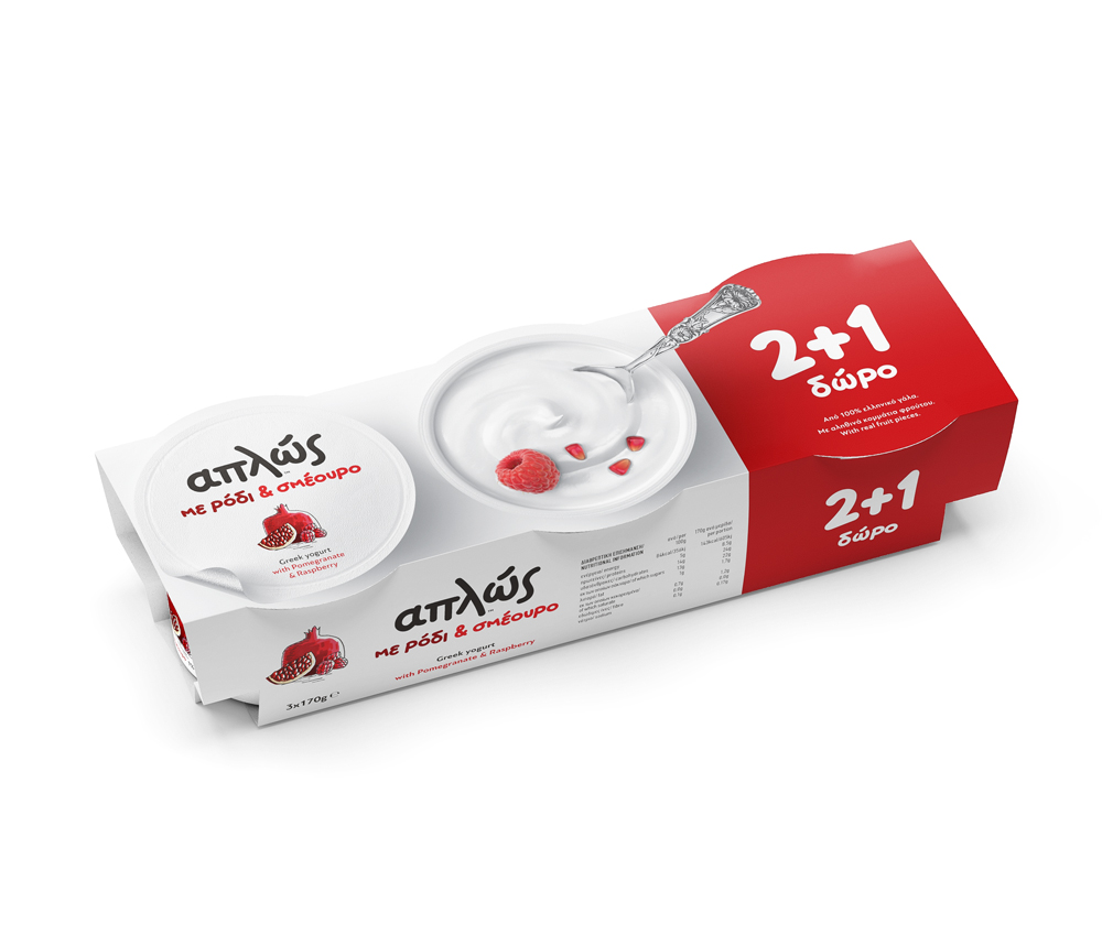
By observing the changing trends in the global health-food market and seeing that the brand aligned with this market category, we decided to avoid the artificial look and feel. As a result, the visuals give the essence of something handmade. They are simple, yet appetizing. They directly inform consumers about the product type, using a differentiated design language.
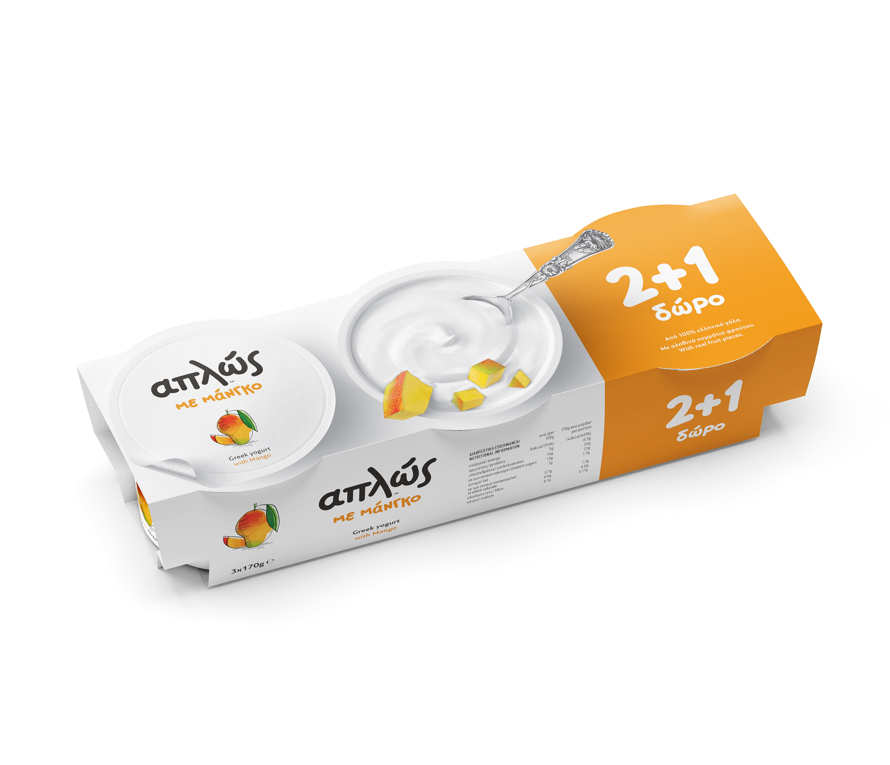
For functional reasons, the new sleeves completely cover the tabs. As a result the actual tabs are not visible on the shelf. So we also redesigned an appetizing packaging identity for the sleeves. The brief was to reflect the brand and the flavor. Our design approach aimed to showcase the ingredients of each flavor using realistic key visuals: the styling is minimal and the images depict an open tab of yogurt with raw fruits and a spoon inside it. Despite the yummy feeling, the design helps consumers identify the product easier, and creates an outstanding and stylish identity.
© Caparo DC 2018


Stay tuned with daily posts!
Follow us on Instagram
Follow us on Instagram

Aplos, Greek yogurt with fruits