Cardiff Motor Group


Context
Previously Lake Motor Group, Cardiff Motor Group is a full-service automotive destination offering new car sales, finance, servicing and parts. To coincide with their name change to the more fitting Cardiff Motor Group, Shorthand was approached to develop and roll out a new brand identity system.
Challenge
Cardiff Motor Group have a great team – implementing high level customer service and offering a unique buying experience. To help them change the perception of car dealerships, we needed to create a brand that was fun, approachable and trustworthy.
Solution
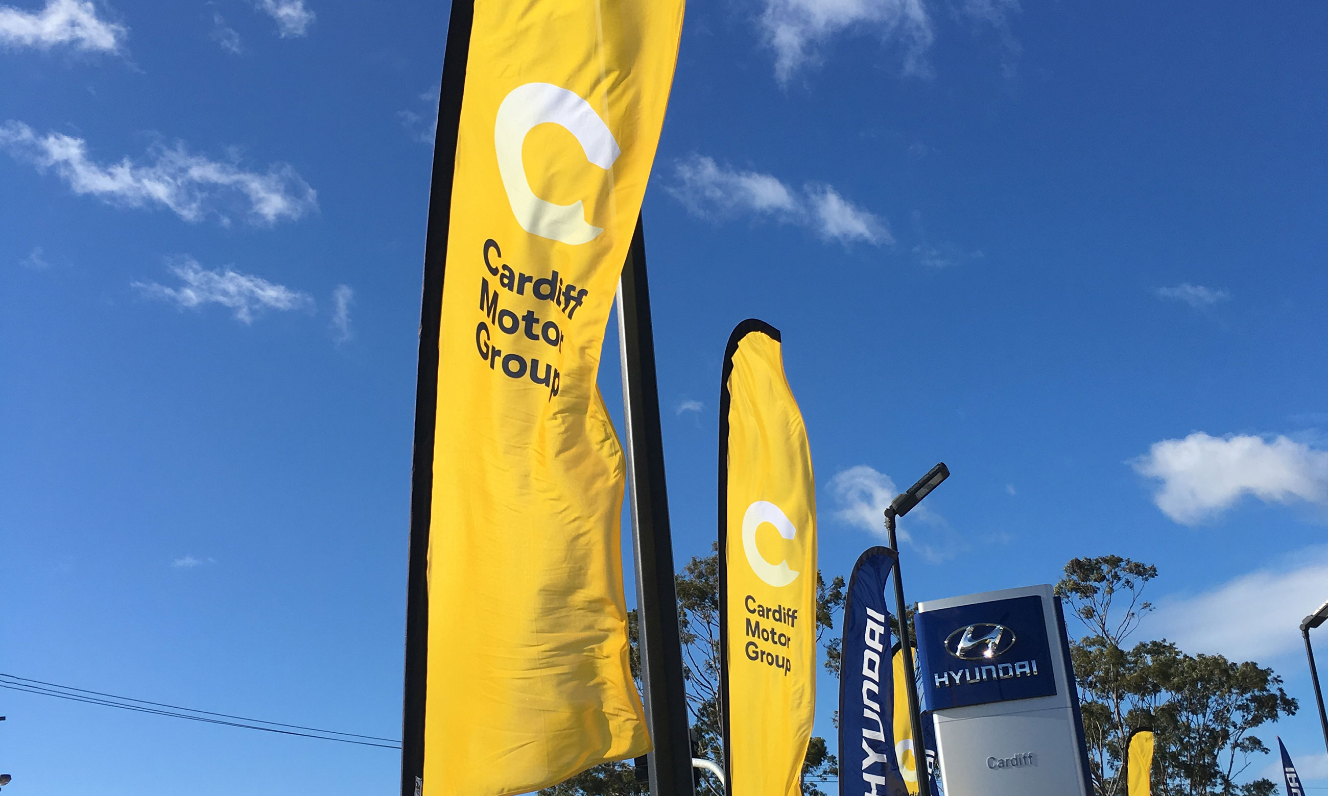
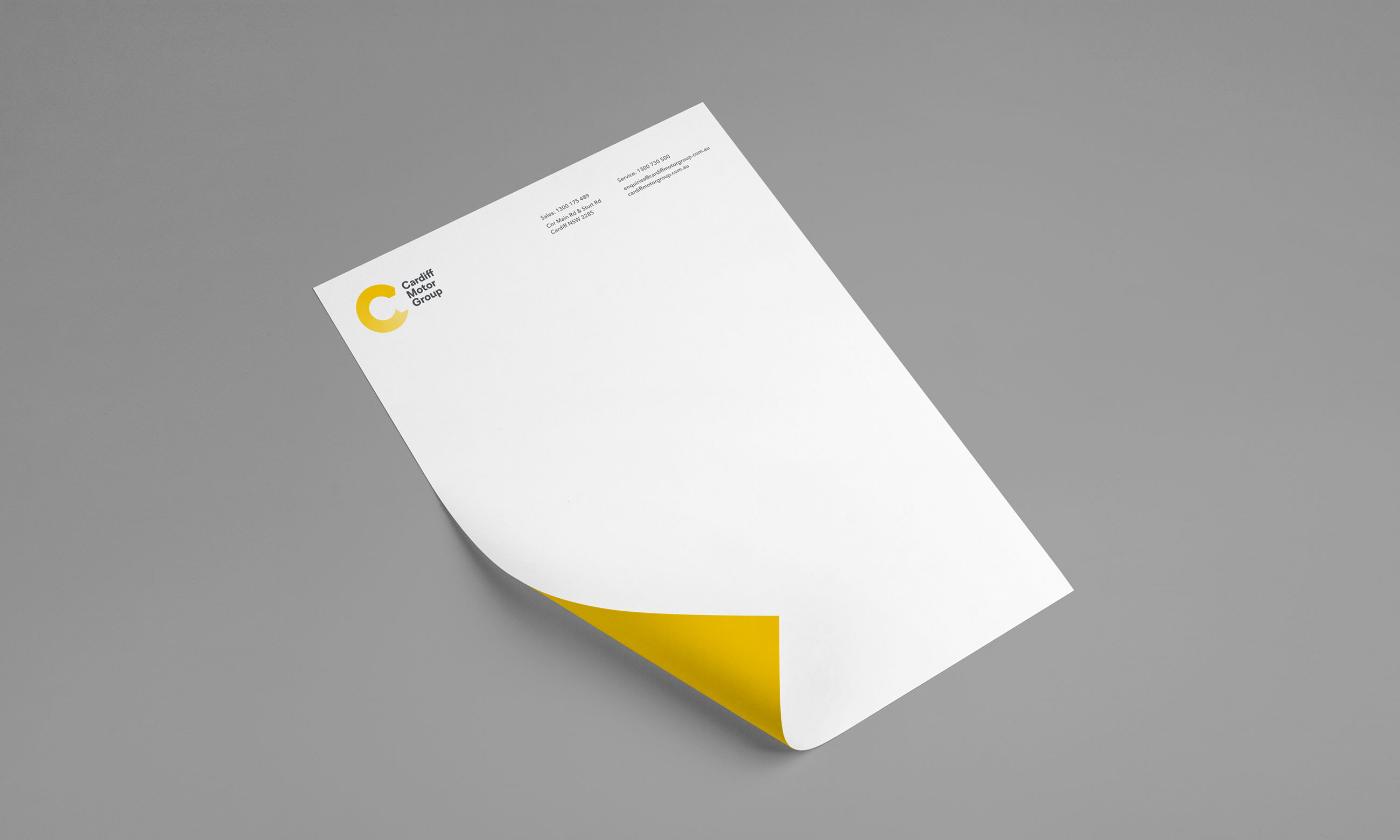
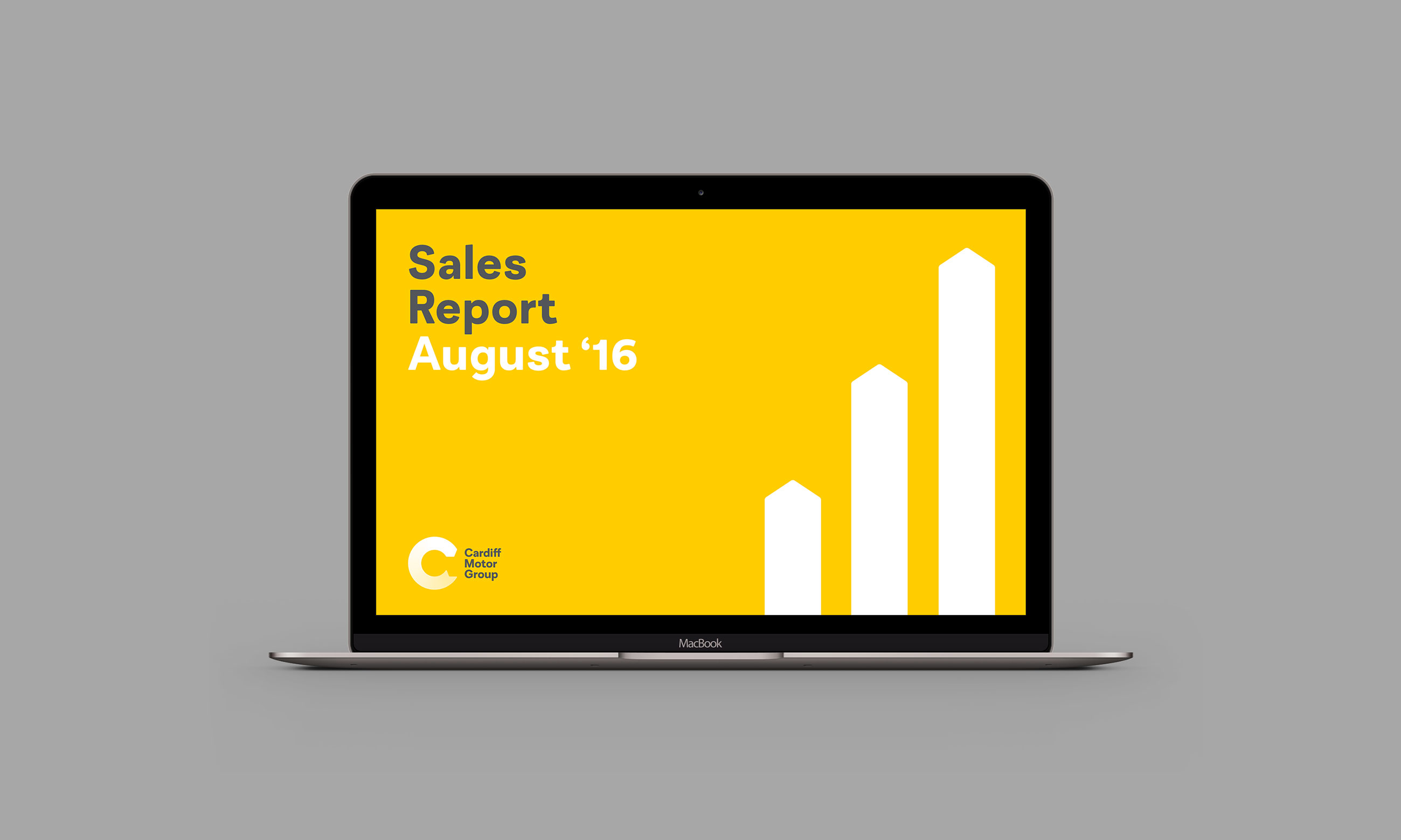
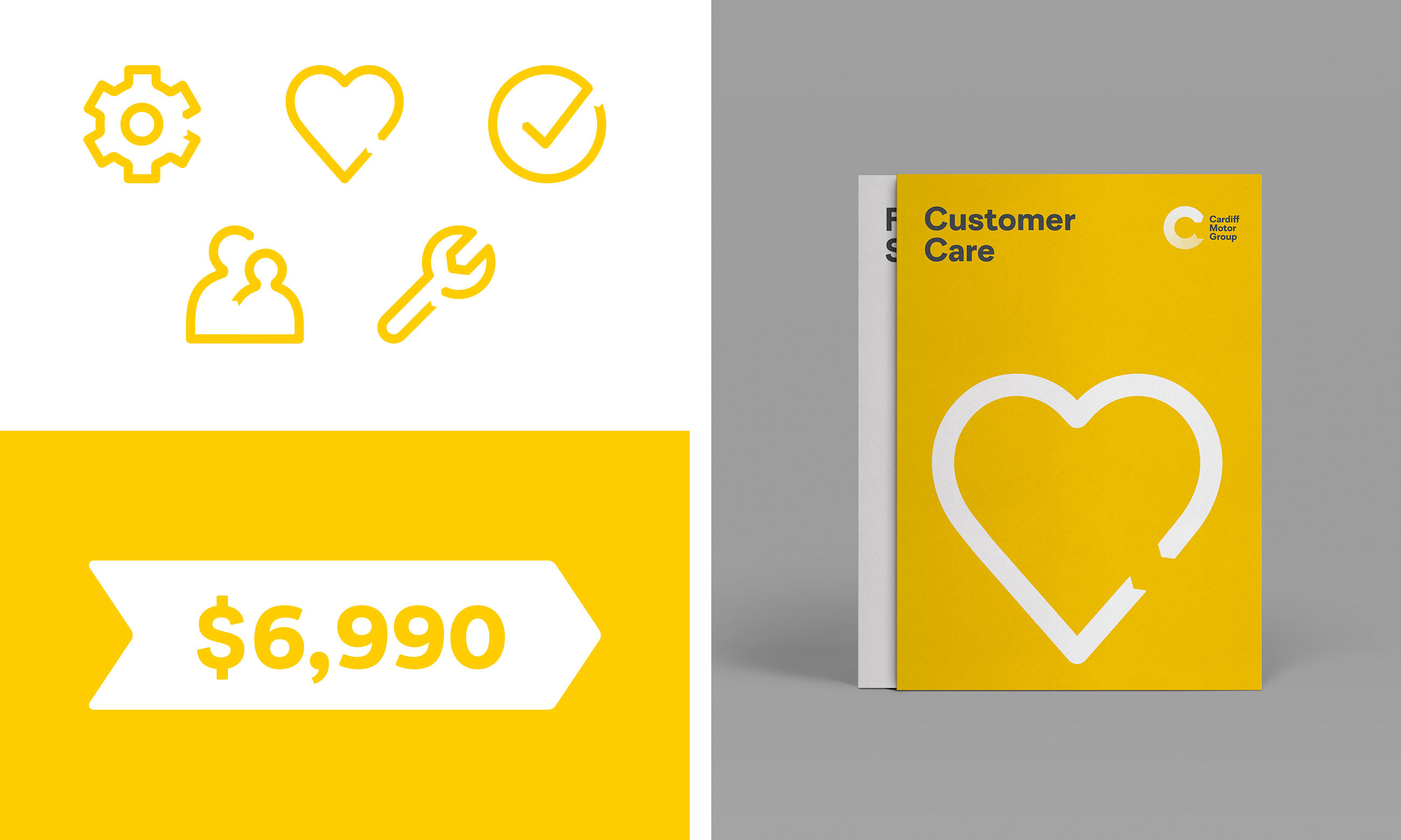
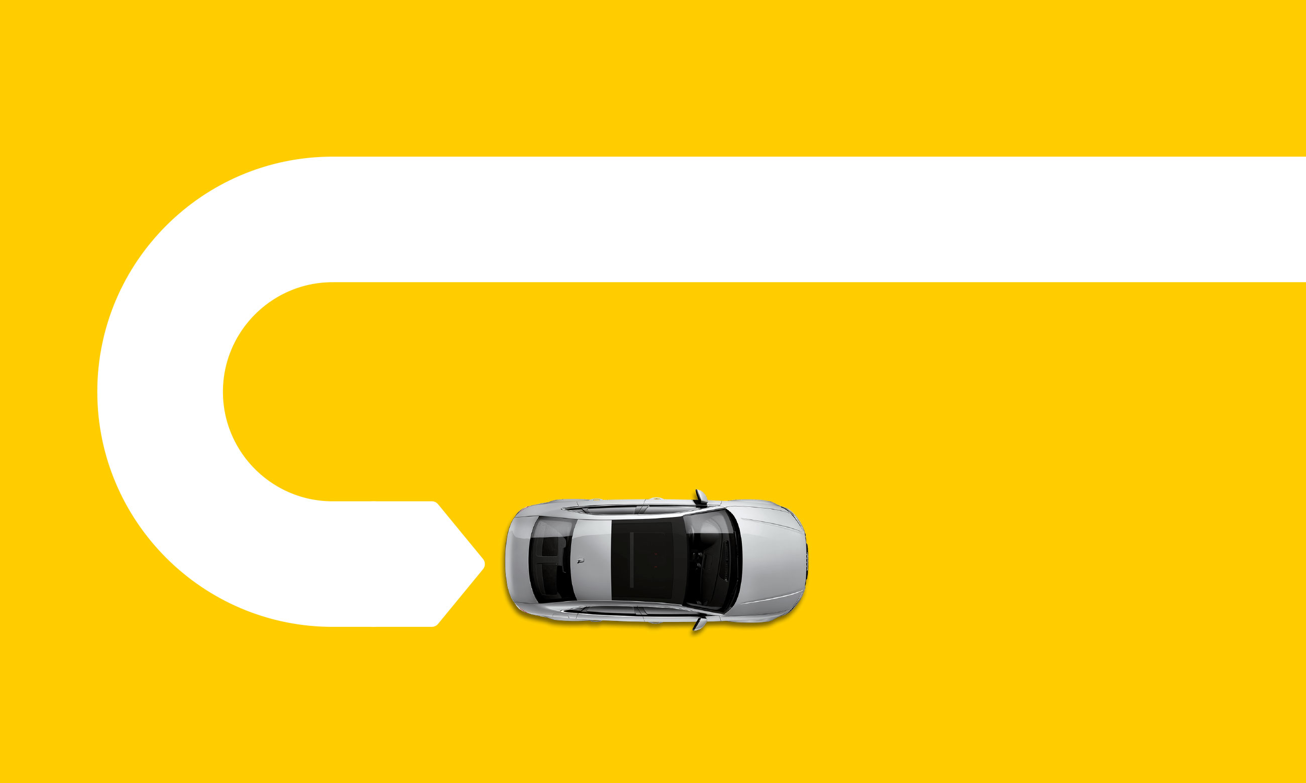
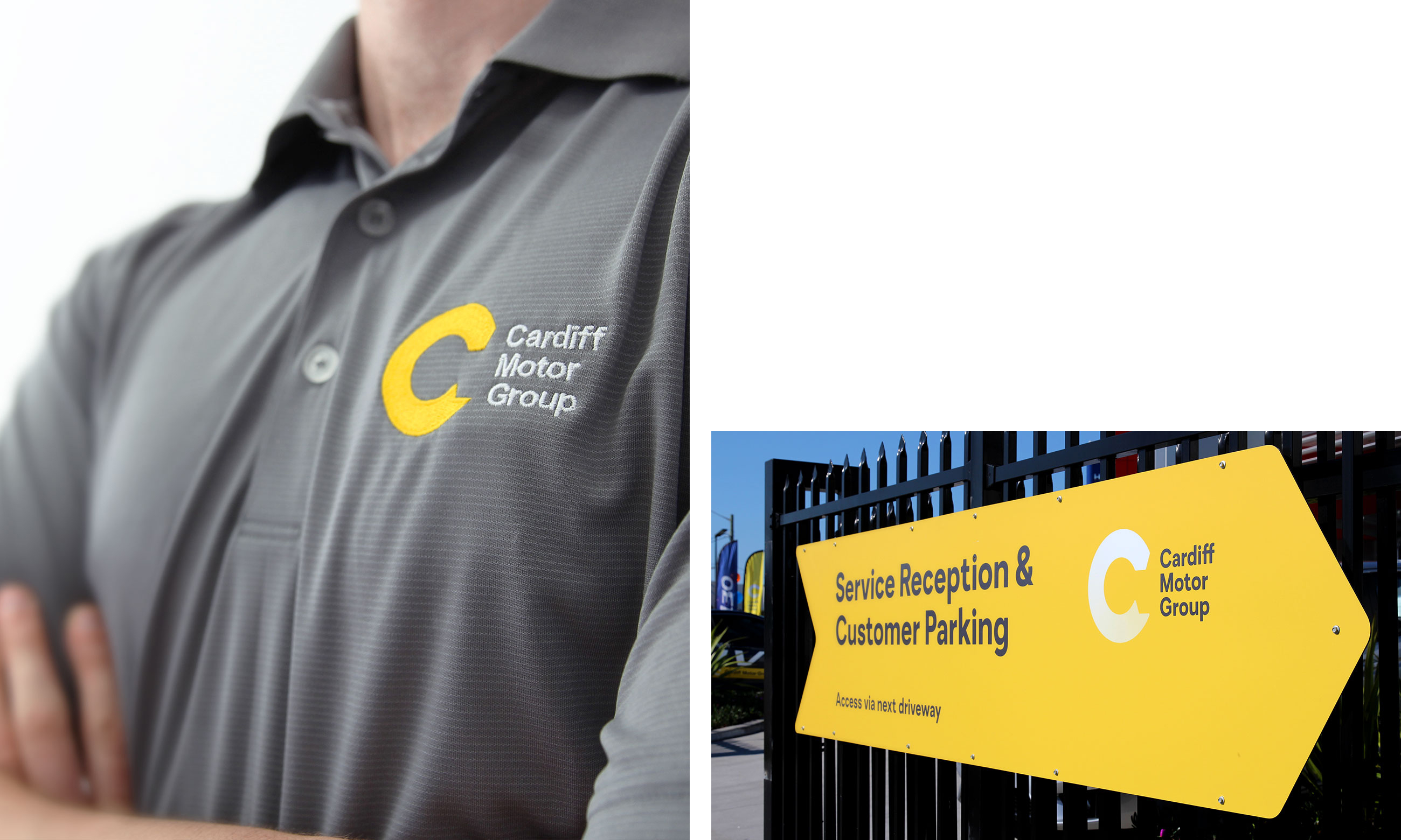
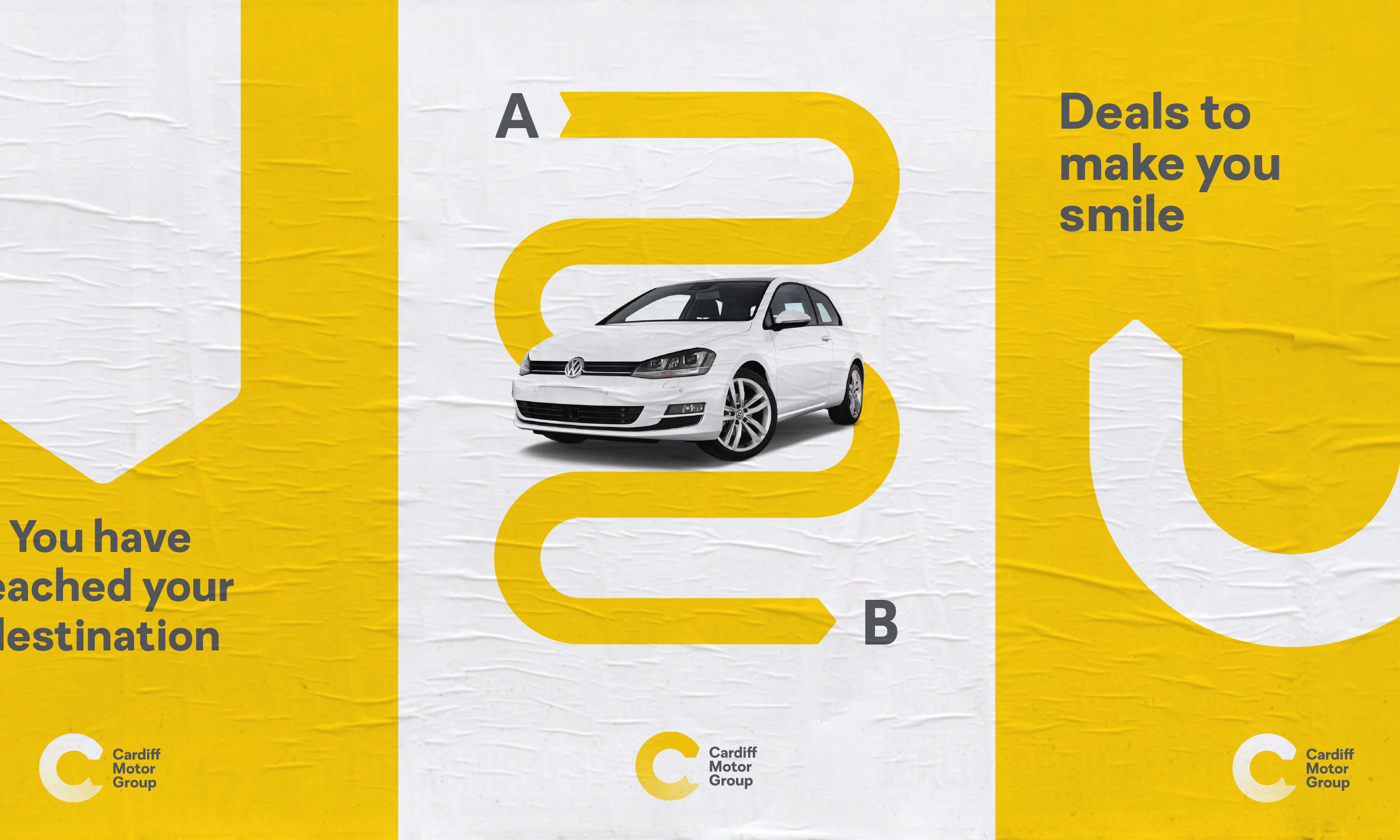
Stylistically inspired by road iconography, the brand’s ‘revolution symbol’ represents both a capital ‘C’ and the rotation of a wheel – a nod to the forward thinking of company. The bright yellow was chosen to stand apart from the group’s collection of car brands. As a playful extension of the identity, the symbol has been adapted into a flexible supporting device. This directional motif lends itself to an endless amount of design applications from branded messages to wayfinding signage.
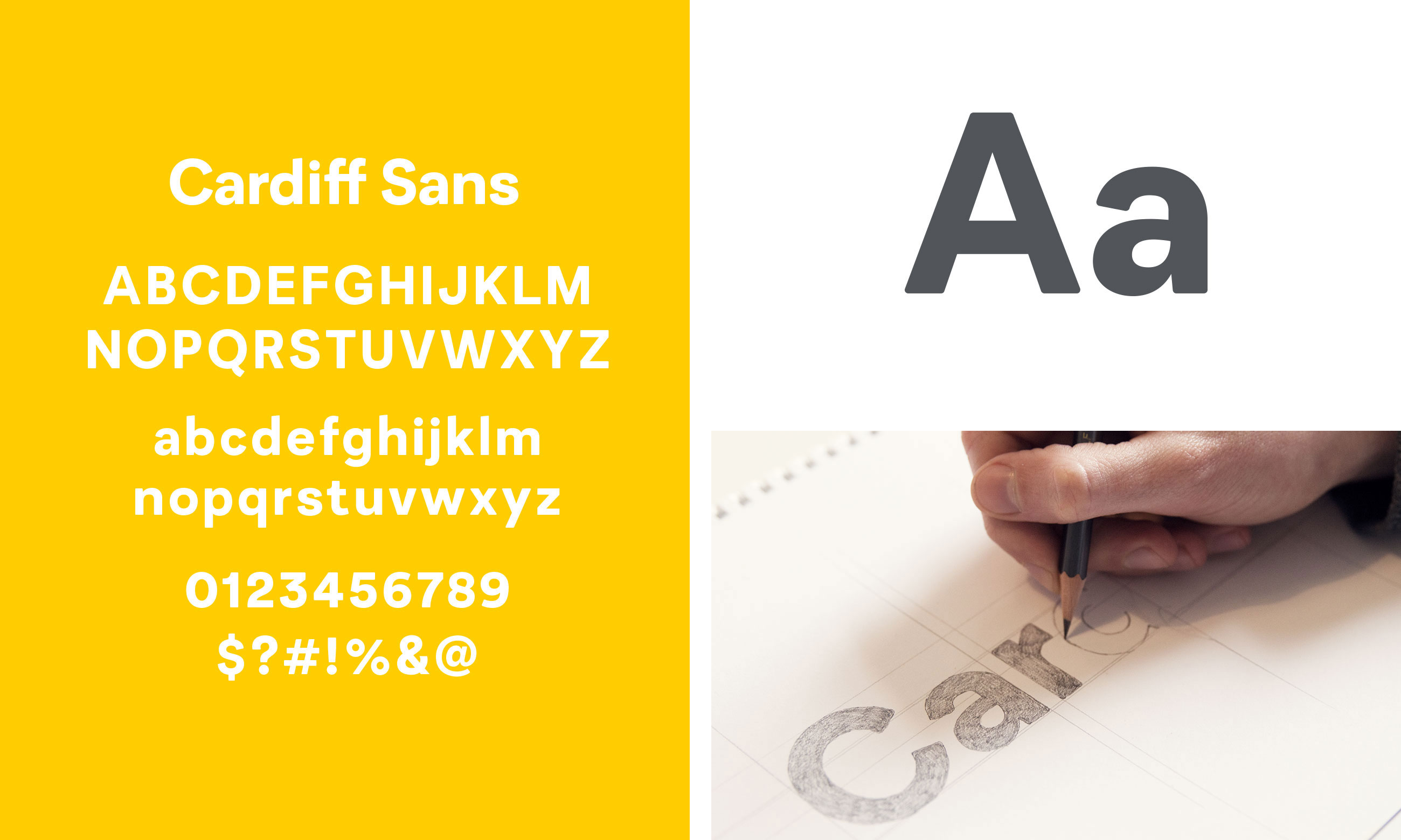
To further set their brand messages apart from their competitors, we worked with Wayne from the Australian Type Foundry on a custom typeface. The group’s own Cardiff Sans was designed to feel friendly while sporting the smooth contours and geometry of a car.
Collaborators
Client(s): Edward Geschke and Carol Duncan
Custom Typeface: Australian Type Foundry
Signage Production: Owen Signs
Custom Typeface: Australian Type Foundry
Signage Production: Owen Signs
Cardiff Motor Group