FORmente / VI design
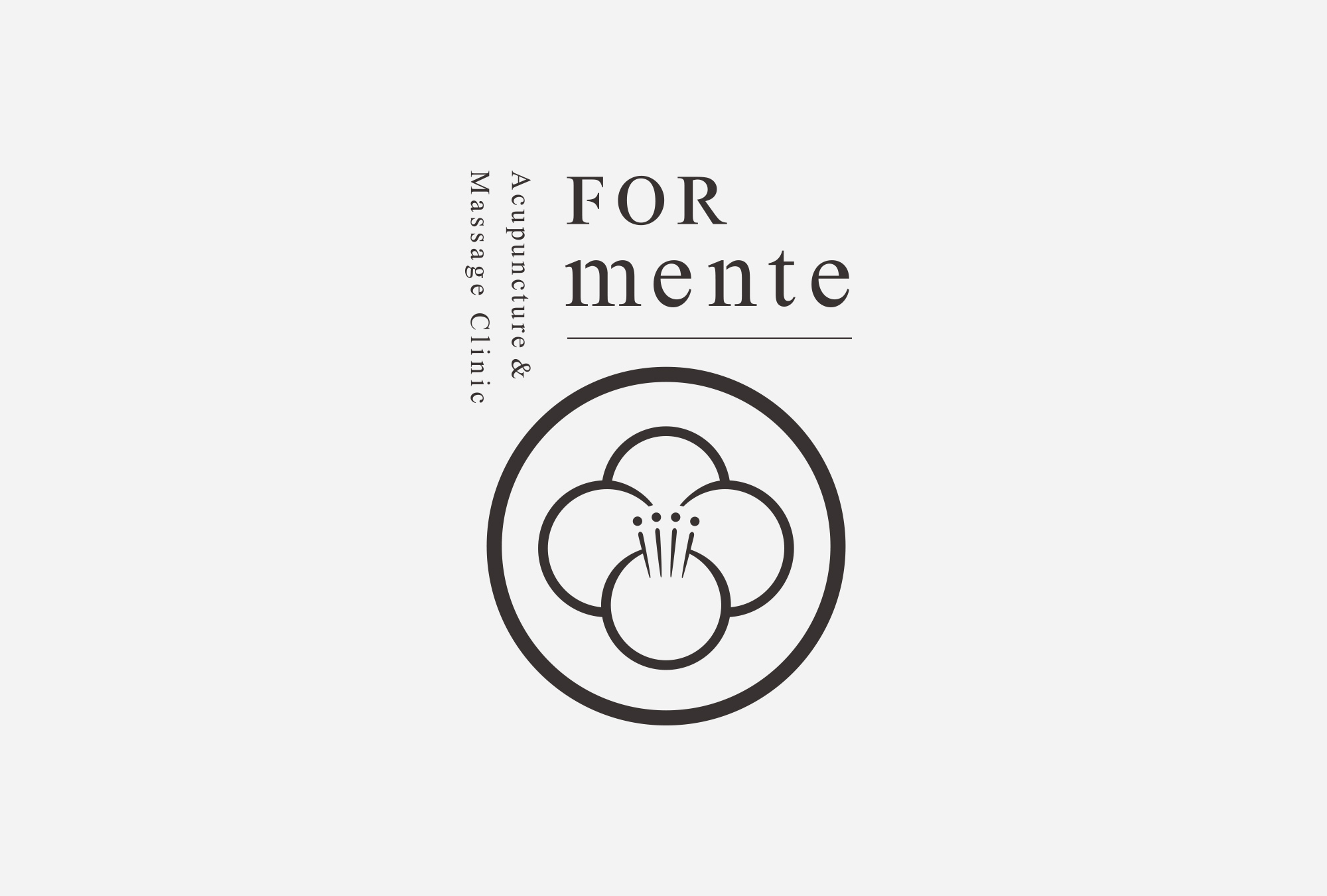
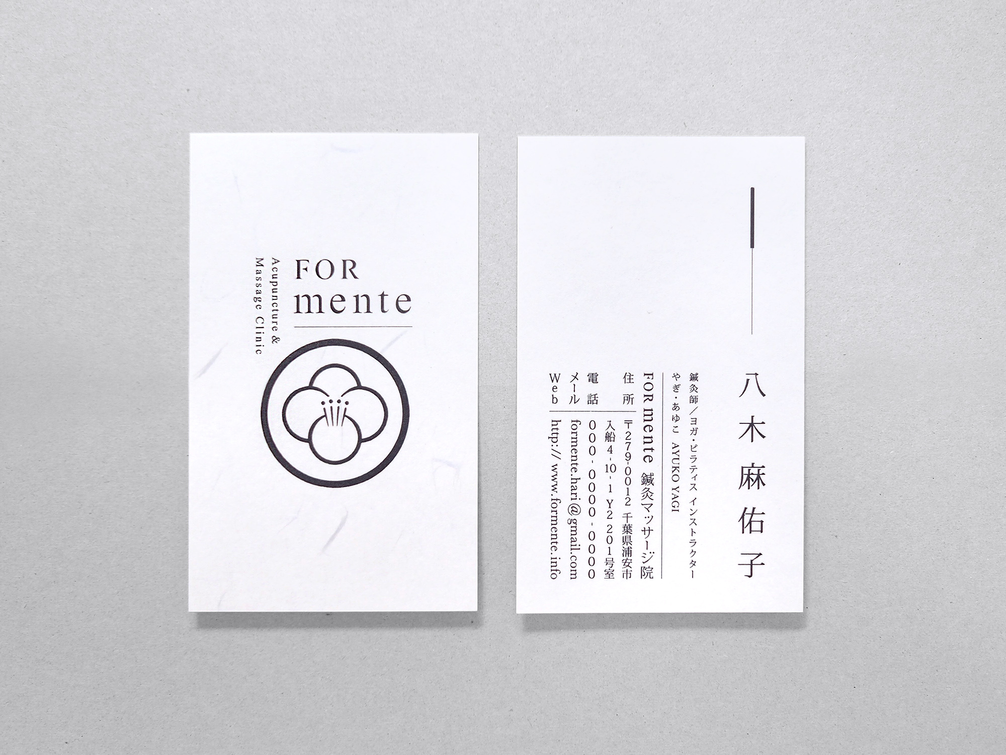
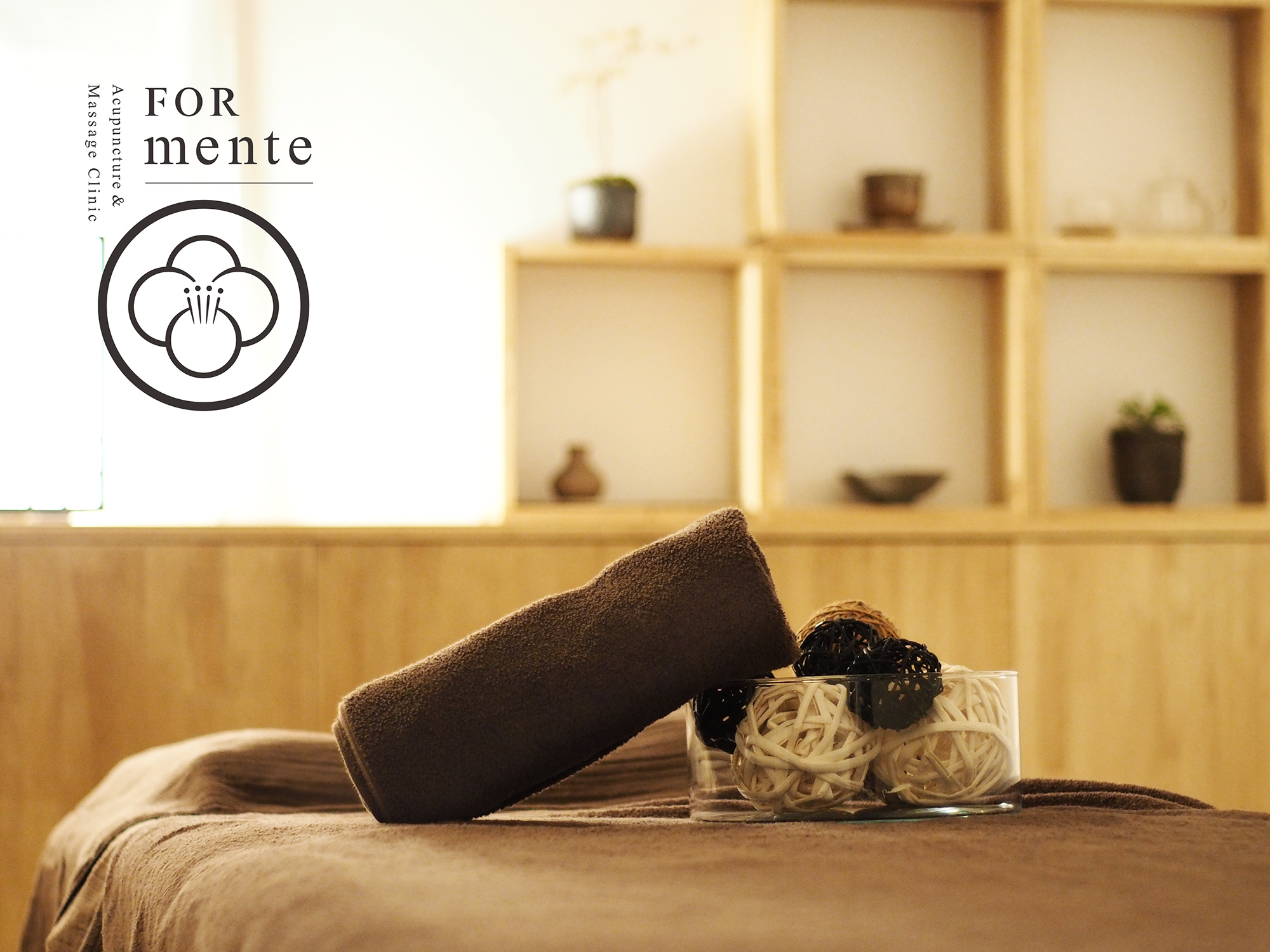
FORmente Acupuncture & Massage Clinic
千葉県浦安市に開業した「FORmente 鍼灸マッサージ院」は、中医学をベースとした体のメンテナンスに関わることを総合的にサポートする治療院です。tegusuでは、VIデザイン・ショップカード・名刺などの基本アイテムから、リーフレット・薬膳シートなどのプロモーションツールまで、全体のデザイン制作・監修を行いました。
“FORmente Acupuncture & Massage Clinic,” which opened in Urayasu, Chiba Prefecture, is a clinic that provides comprehensive support for the maintenance of your body, through treatment based on Chinese medicine. tegusu handled the overall design and supervising work. We designed the clinic’s VI. The items we designed range from basic stuff such as the shop card and the business card, to promotional tools such as the leaflet and the medicinal food sheets.
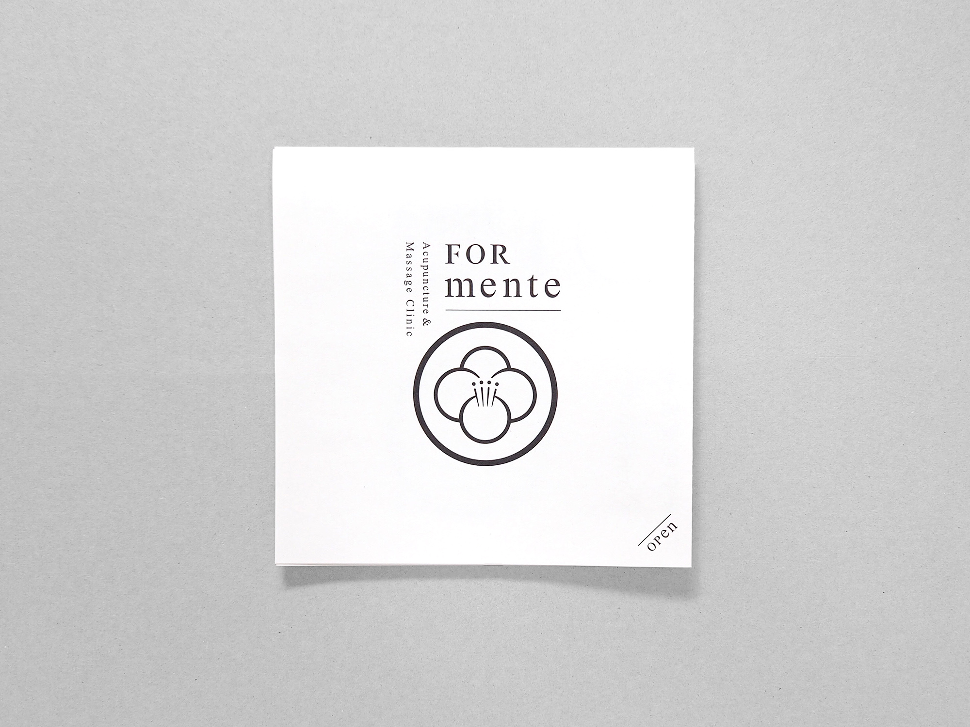
FORmenteの名前は「鍼&マッサージ、美容鍼、姿勢調整、薬膳アドバイスという四つ(Four)の柱を通して、体のために(For)本当に必要なメンテナンスを施す」という治療院のコンセプトに由来しています。その名前から、四つのモチーフが集まり1つの造形が生まれる仕組みを、VIやプロモーションツールのデザイン設計ルールと定義し、展開しています。
The name” FORmente” comes from the clinic’s concept, “Provide truly necessary maintenance for the body through acupuncture & massages, aesthetic acupuncture, posture correction and advice for medicinal food, the four main pillars of the treatment”. We defined the design rule, which required us to include a structure with four motives molded into one shape in our design of VI and other promotional tools.

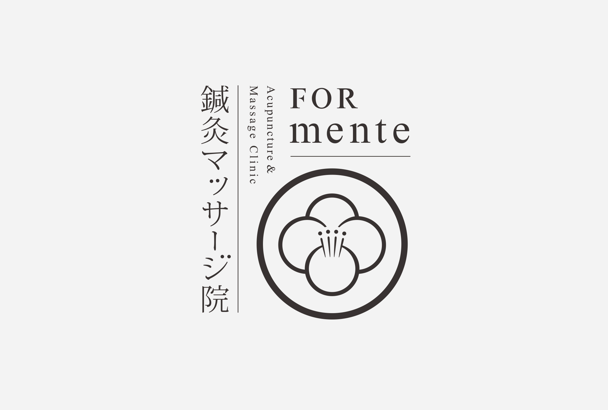
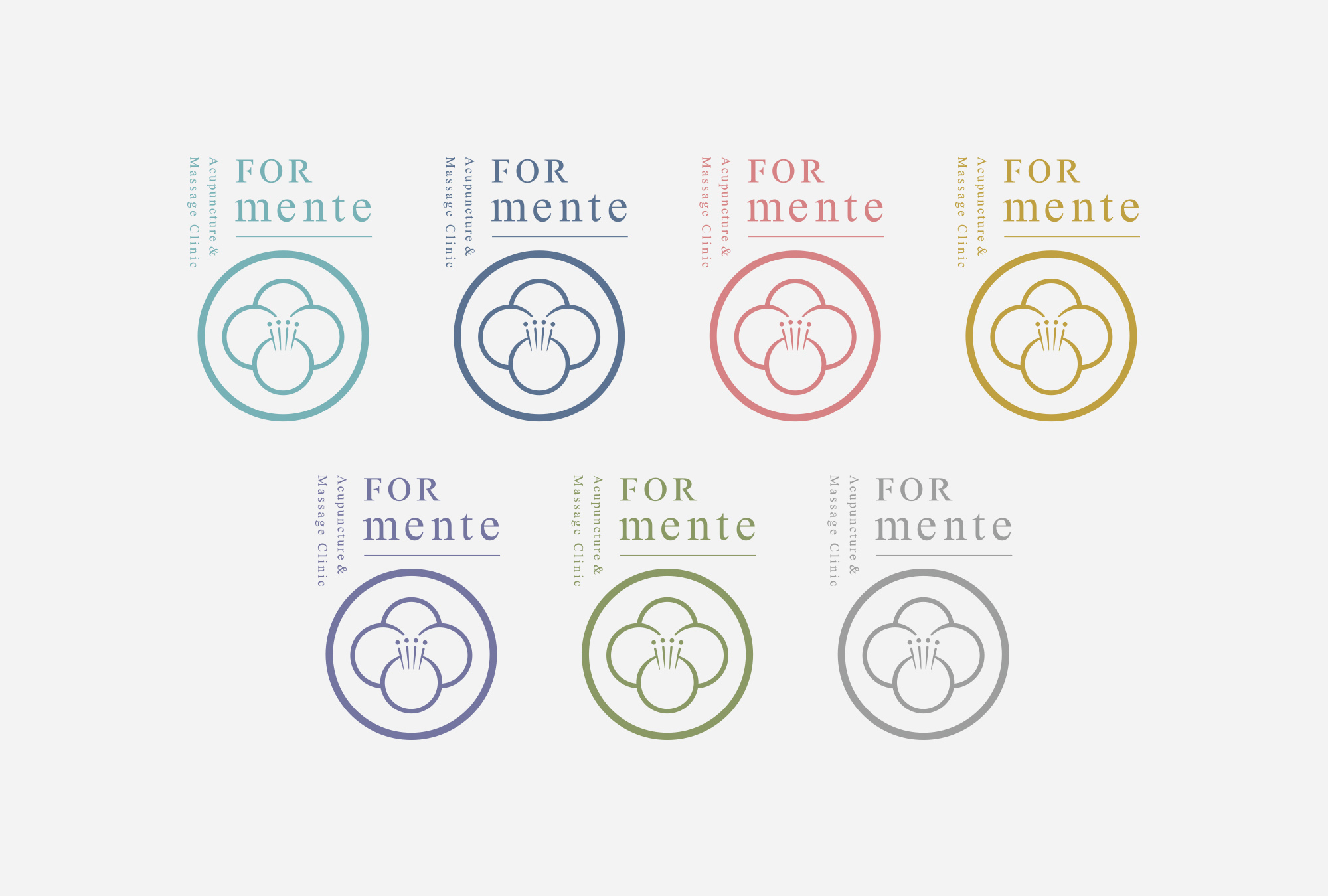

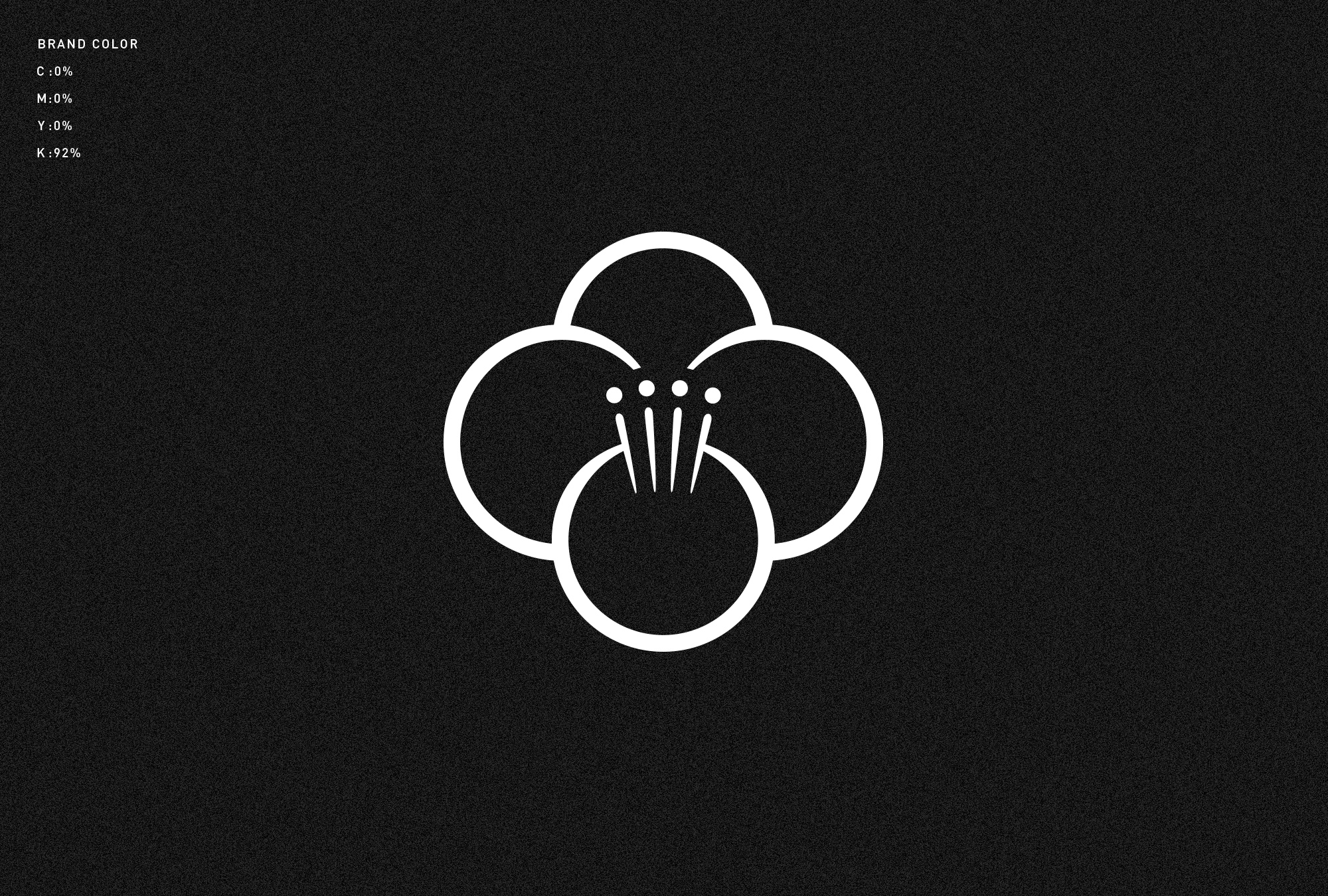
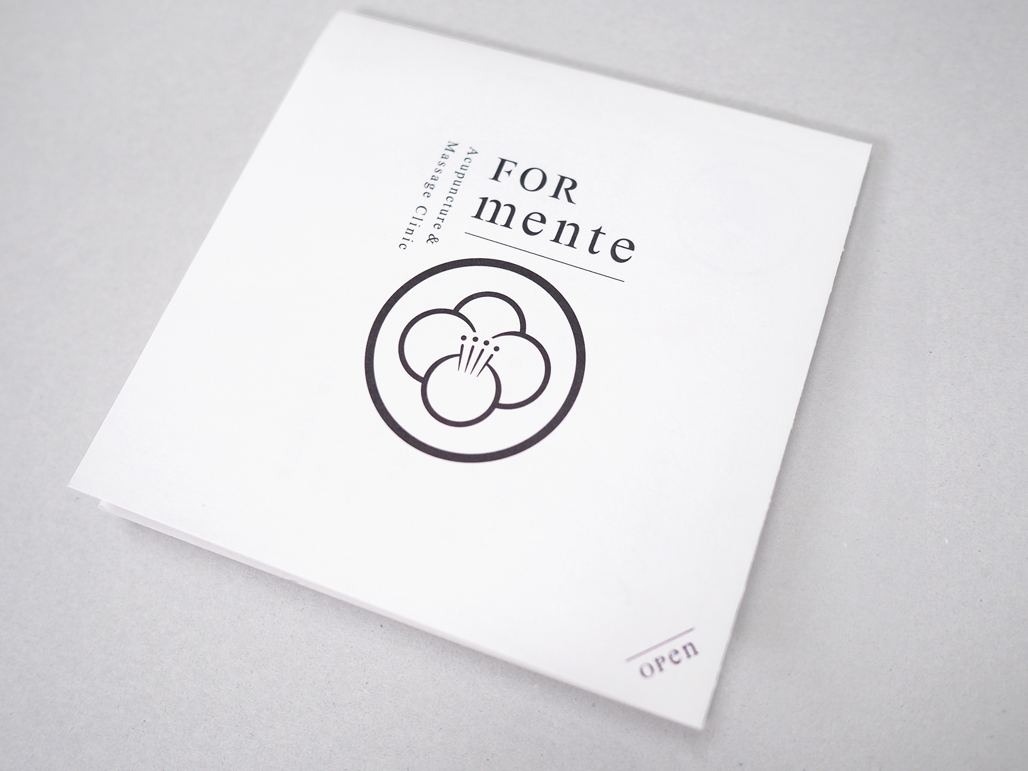
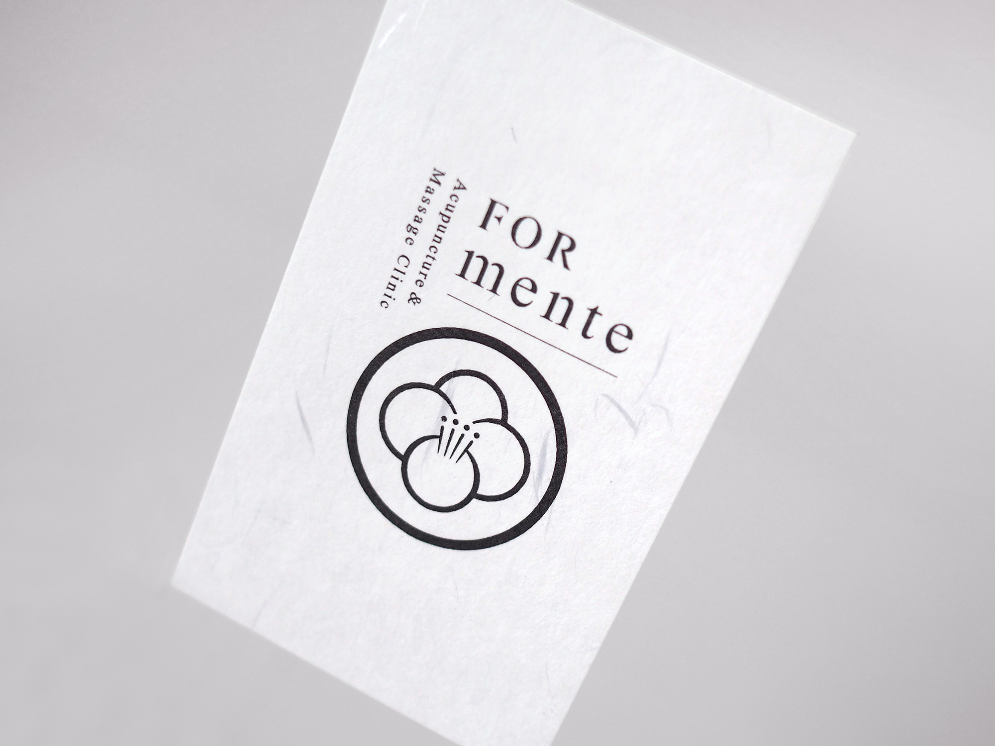
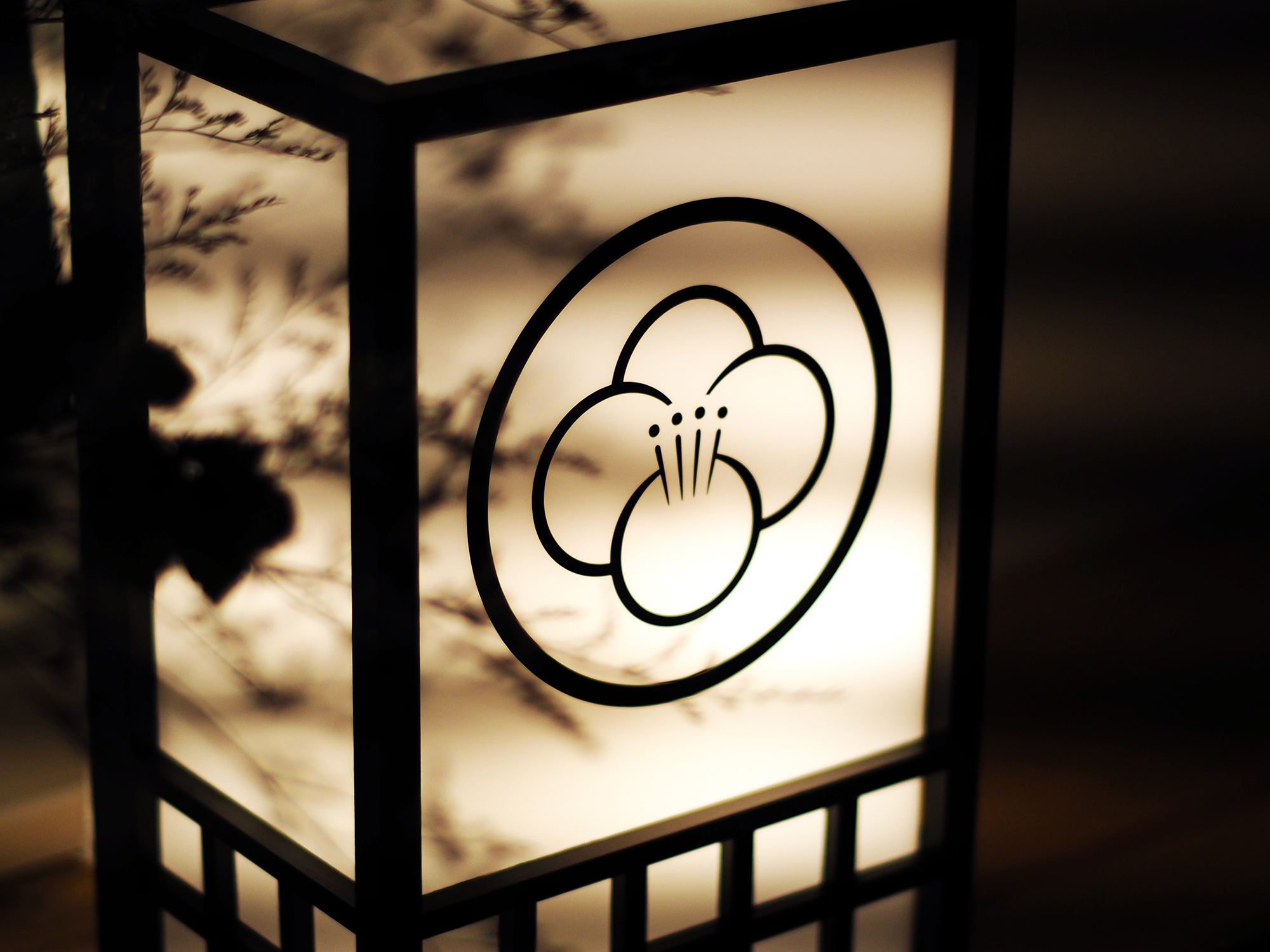
シンボルマークは、四つのサークルが集結し一つの花を形成します。FORmenteの四つの施術を組み合わせることで体の根本的な悩みにアプローチし、花が開くように健康な体を取り戻していく様子を表現しています。
The logo is in the shape of a flower which is made up of four circles. This signifies the clinic’s approach to solving fundamental issues of patients’ bodies by combining the four pillars of their treatment. It also symbolizes the way patients regain their healthy bodies, which is just like the way a flower blooms.

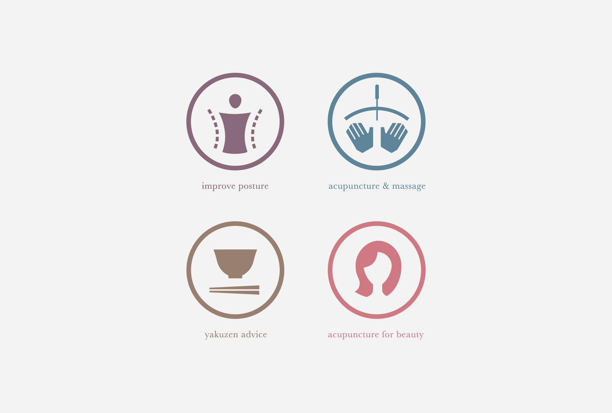
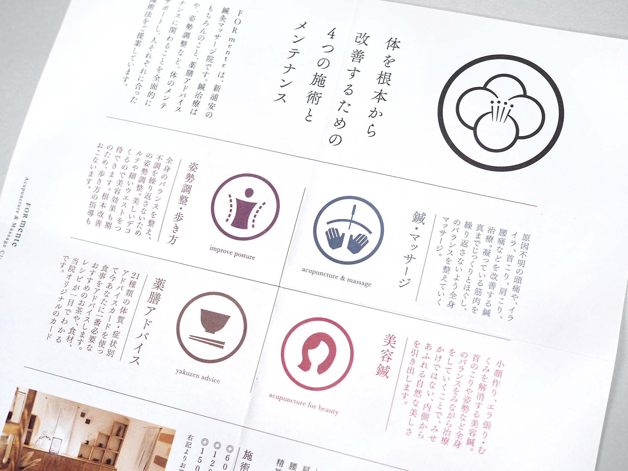
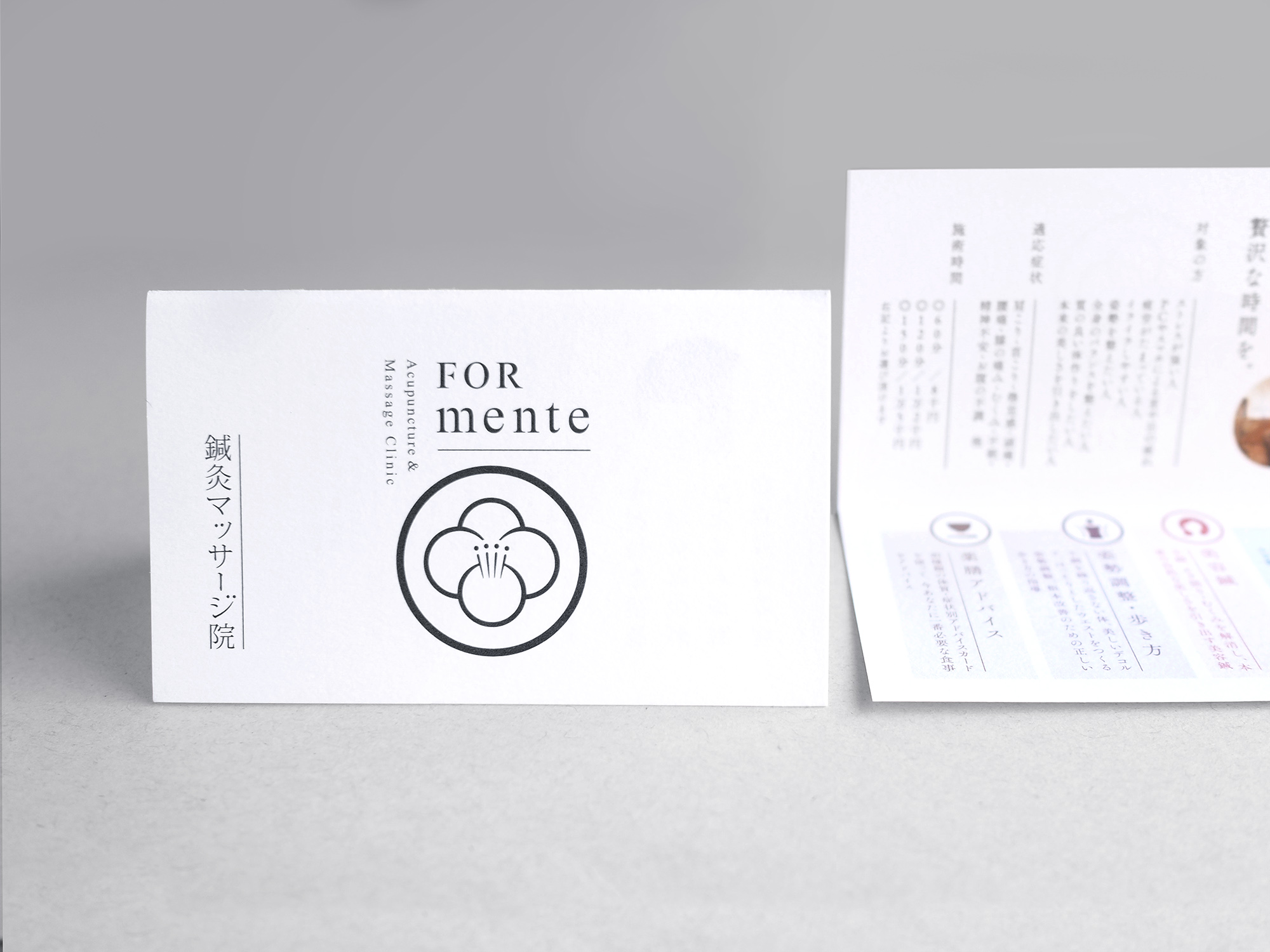
また四つ折のフライヤーは、開くと施術内容が網羅できる_仕様になっています。鍼マッサージ、美容、姿勢、薬膳という四つの施術をアイコン化し、WEBなど他の媒体におけるサービス説明でも統一感を保てるように配慮しました。
The flyer, folded in four, is designed so that you can see the four pillars of the treatment at a glance simple by opening it. We created an icon for each of the four pillars of the treatment, which are acupuncture & massages, aesthetics, posture and medicinal food. We paid attention to the consistency of the design, so the same icons are also used for service descriptions on the website and other media.


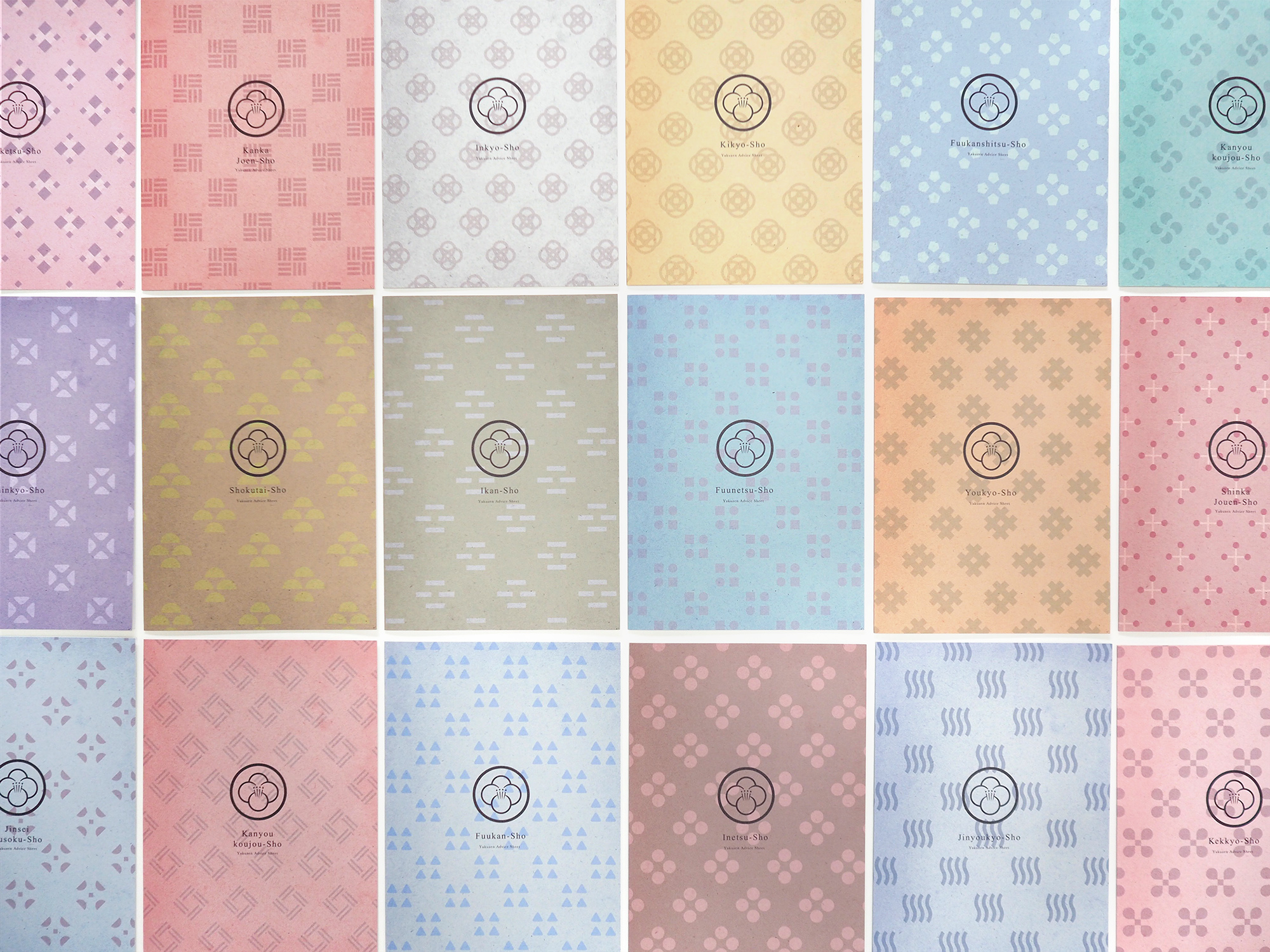
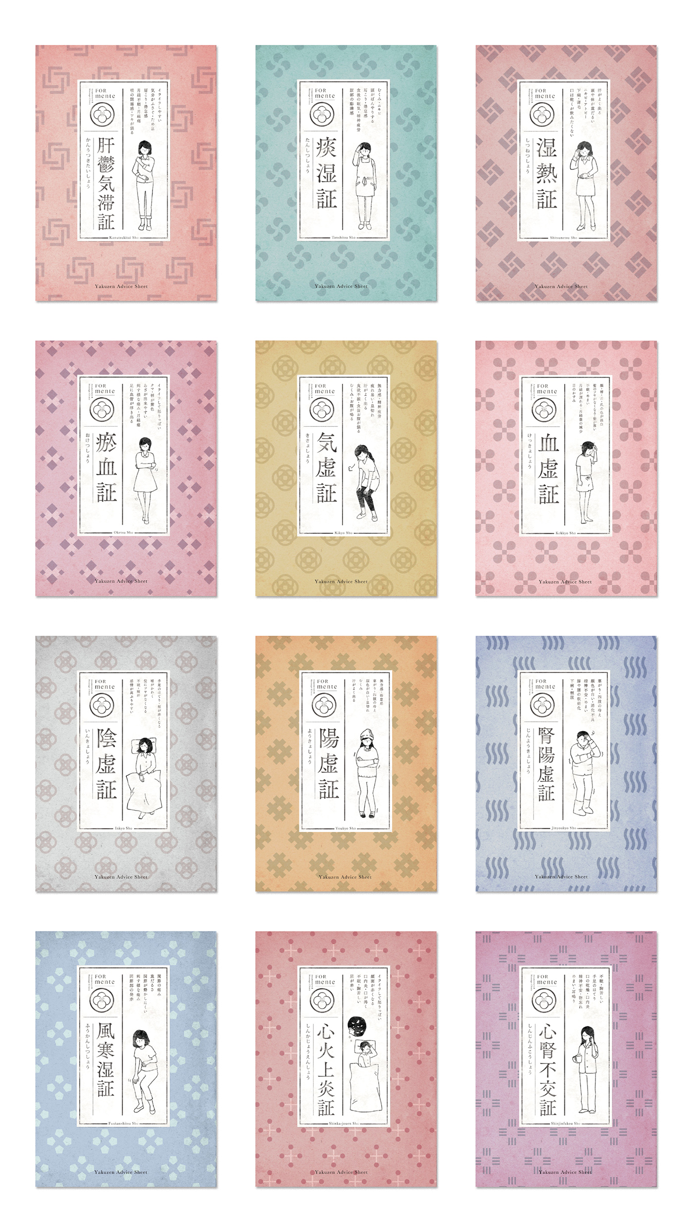
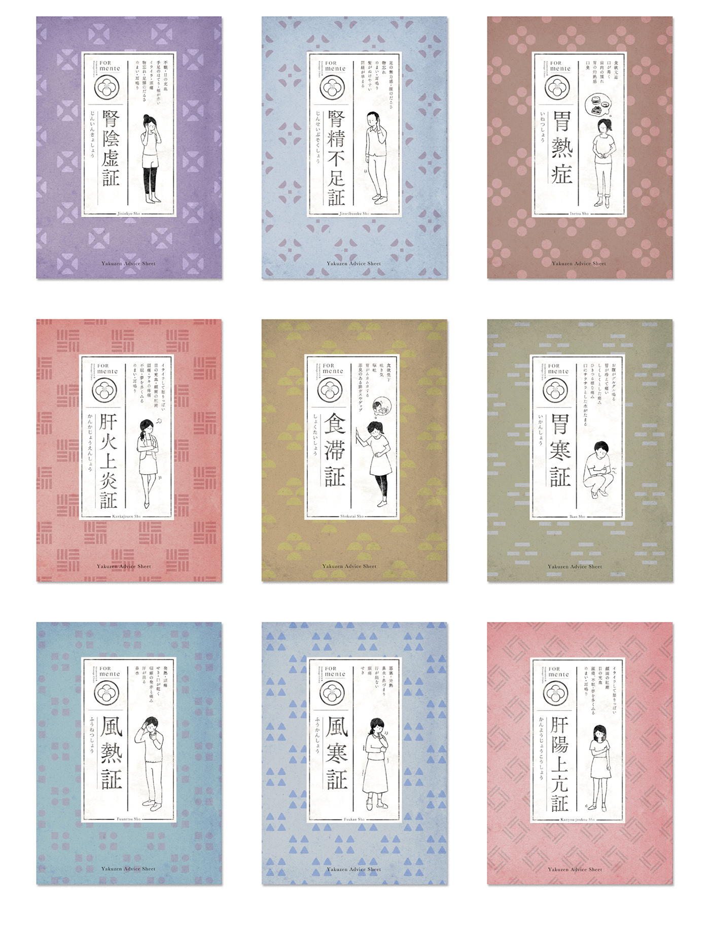
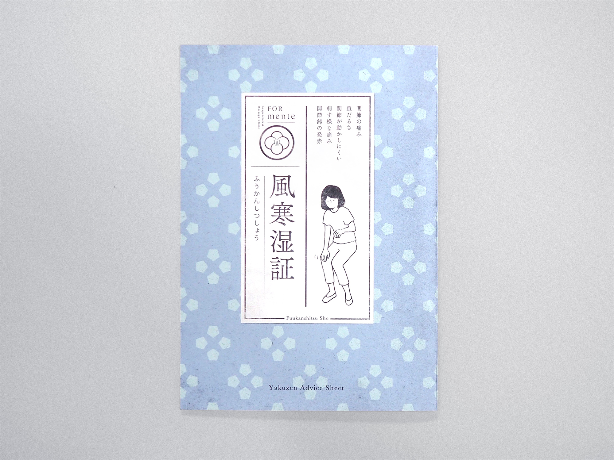
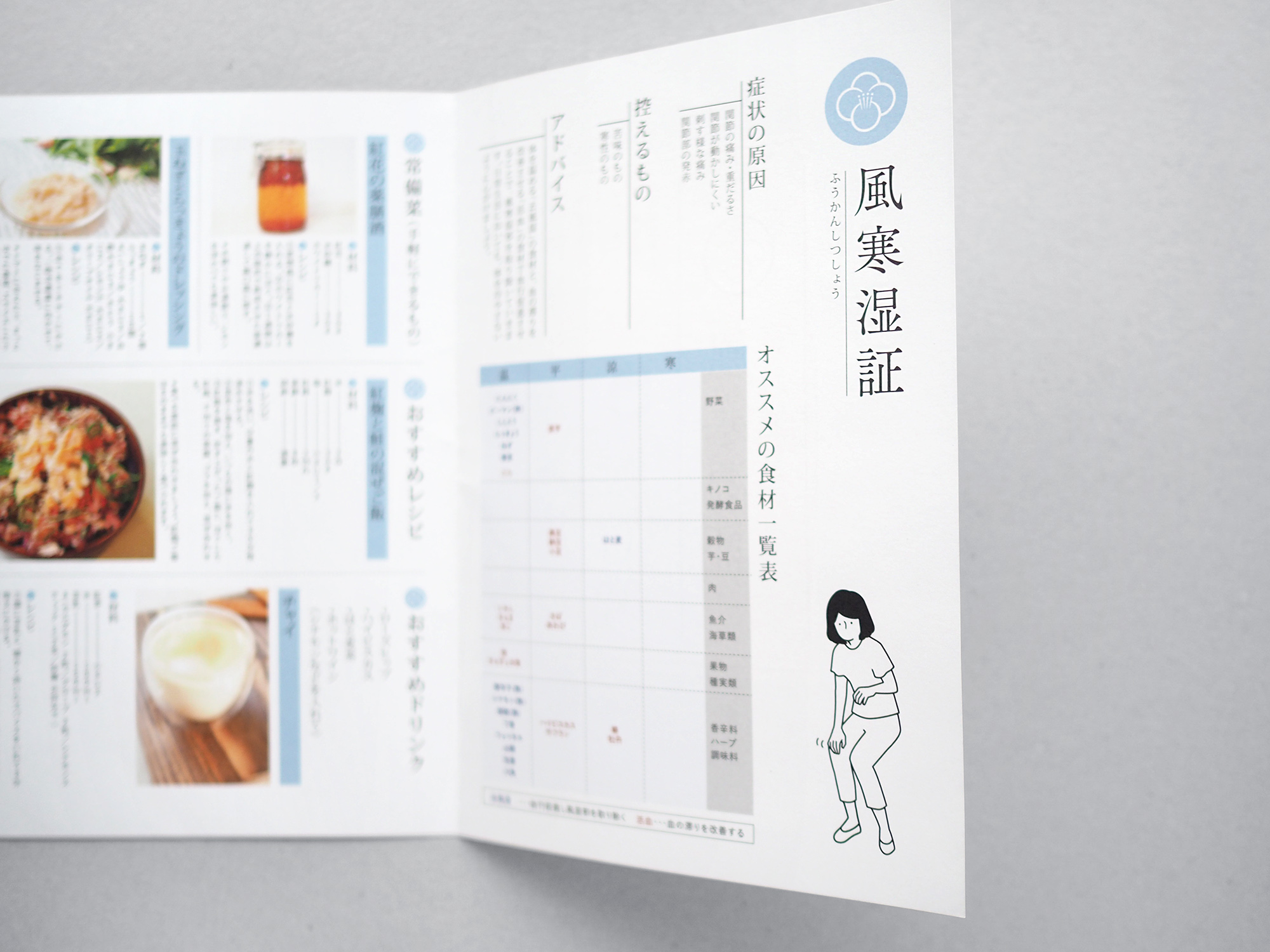
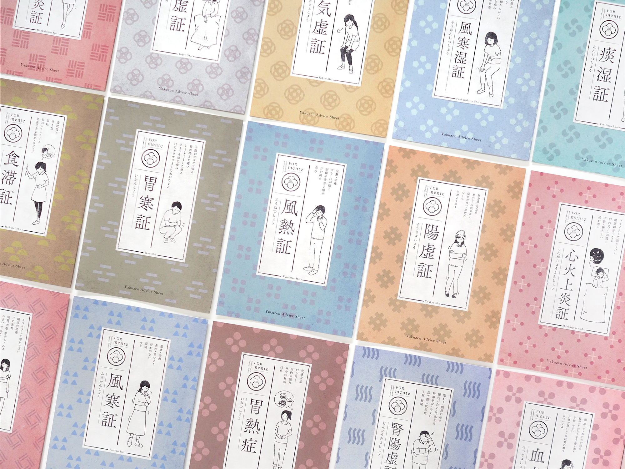
古い書物をデザインソースにしたオリジナルの薬膳シートは、中医学における21種類の「証」がイラストで表現され、症状に合わせてオススメの食材や料理が記されています。表紙の背景にはそれぞれ異なる四つのモチーフからなる造形_を地紋に使用し、日本の伝統色を意識した配色で彩っています。
The design of the medicinal food sheets we created was inspired by an old book. Twenty-one kinds of “sho”, which means “diagnosis” in Chinese medicine, are visualized in illustrations. Each sheet is dedicated to one kind of “sho”, and lists up the food and ingredients recommended for each symptom. On the background of the cover, a pattern with shapes made up of four motives is used. The background color and the color of the shapes create the color combination that matches the impression of traditional Japan.

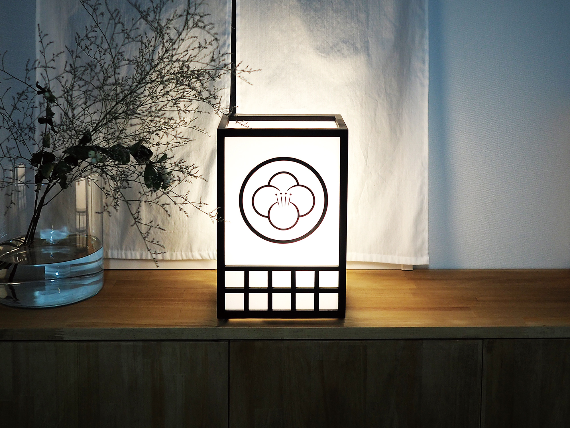
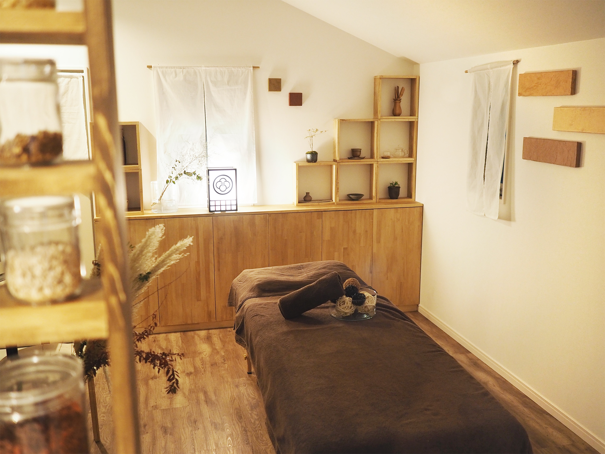
施術空間も東洋の雰囲気で統一され、和紙を用いたファブリックボードや、シンボルマークが目を引く行灯によって落ち着いたプライベート空間を演出しています。
The clinic’s space for treatment has a uniquely oriental atmosphere. The tranquil, private space is produced with objects like fabric panels made with Japanese paper and a paper lantern that has the eye-catching logo on it.
Clinet:FORmente 鍼灸マッサージ院
Art Direction, Design : 藤田雅臣
Illustration:古舘尚子
Client : FORmente Acupuncture & Massage Clinic
Art Direction, Design : Masaomi Fujita (tegusu Inc.)
Illustration : Shoko Furudate
Thank you for watching.
FORmente / VI design