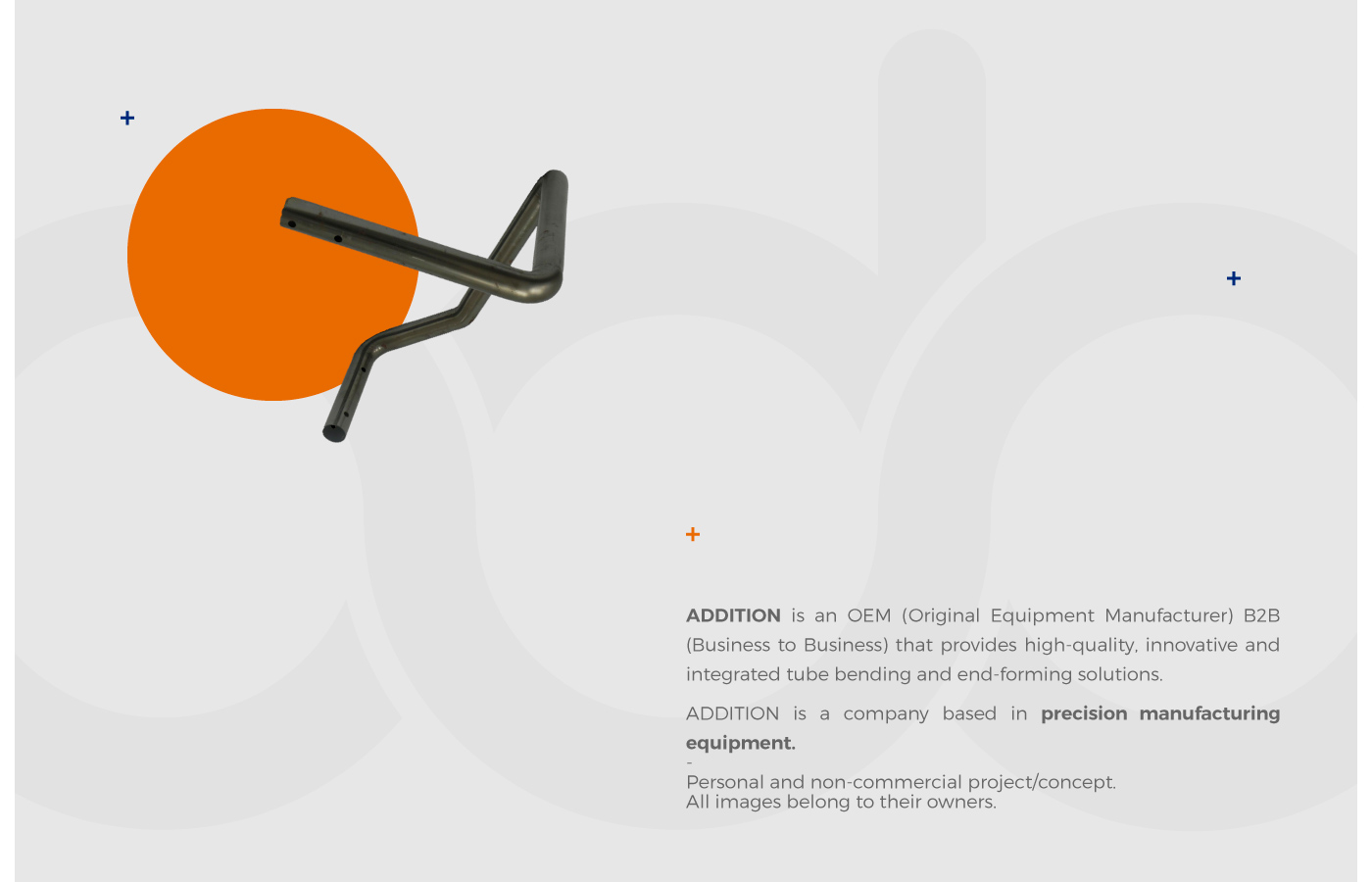
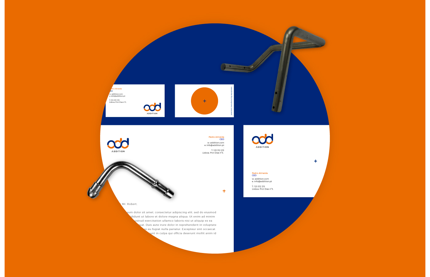
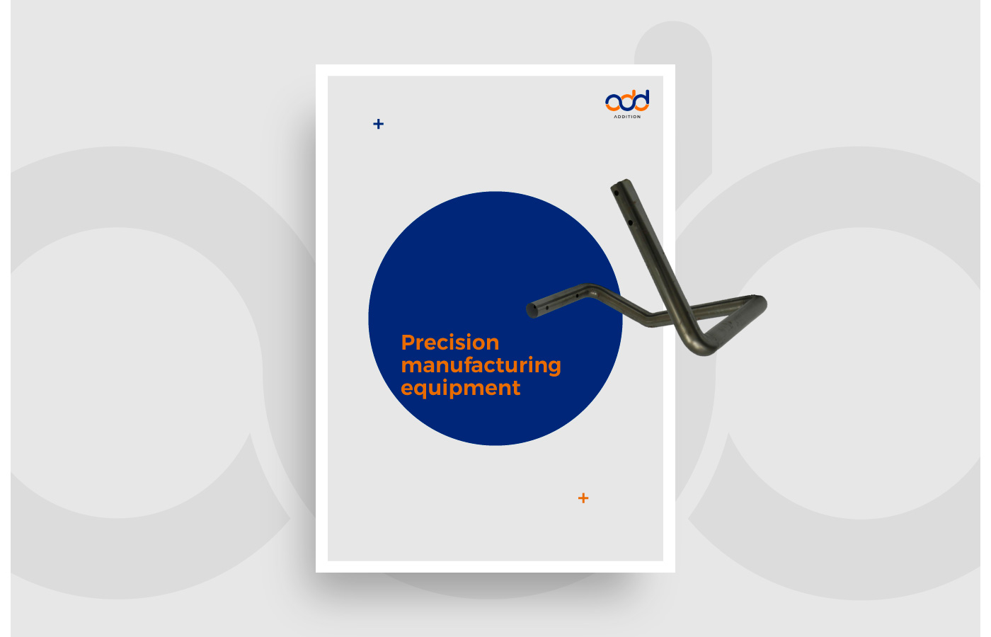
Addition – brand identity

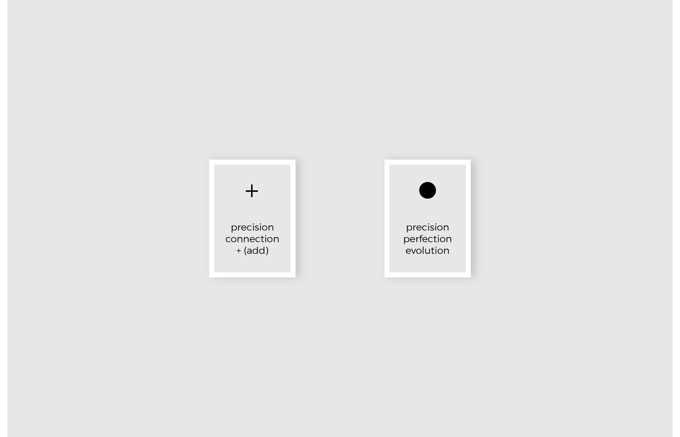
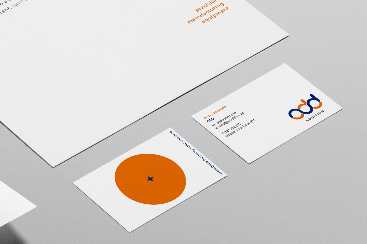
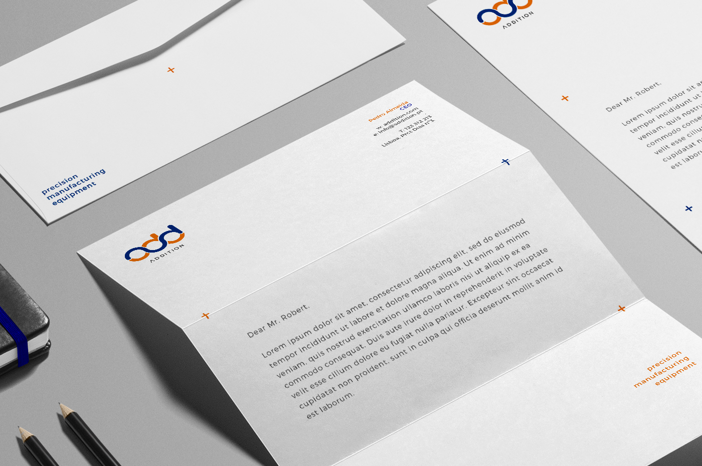
The mark is the graphical representation of the product/service and also the Add (+) acronym for Additon


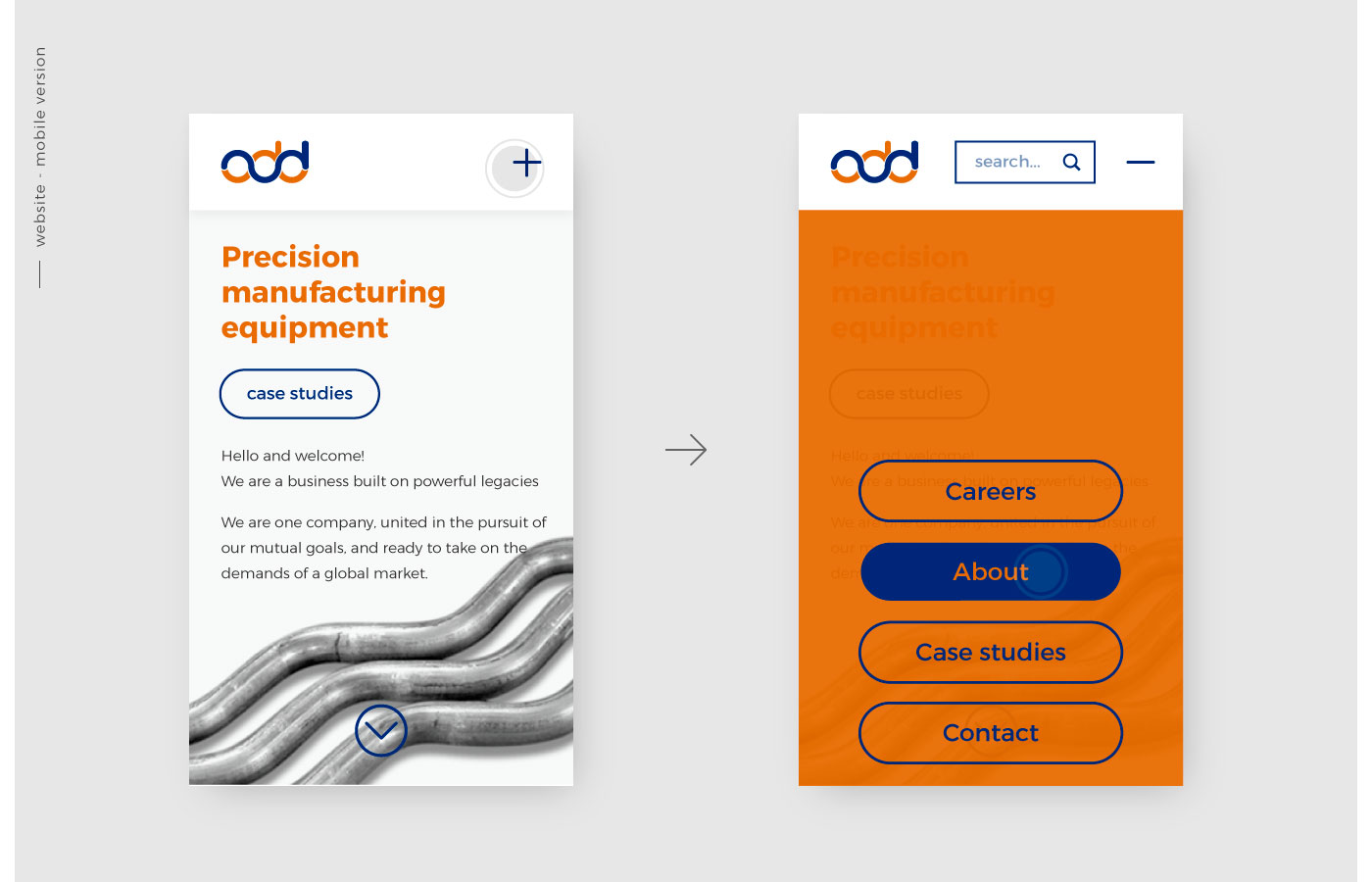
As mobile phones have gotten taller and wider, the menu is displayed in the bottom so you can use only one hand and it’s also easier to reach the menu and other buttons with your fingers.
I replaced the “hamburguer” menu with one of the brand graphic elements, also an universal symbol. The plus symbol ” + ” which means more and when the menu is active, the plus symbol turns into the minus ” – ” symbol, representing the meaning of less. It’s simple, if you want to see more, press the plus icon, if you want to see less, press the minus icon.


Addition – brand identity