2016_Autumn_Exhibition
神奈川県の平塚市美術館にて2016年秋に開催された2つの展覧会について、広報物の制作を担当しました。
We handled the production of PR materials for two exhibitions held in The Hiratsuka Museum of Art in the fall of 2016. The museum is located in Kanagawa Prefecture.
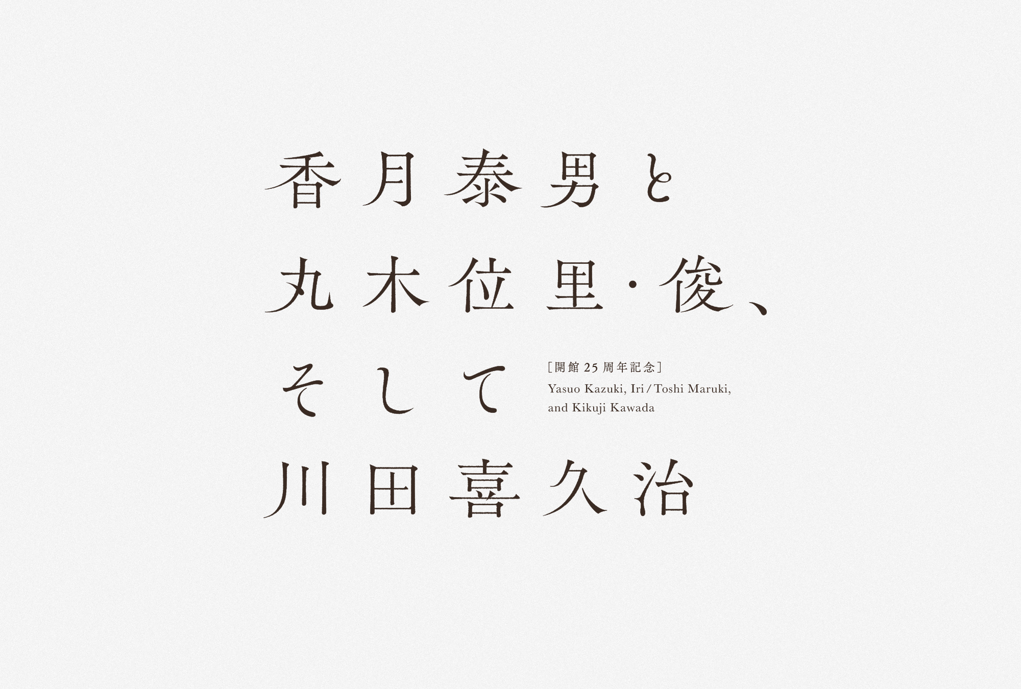
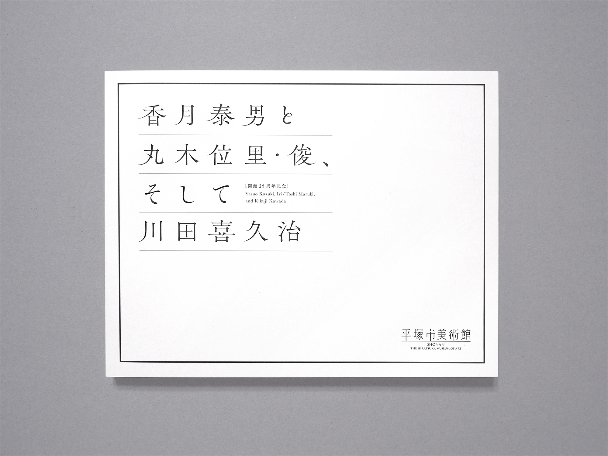
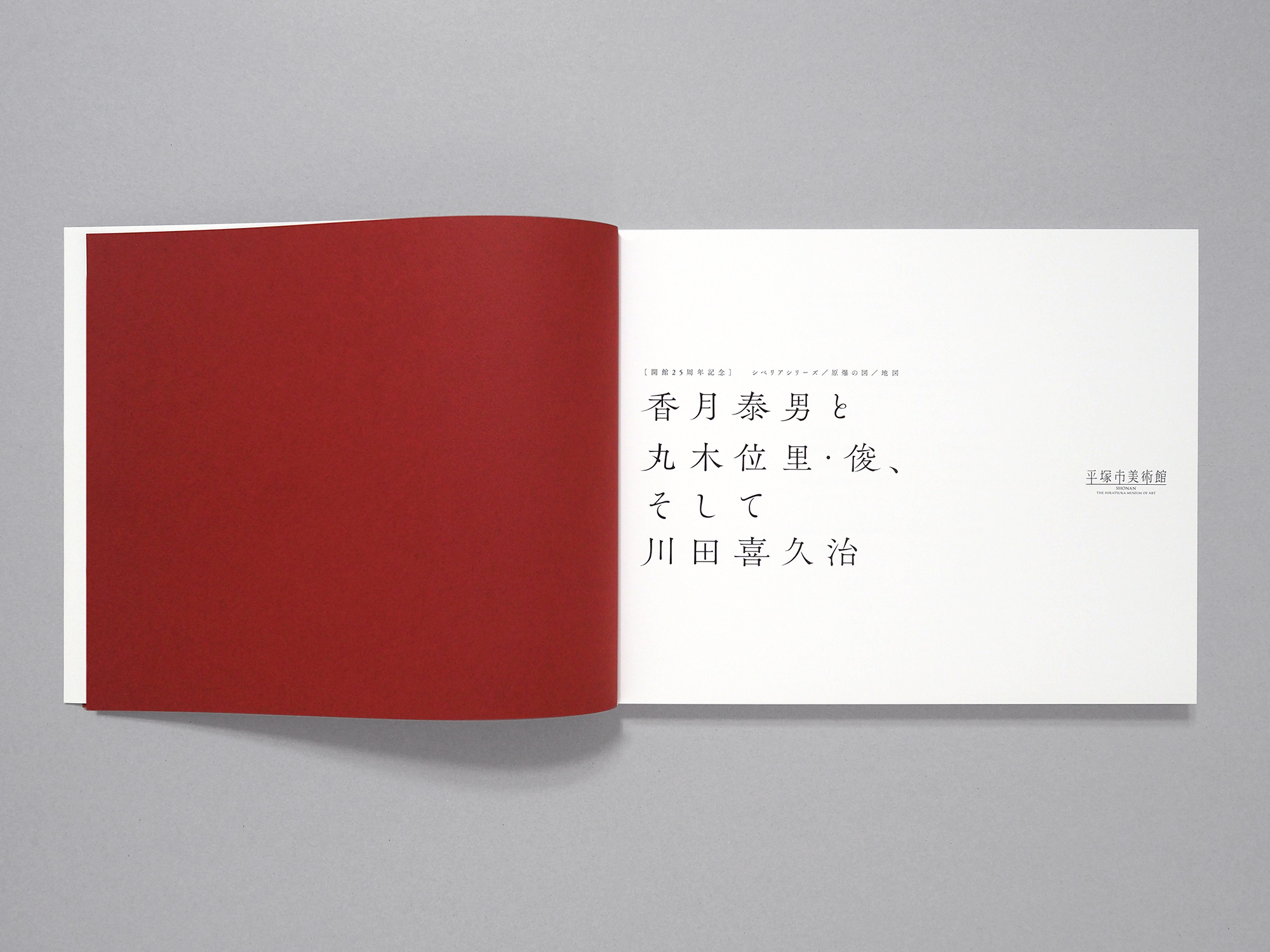
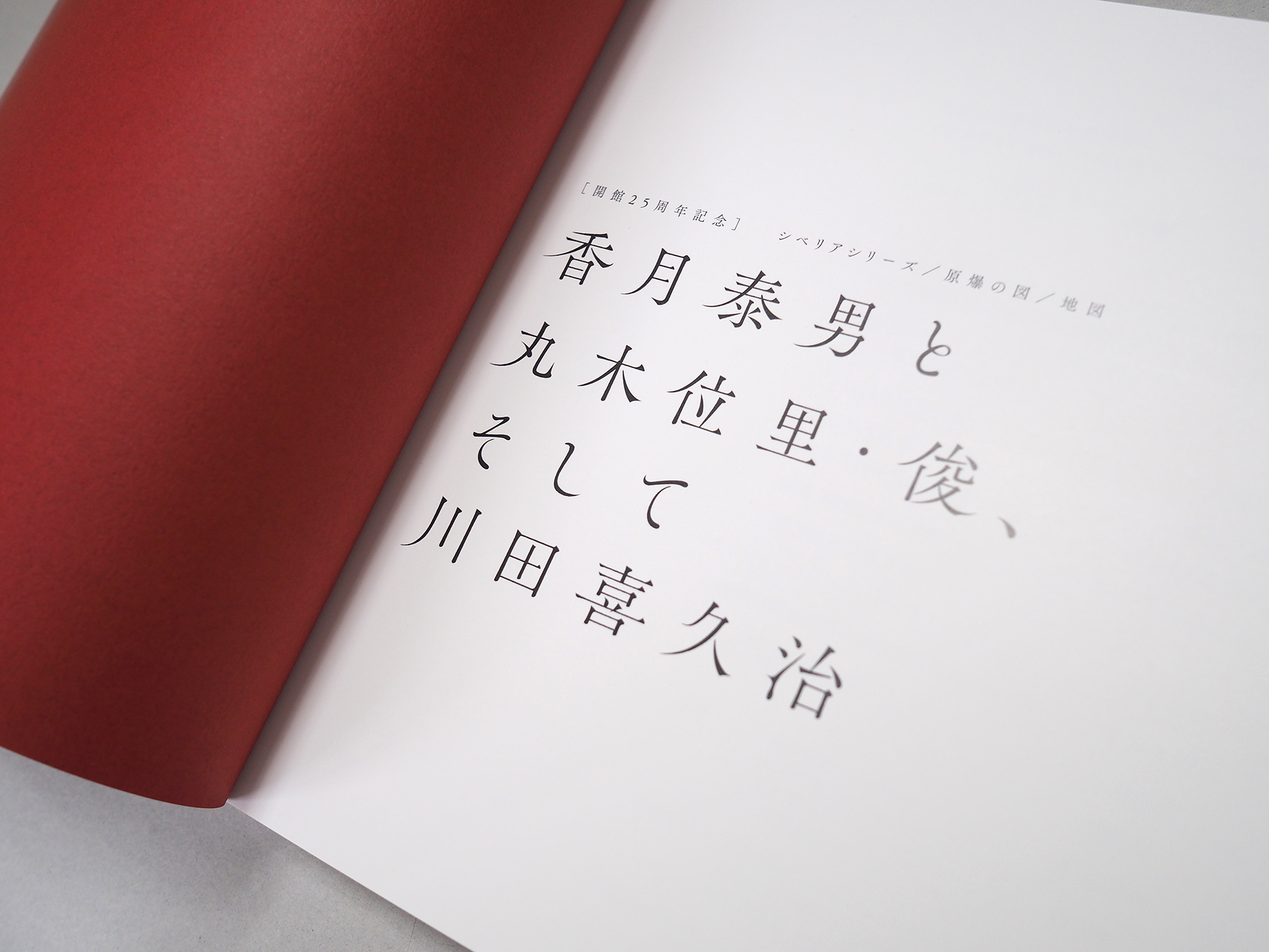
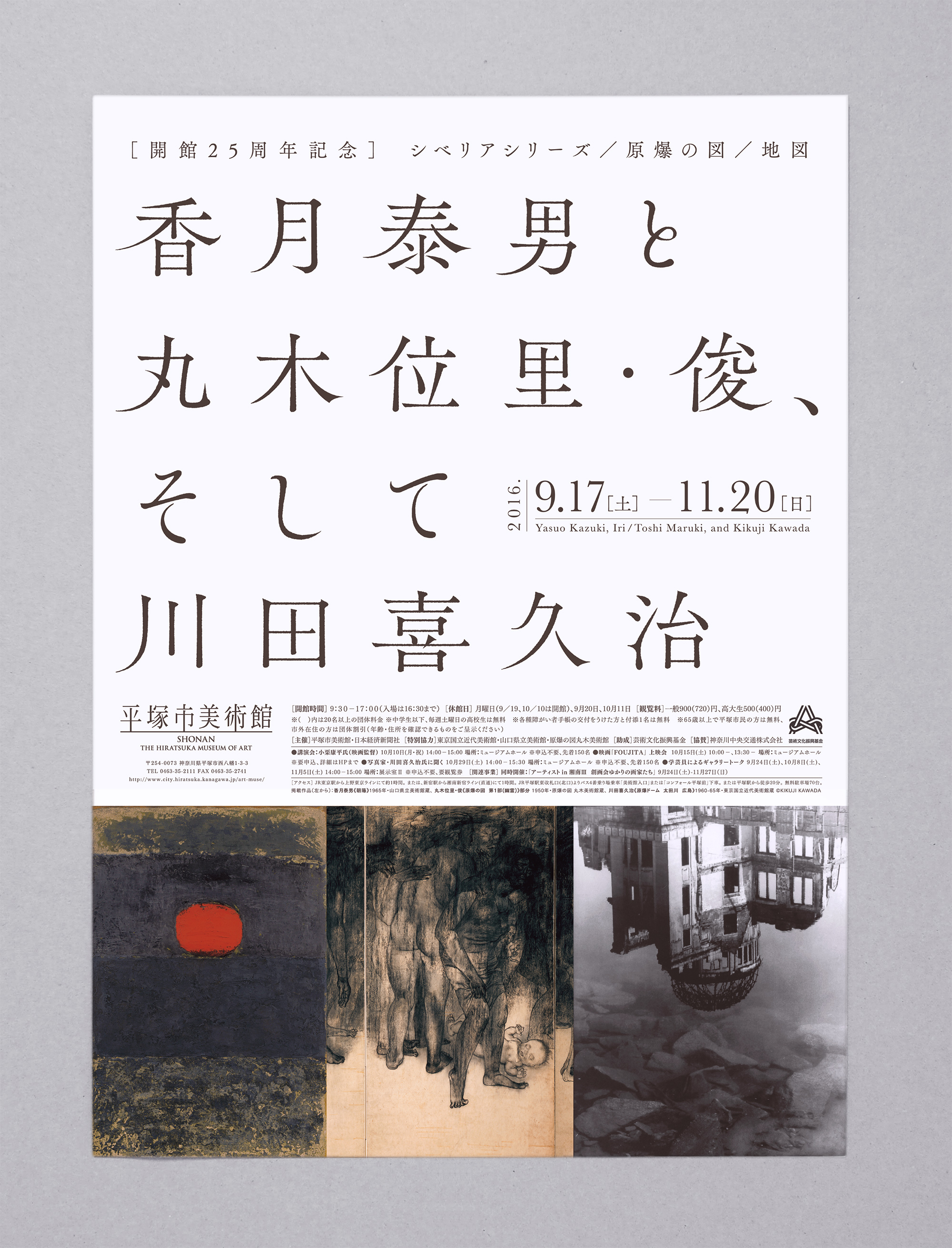
「香月泰男と丸木位里・俊、そして川田喜久治」
平塚市美術館の開館25周年を記念し開催された展示会です。シベリアに抑留された経験をもとに「シベリアシリーズ」を制作した洋画家の香月泰男。原爆投下後の広島を見た体験をもとに巨大な日本画の連作「原爆の図」を夫婦で共同制作した丸木位里・俊。原爆ドームの壁のしみや特攻隊員の遺影などを撮ったモノクローム写真「地図」を発表した川田喜久治。洋画、日本画、写真という異なる表現の中から、戦争に対するそれぞれのまなざしを感じ取ることができる展覧会です。
“Yasuo Kazuki, Iri and Toshi Maruki, and Kikuji Kawada”
This is an exhibition held to commemorate the 25th anniversary of The Hiratsuka Museum of Art. Yasuo Kazuki is a Western-style painter who produced “Siberia Series” based on his experience of being detained in Siberia. Iri and Toshi Maruki, as a couple, co-produced a series of gigantic Japanese-style paintings called “The Hiroshima Panels,” based on their experience of seeing Hiroshima after the atomic bomb was dropped. Kikuji Kawada released a collection of monochrome photographs called “Map,” which included photographs of deceased Kamikaze pilots and stains on the wall of the Atomic Bomb Dome. In this exhibition, you can see varied points of view towards the war through Western and Japanese-style paintings and photographs; three different artistic forms of expression.
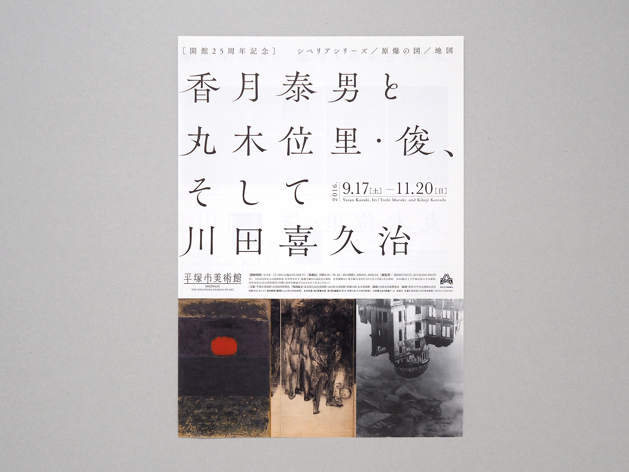
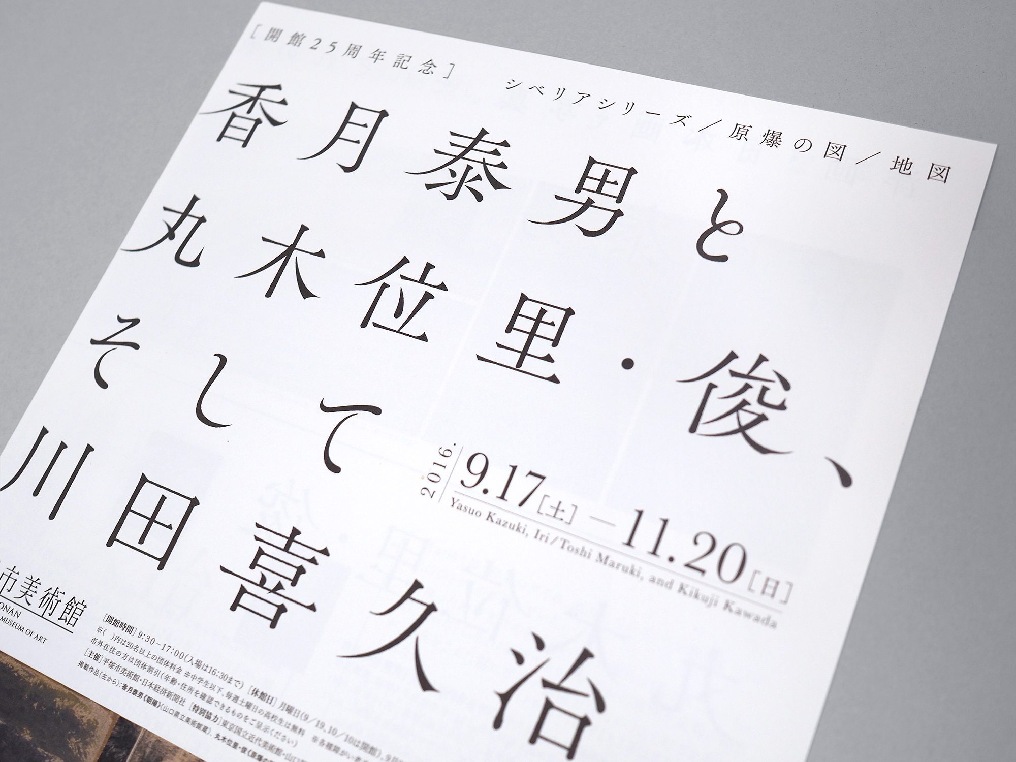
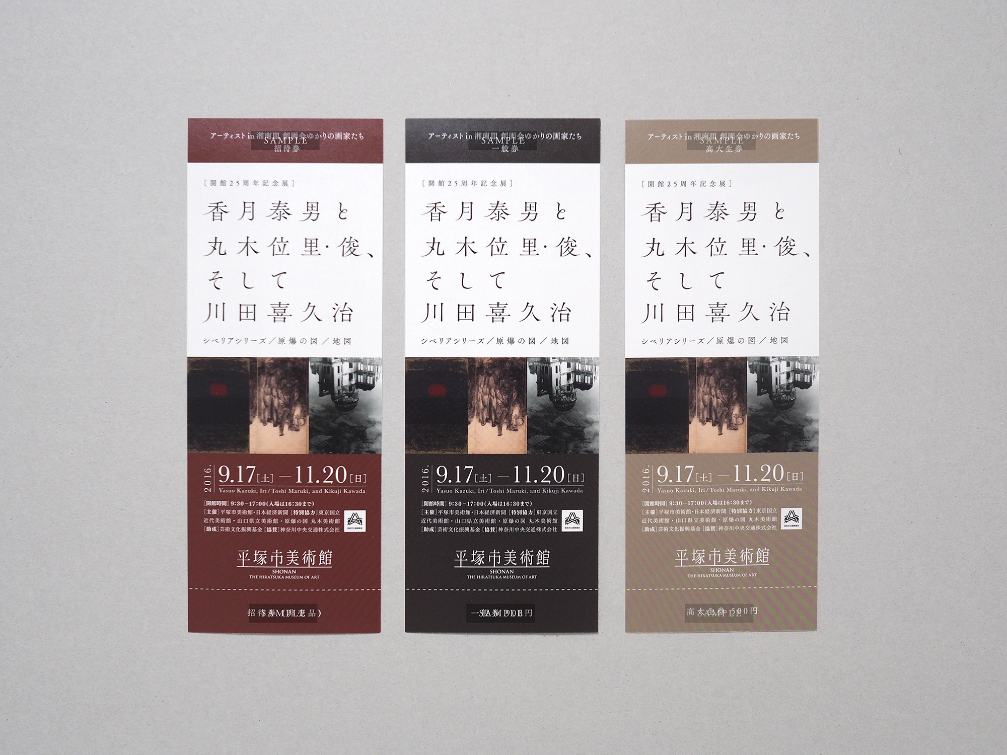
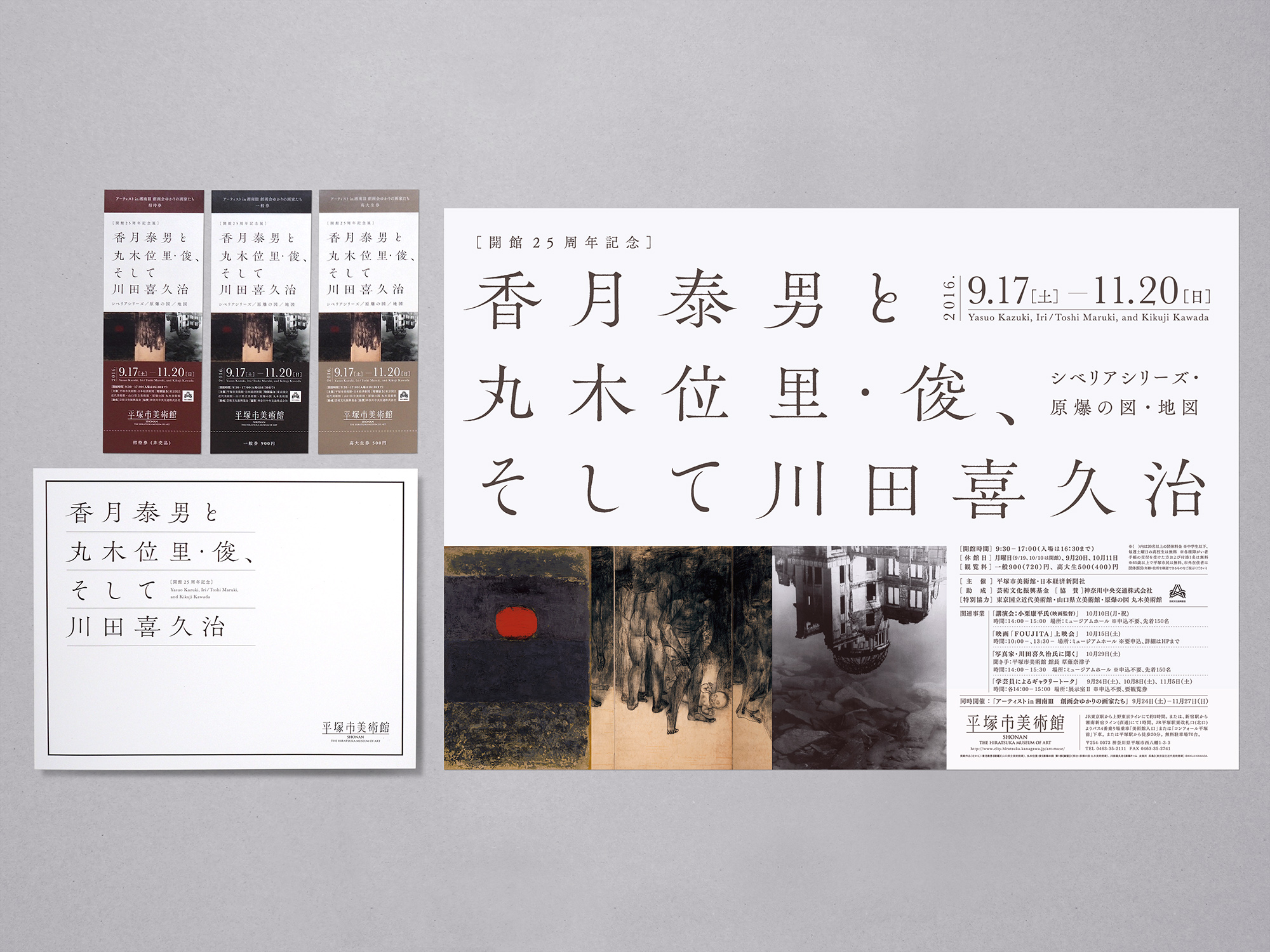
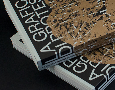
tegusuでは、展覧会のメインビジュアルをデザインし、ポスター、リーフレット、観覧券、図録など様々な印刷物に展開しました。シリアスな展覧会の内容を踏まえ、装飾的な要素を加えず、日本語の繊細な文字のフォルムと、作品の力強さ、余白を生かしたレイアウトで、緊張感の感じられるデザインに仕上げました。
tegusu designed the main graphics for the exhibition, and used the design in various printed materials including the poster, leaflet, admission ticket and catalogue. Considering the serious nature of the exhibition content, we didn’t make the design too decorative. Instead, we created the design from which you can feel tension, using elements like Japanese letters in a delicate-looking font, the powerful presence of painting images, and the layout in which a margin is meaningfully used.

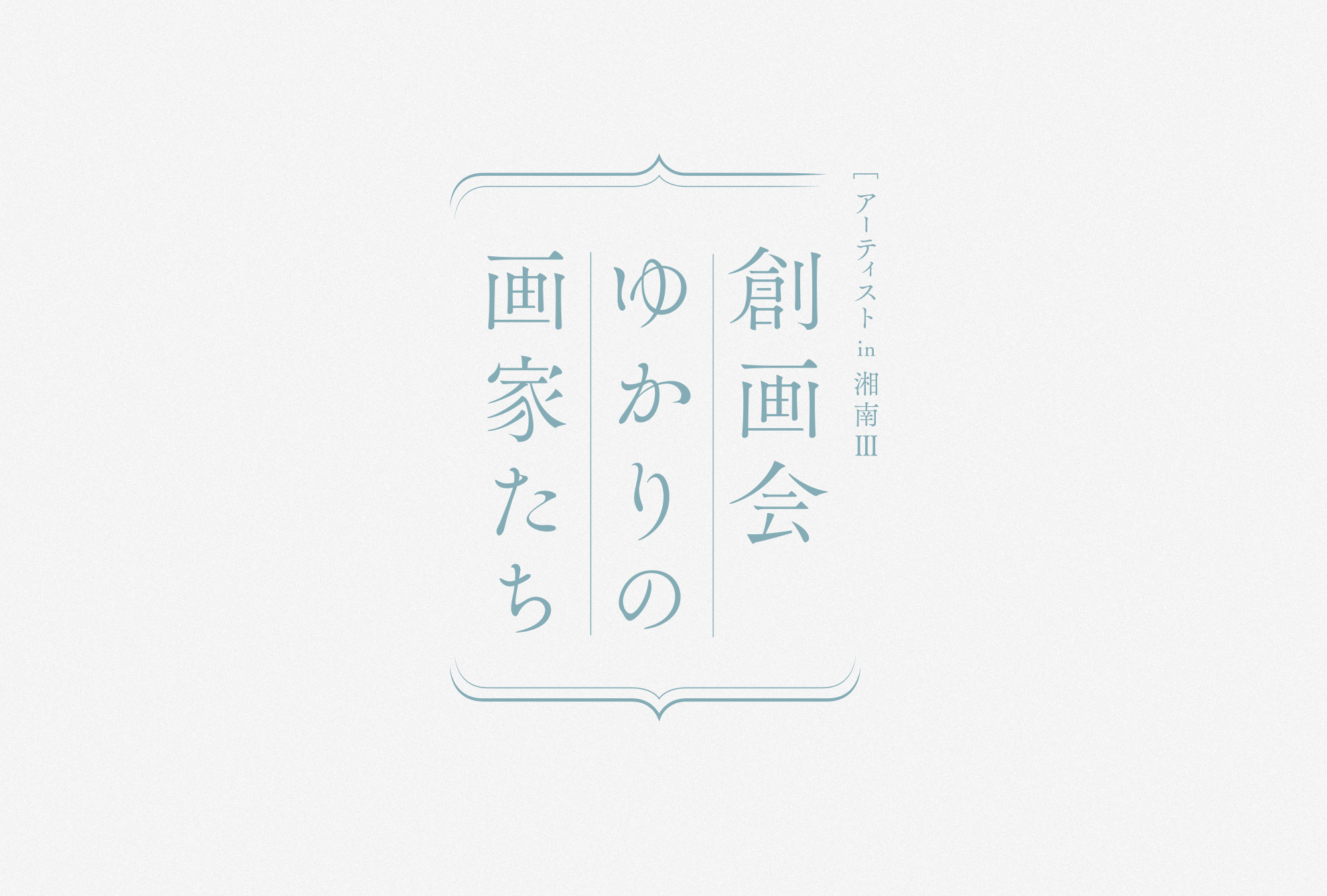
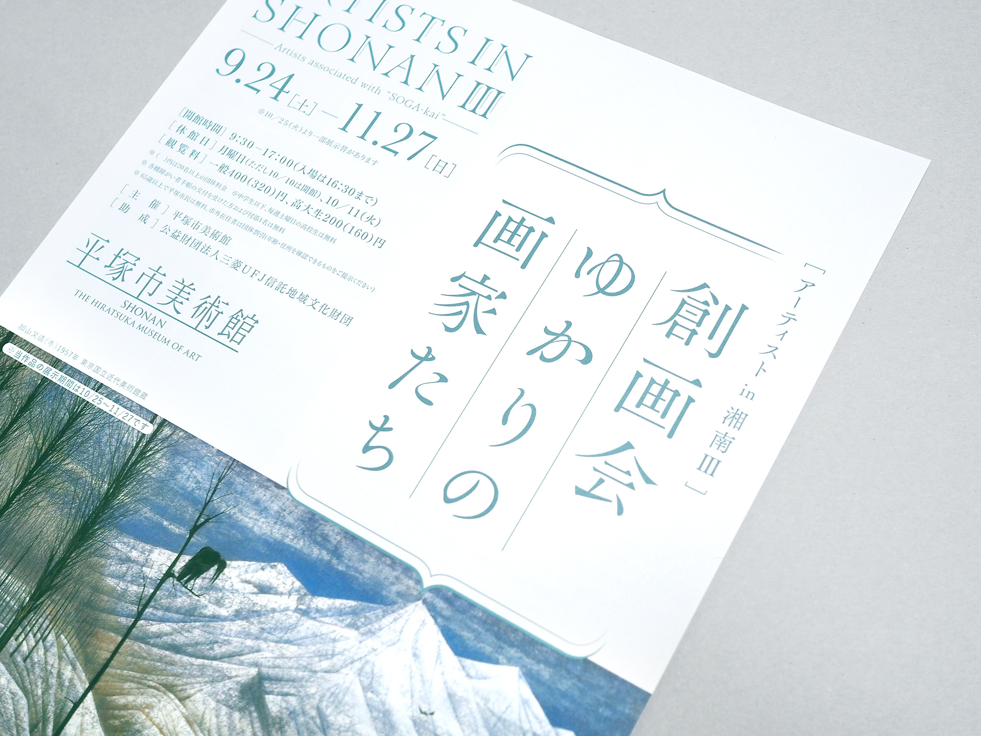
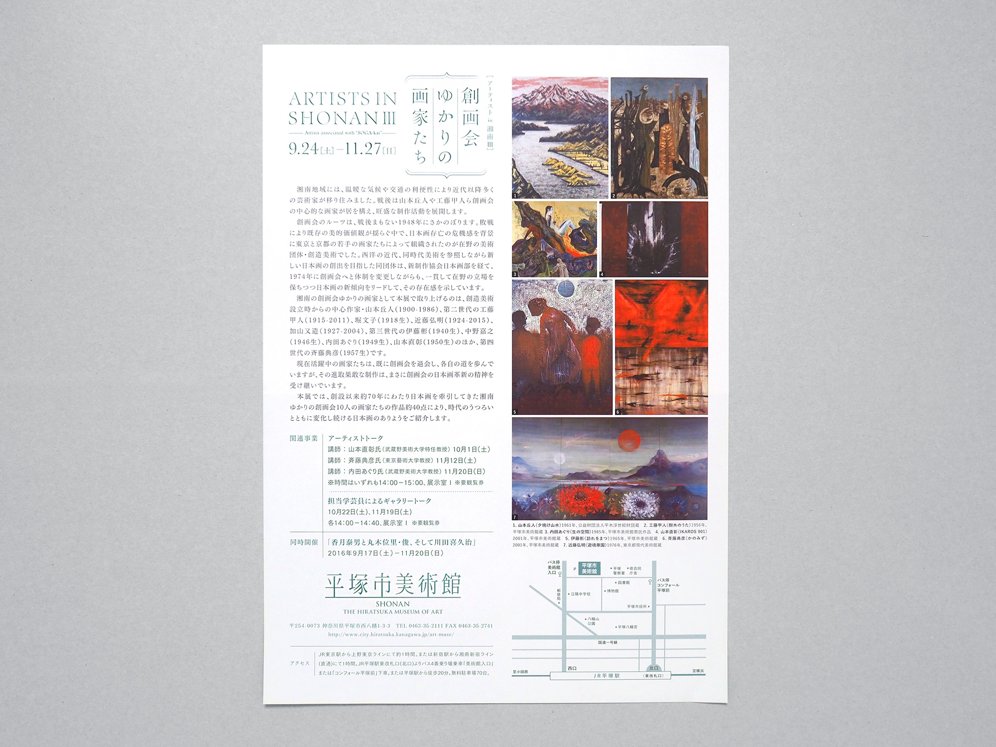
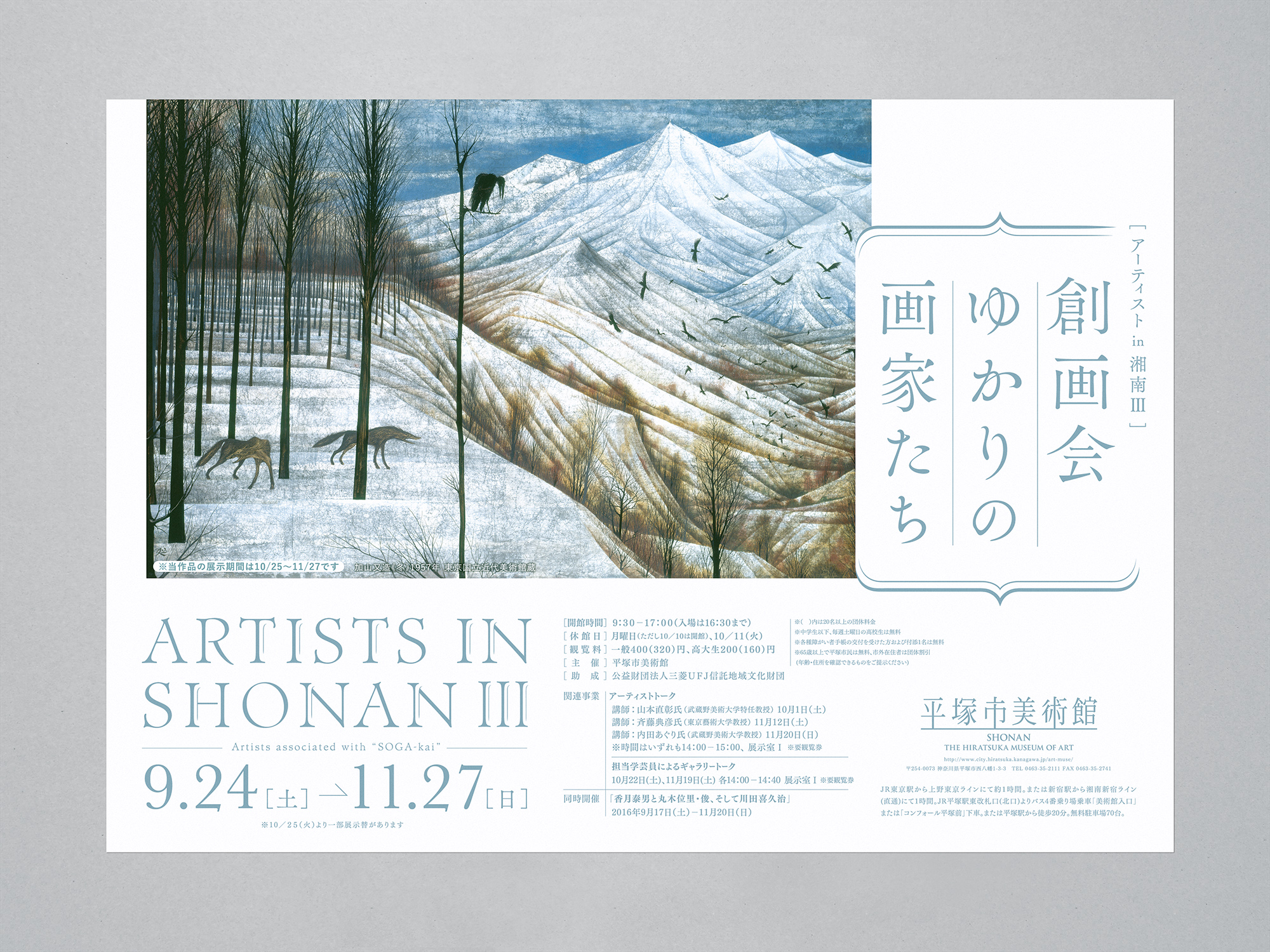
「創画会ゆかりの画家たち」
湘南(平塚市美術館がある区域)にゆかりのあるアーティストを紹介する「ARTISTS IN SHONAN」シリーズの第三弾。西洋の近代美術を参照しながら新しい日本画の創出をめざした「創画会」。湘南地区で同団体に関連のある画家10人の約40点の作品を展示し、時代とともに変化する日本画の有り様を探求する展示会です。
“Painters Who Have a Connection to The SOGA-kai Association of Japanese Painting”
This is the third event of a series of exhibitions called ”ARTISTS IN SHONAN,” which have been held to introduce artists based in Shonan, the area where The Hiratsuka Museum of Art is located. “SOGA-kai” attempted to innovate Japanese painting while examining Western modern art. About 40 artworks of ten painters, who are based in the Shonan area and have a connection to SOGA-kai are exhibited to examine how Japanese-style paintings have changed with the times.
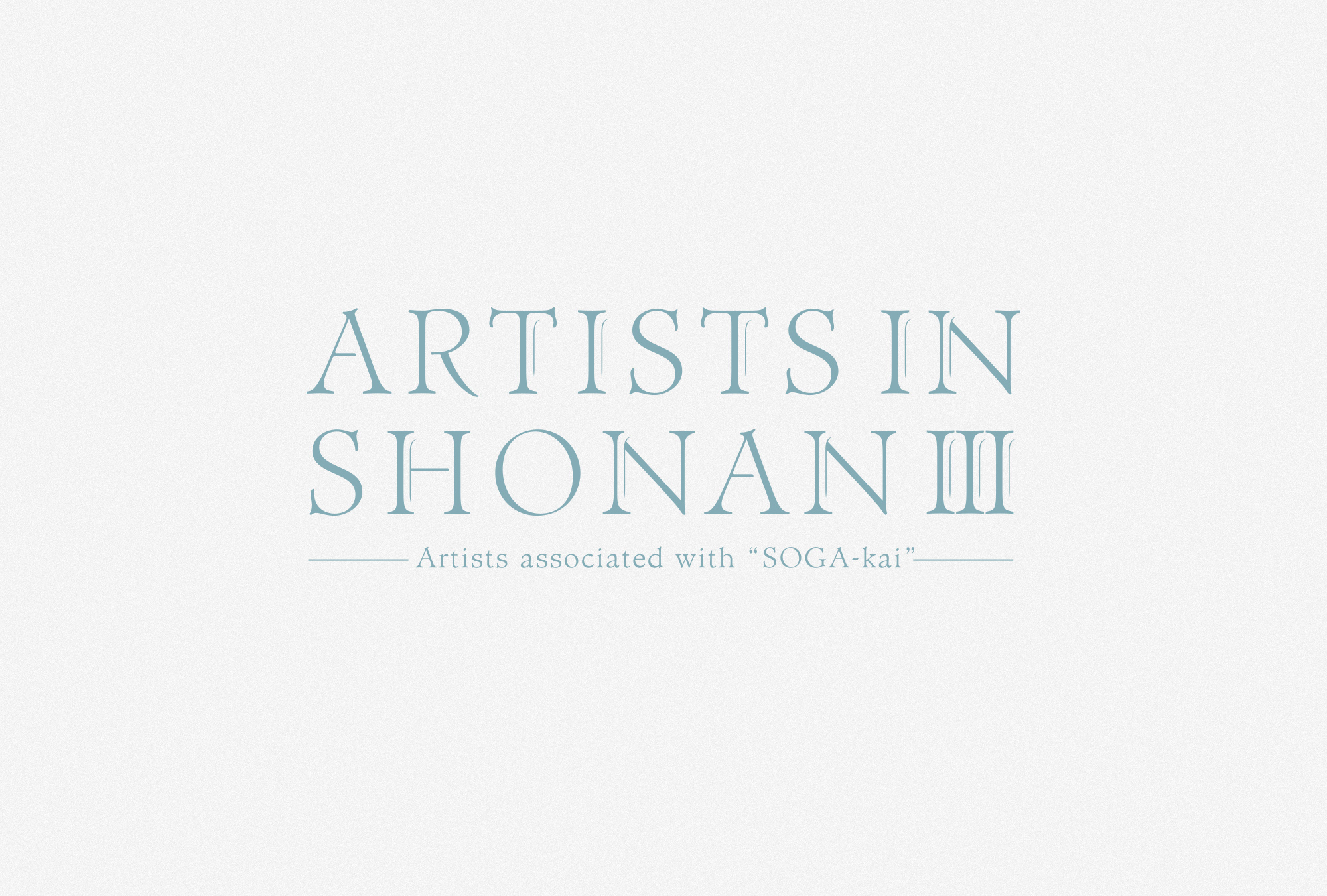
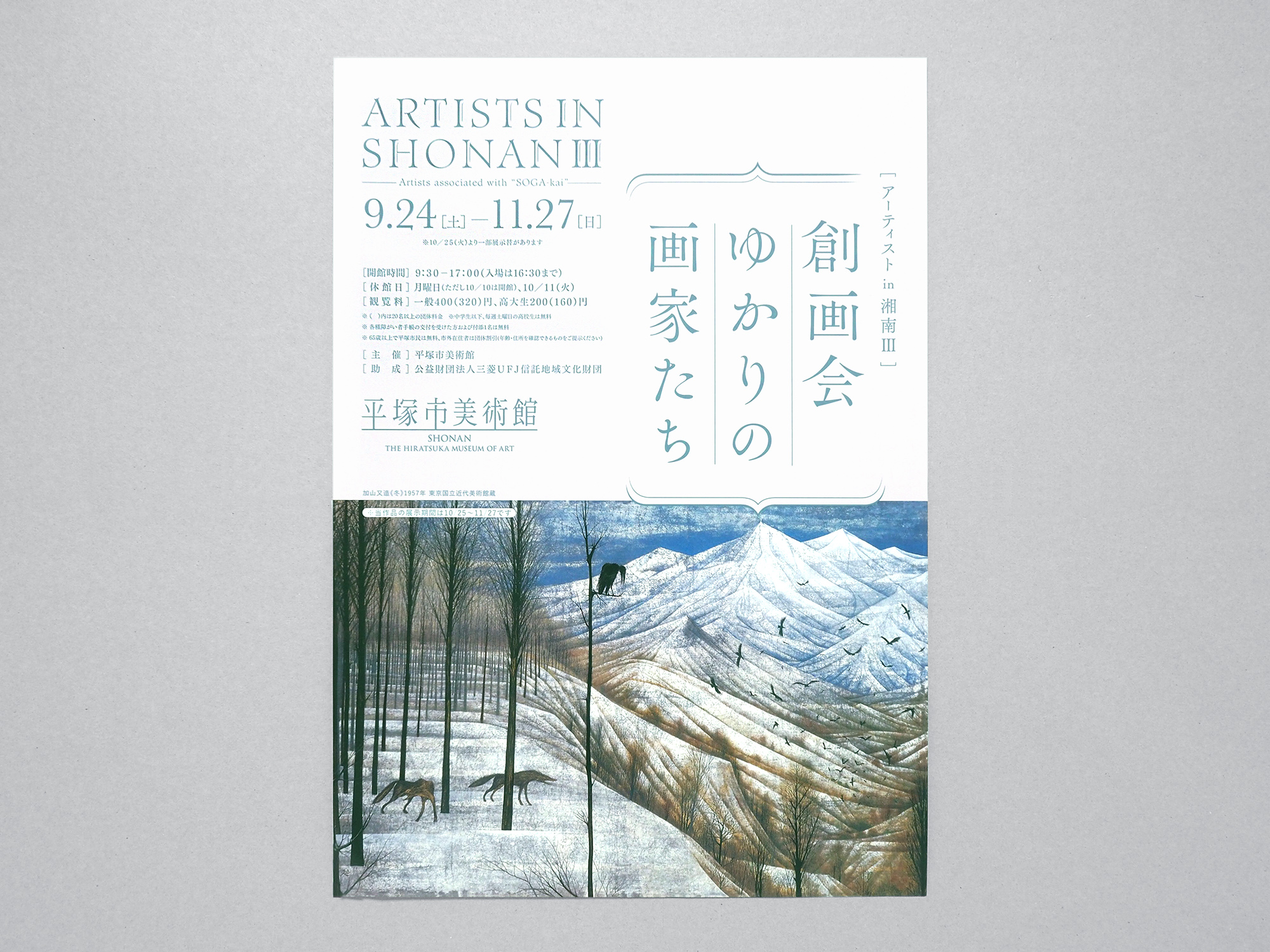
tegusuでは展覧会のポスターやリーフレットなどを制作しました。西洋絵画を参照して新しい日本画のあり方を模索したという創画会のルーツから、欧文を大きめに使用し、日本語の展覧会名と合わせることでイメージを形作りました。またメインビジュアルの加山又造の作品「冬」で用いられる繊細な色や描写を、淡い青のベースカラーやフォントのフォルムに反映しています。
tegusu produced the poster and the leaflet of the exhibition. Considering the fact that SOGA-kai were in search for how the style of Japanese painting ought to be while looking into Western-style painting, we used bigger sized alphabetical letters and matched them with the Japanese title of the exhibition. Light blue, used for the letters as the main color, and the font form reflect the delicate colors and lines of Matazo Kayama’s painting titled “Winter,” the main image used in the poster and the leaflet.
2016_Autumn_Exhibition