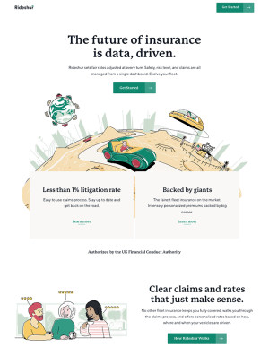
My Health – Mobile App
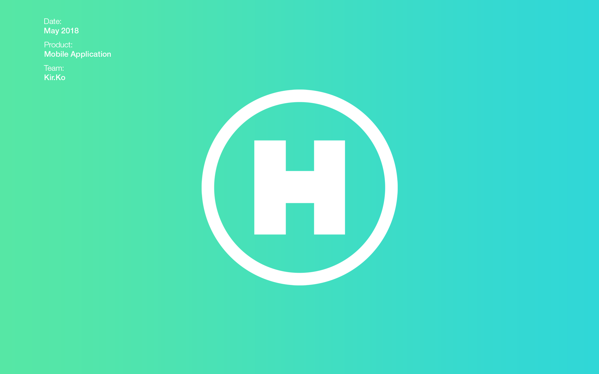
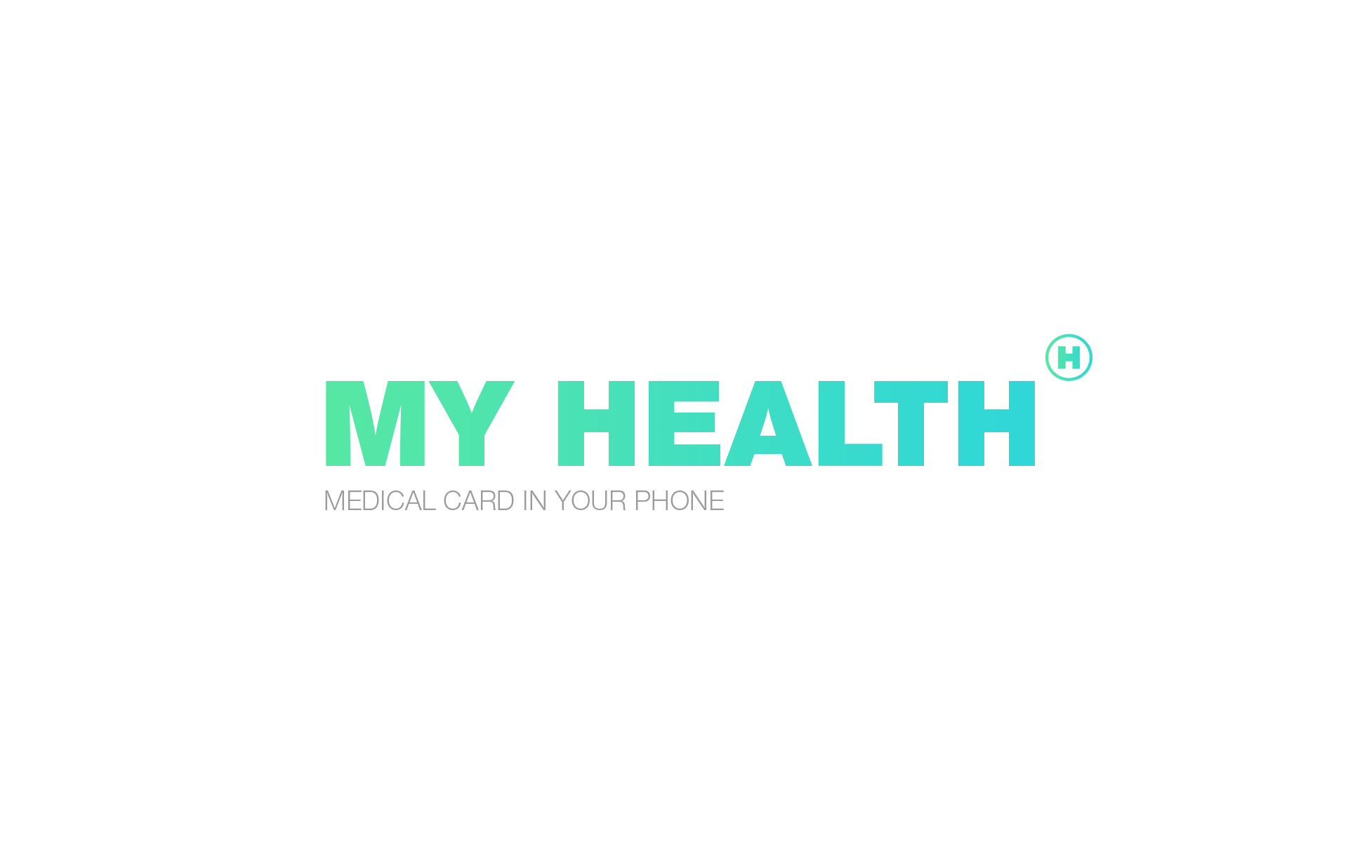
My Health
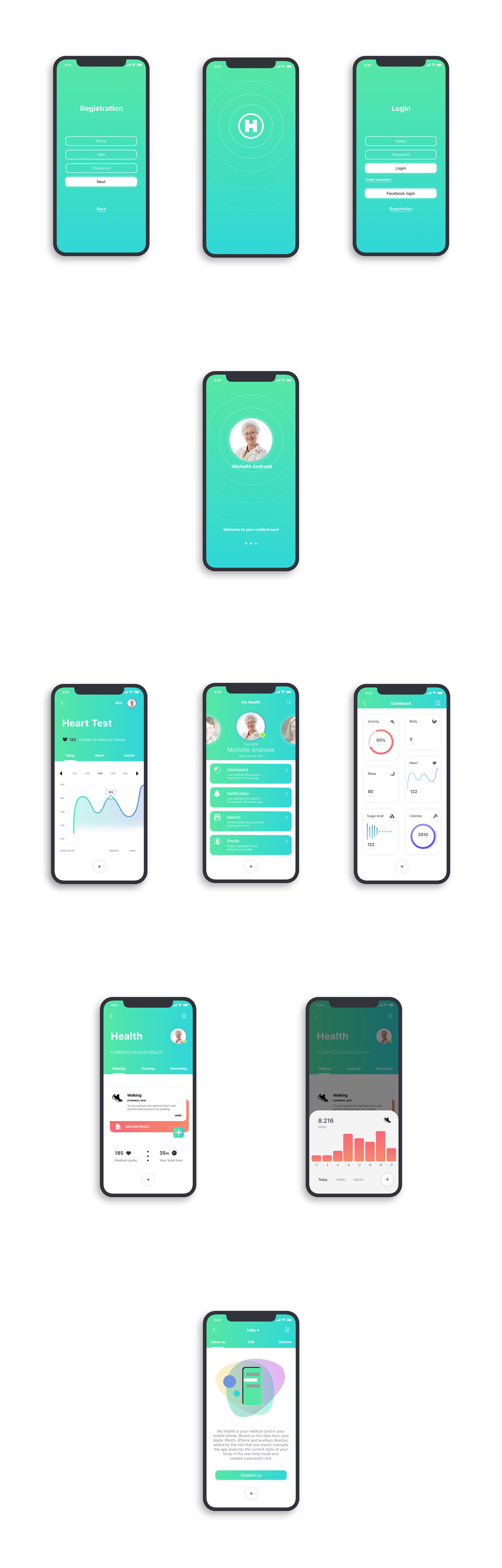
It’s your medical card in your mobile phone. Based on the data from your Apple Watch, iPhone and auxiliary devices, added by the info that one inputs manually the app analyzes the current state of your body in the real-time mode and creates a personal card, the card that you can share with your doctor online in the app right away.
You can analyze the state of health of your parents or kids on the distance of 500-1000 or more kilometers.
There is functionality that lets you get a prescription online and find the nearest pharmacies with the required medicine.
Soon My Health company will add the functions of purchasing the brand gadgets on the site for body state monitoring based on extra parameters.
The KirKo Team has developed the logo, the brand style, the structure and the design of the mobile app, the design of pages in the social network and the banner ads on the web-resources.
01. Concept
The visual style mission is to be on the same page with the recognizeable design of the medical apps already existing in the market and to attract the young audience. We have taken the color pattern of the popular medical apps as the basis and we managed to revamp the style to be up to date with the modern user requirements without loosing the heritage. This solution let us keep the attention of mature audience of the same type of apps and attract the teenagers by broadcasting the message to the society – health is something you should take care of from younger years.
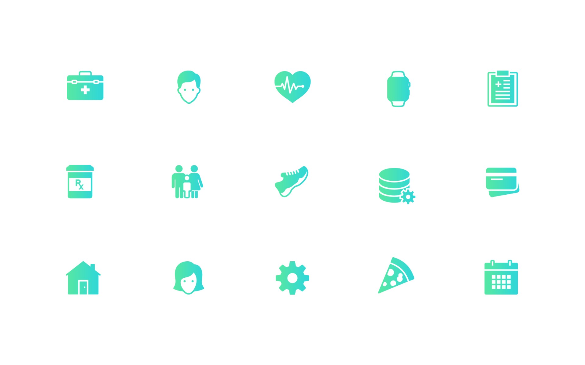
Fresh colors create the atmosphere of trust, minimalism in forms, soft gradient and the recognizeable symbols are the main essentials of the concept.
02. User flow
Easy and accesible. These 2 words became the basement to the user flow. Dashboard info is acessible within 3 taps. We provided rapid integration with the gadgets to collect the info. Unique function added – watching the state of family health in the live mode, the user choses the type of data which will be shared. Based on this data the medical card will be formed and one can share it with a doc. We have chosen the standard chain of the app interaction which we will display on the further stages of the presentation.
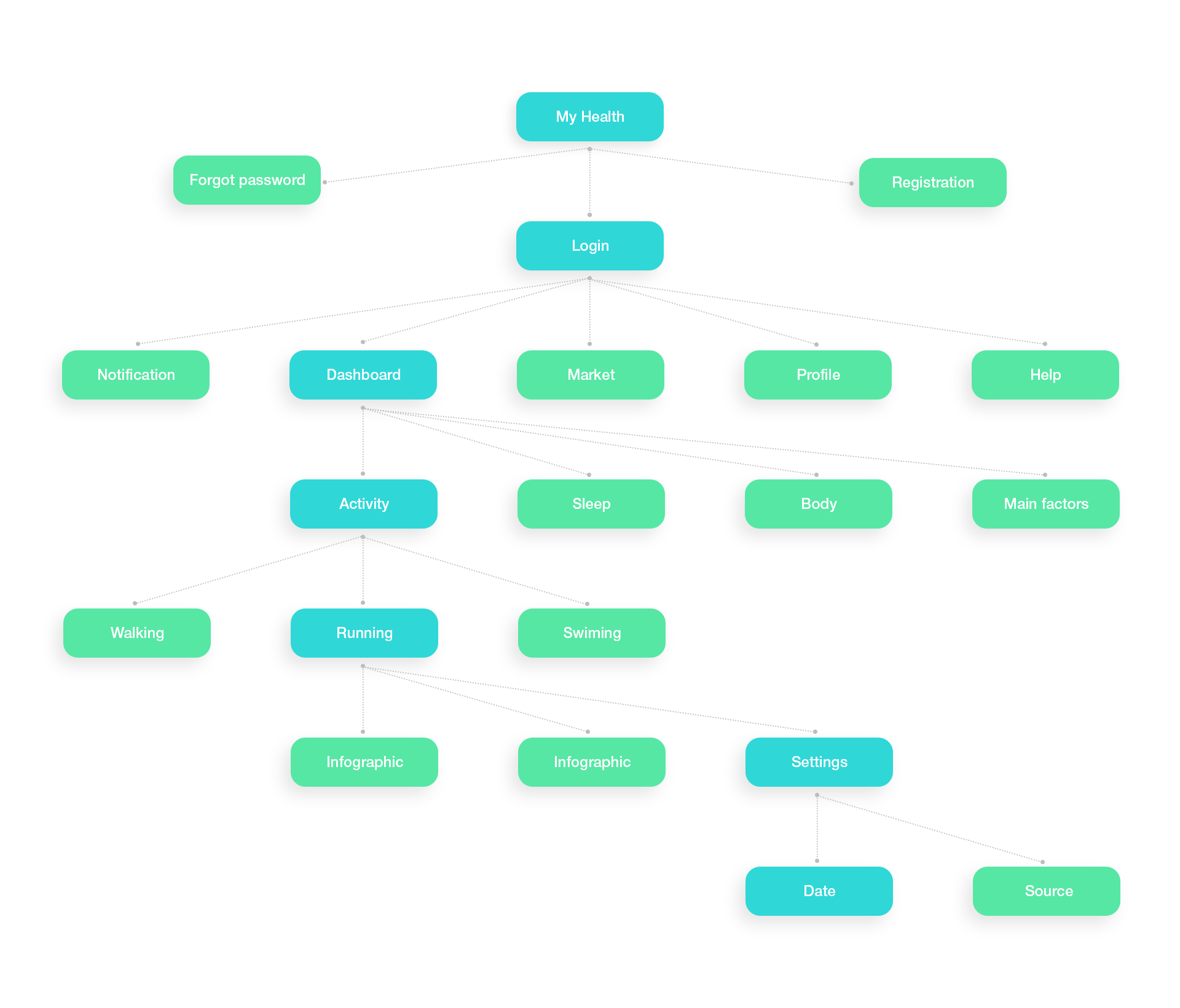
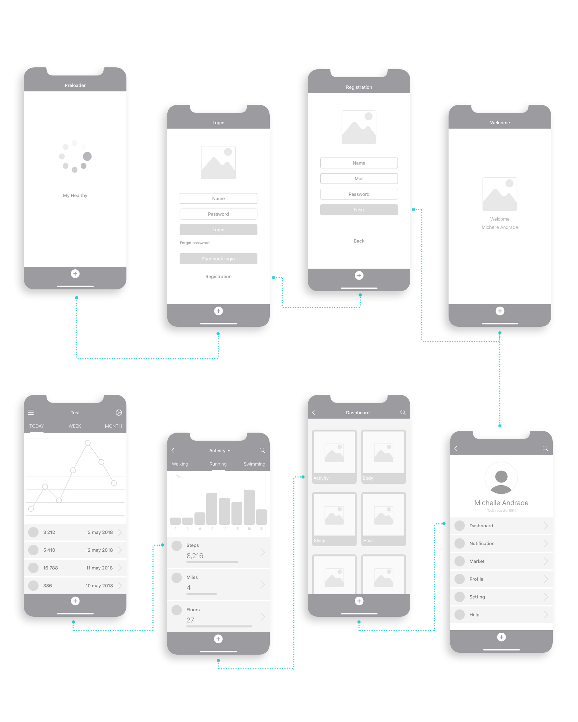
03. Wireframe
Maximum display of the functions and the information on each of the app screens. This step allows to work through the different interaction chains and minimize the expenses for the design and development since the corrections of the prototype always cost less.
04. Design
The attention of the user is focused on the received data about the organism. The distracting elements and the color pattern are minimized and simplified. Auxilliary illustrations are present in the section of help and while logging into the app for the first time.

If you’d like to talk about working together, i’d love to hear you, send an email.
or write to us on these social networks
My Health – Mobile App