Hanaichi
Hanaichi
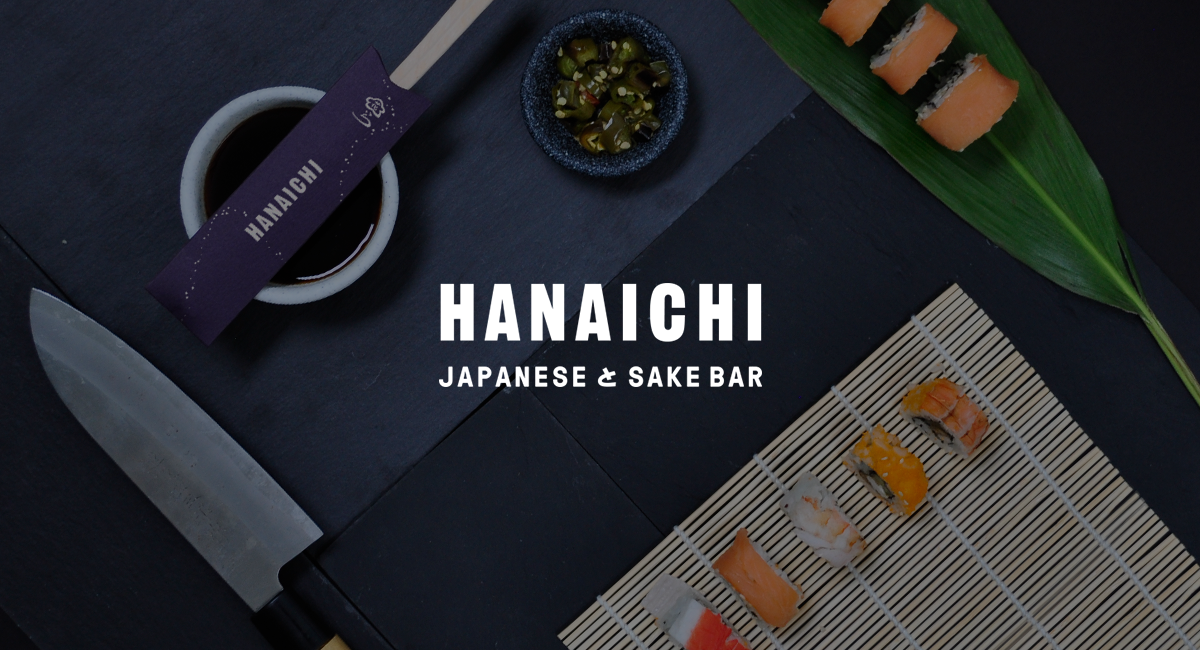
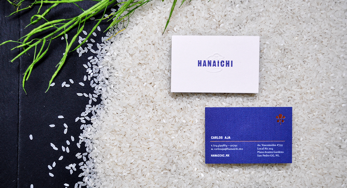
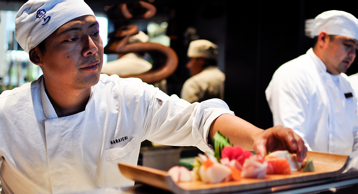
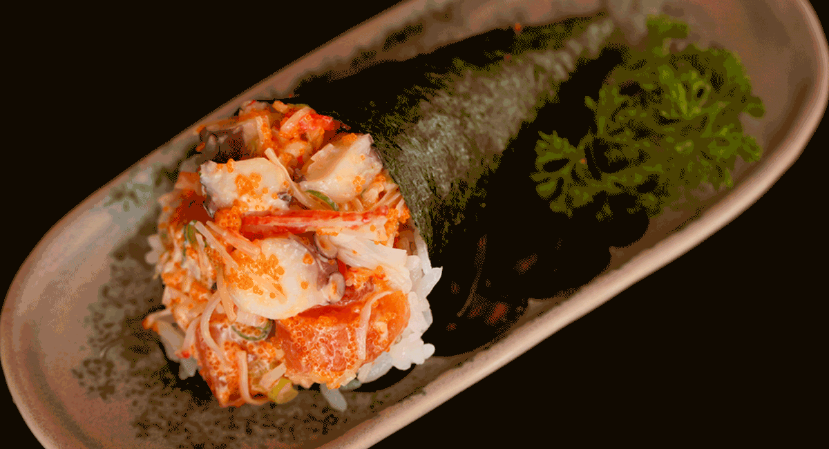
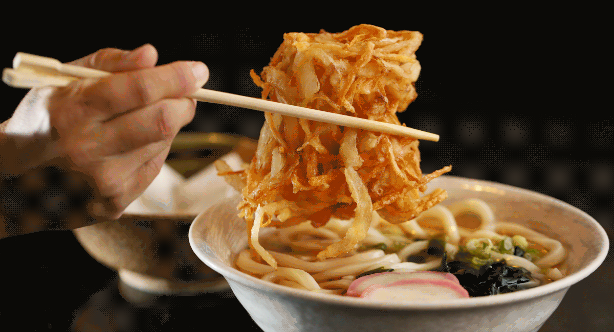
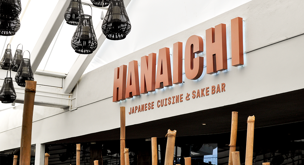
Hanaichi is a Japanese restaurant established in 2002 by Mr. Hashimoto in Cancun, Mexico. Hanaichi aims to introduce the authentic taste of Japan, through exquisite dishes that use only the freshest ingredients. Recently it has expanded its reach and opened its second restaurant in Monterrey. With a bigger restaurant and wider audience, Hanaichi decided it was an ideal time to reinvigorate their brand.
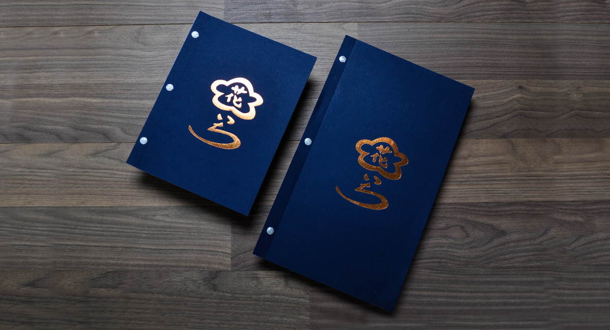
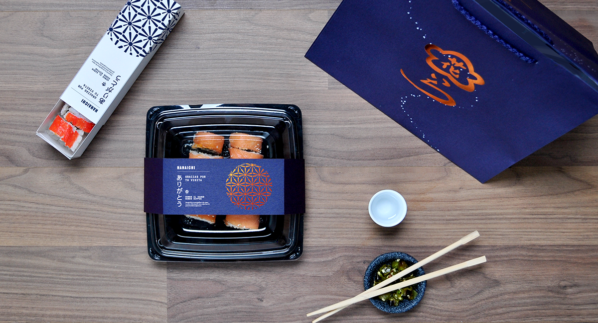
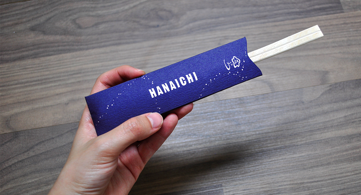
Structure and purity are very characteristic of the Japanese culture, qualities which are important for the brand to reflect. The brand is dynamic, making use of tightly-structured hierarchies that move around the page, resembling the Japanese editorial style often seen in its newspapers.
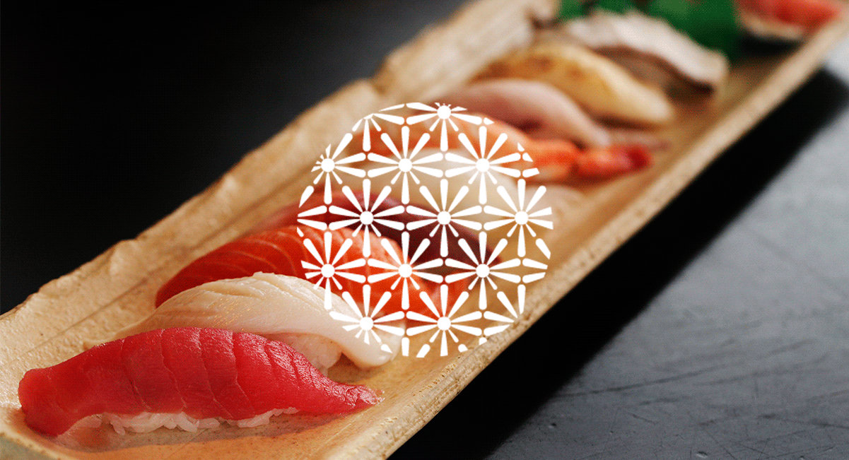
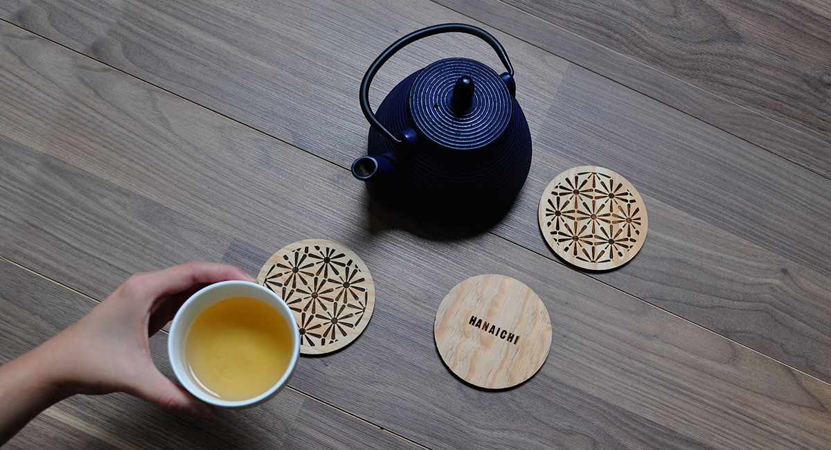
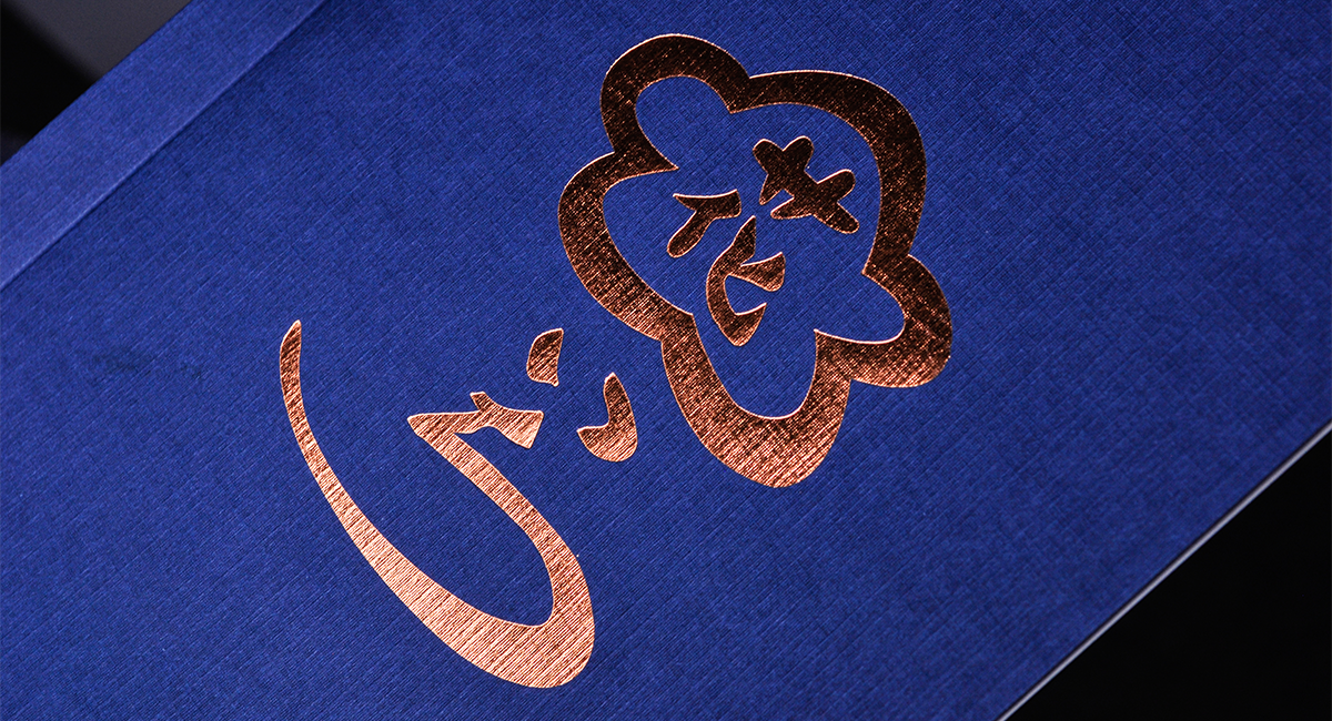
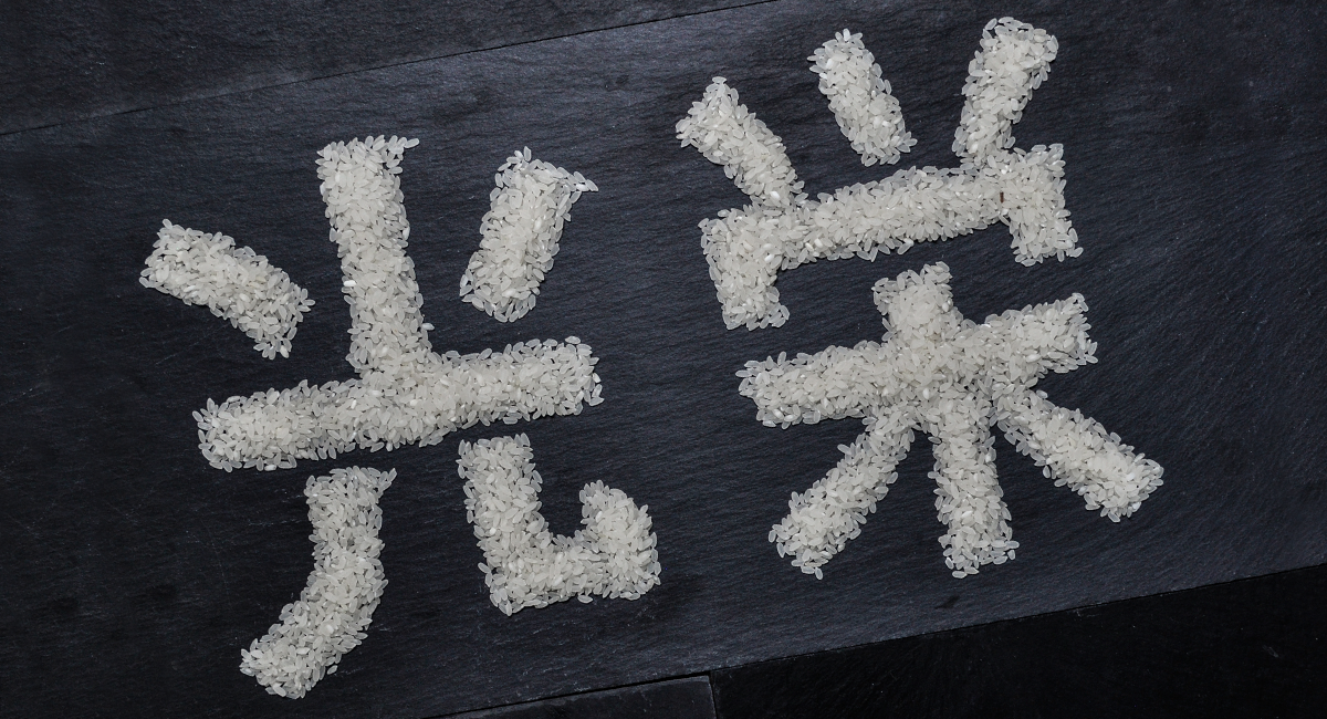
Flower patterns are found throughout the brand collateral, derived from the meaning of Hanaichi in Japanese: “one flower”. We avoided the cliché of the color red in oriental-inspired branding. The color palette emphasizes an Indigo blue instead, derived from “Aizome”, the ancient Japanese tradition of indigo dyeing textiles.
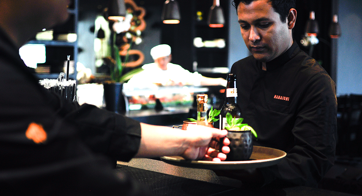
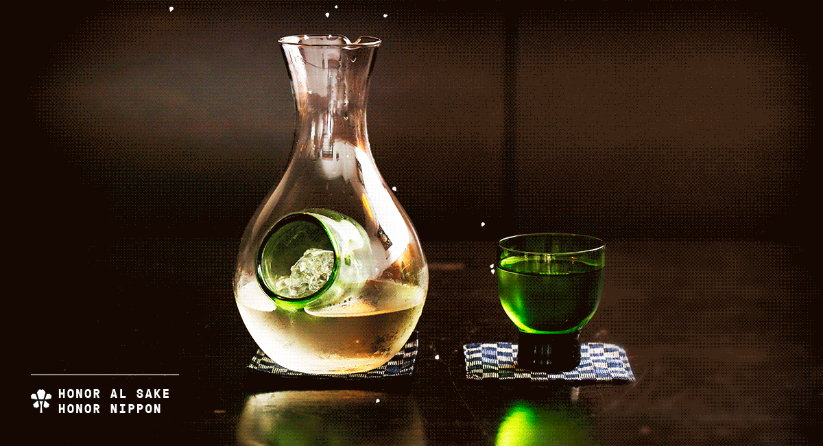
There are many “Japanese” restaurants that merely imitate a true Japanese experience, ignoring traditional food preparation techniques and serving low quality ingredients. Mr. Hashimoto’s passion has allowed him to provide a Japanese cuisine experience that is true to his roots, honoring the Japanese tradition in technique, ingredients, and flavor. Thus, Hanaichi’s voice is all about tradition and honor. Honoring a good meal, one’s friends, and oneself. In the end, honoring as the Nippon do.


www.firmalt.com
Follow us @ Facebook
Follow us @ Facebook
Hanaichi