Website Redesign | Beeders

BEEDERS
Website Redesign
Problem & Project
The initial problem of the website was just the modernization with a new illustration inclusion, in order to make the system more pleasant and interactive.
The redesign came with the need to update the layout for a modern look and to talk directly with illustrations, brand and especially with the values of the company, which are of growth, technology and modernity, with a clear and simple speech for its customers.
So the whole system was remodeled to show these values from Beeders.
Website screens before redesign.
Principal problem: Scattered communication, confused content, dificult orientation and visually non-integrated.
–
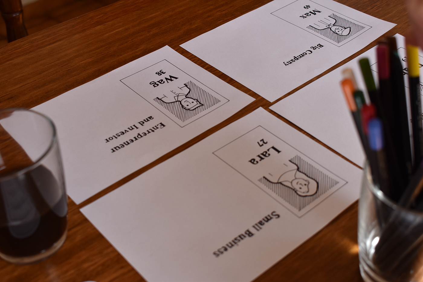
UX Persona
Define the persona helps in the website development, optimizing and reaching the right audience and avoiding conversion errors.
The persona’s definition was given by the company’s current customers, which can be classified into four categories:
Large Companies, Small Businesses, Startups and Investors.
Each character was created to help shape the client’s journey better.
The persona’s definition was given by the company’s current customers, which can be classified into four categories:
Large Companies, Small Businesses, Startups and Investors.
Each character was created to help shape the client’s journey better.

–
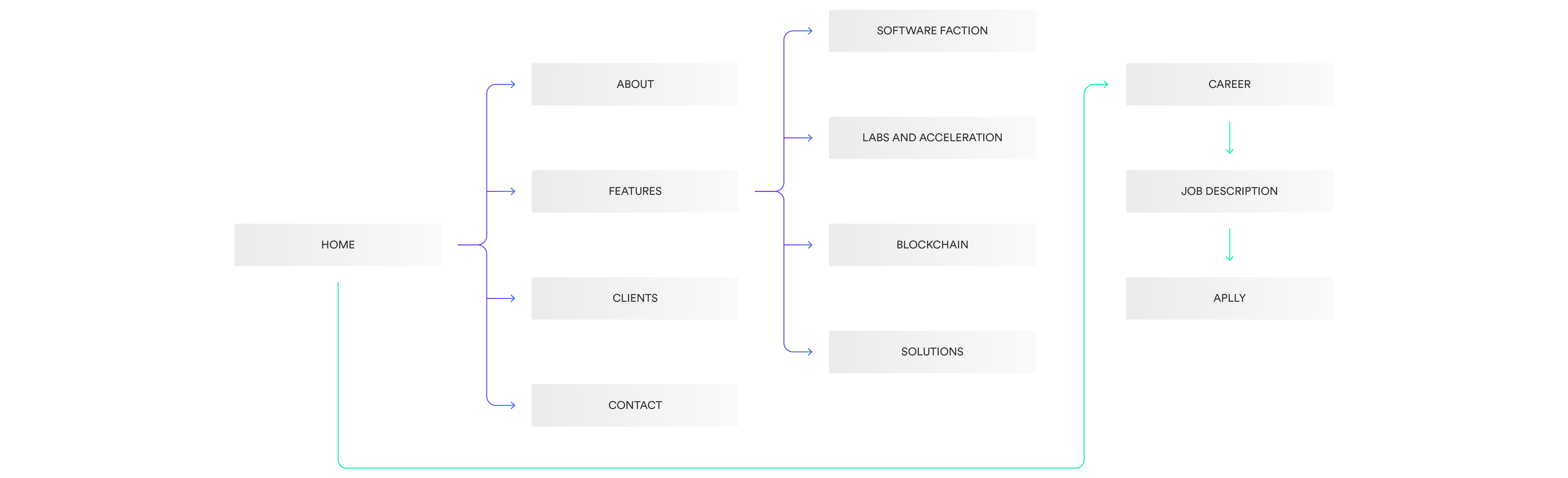
Sitemap
The sitemap aims to make the site as a whole visible and provide a general direction to where the user can go. This view allows you to feel the size and complexity of a website.
–
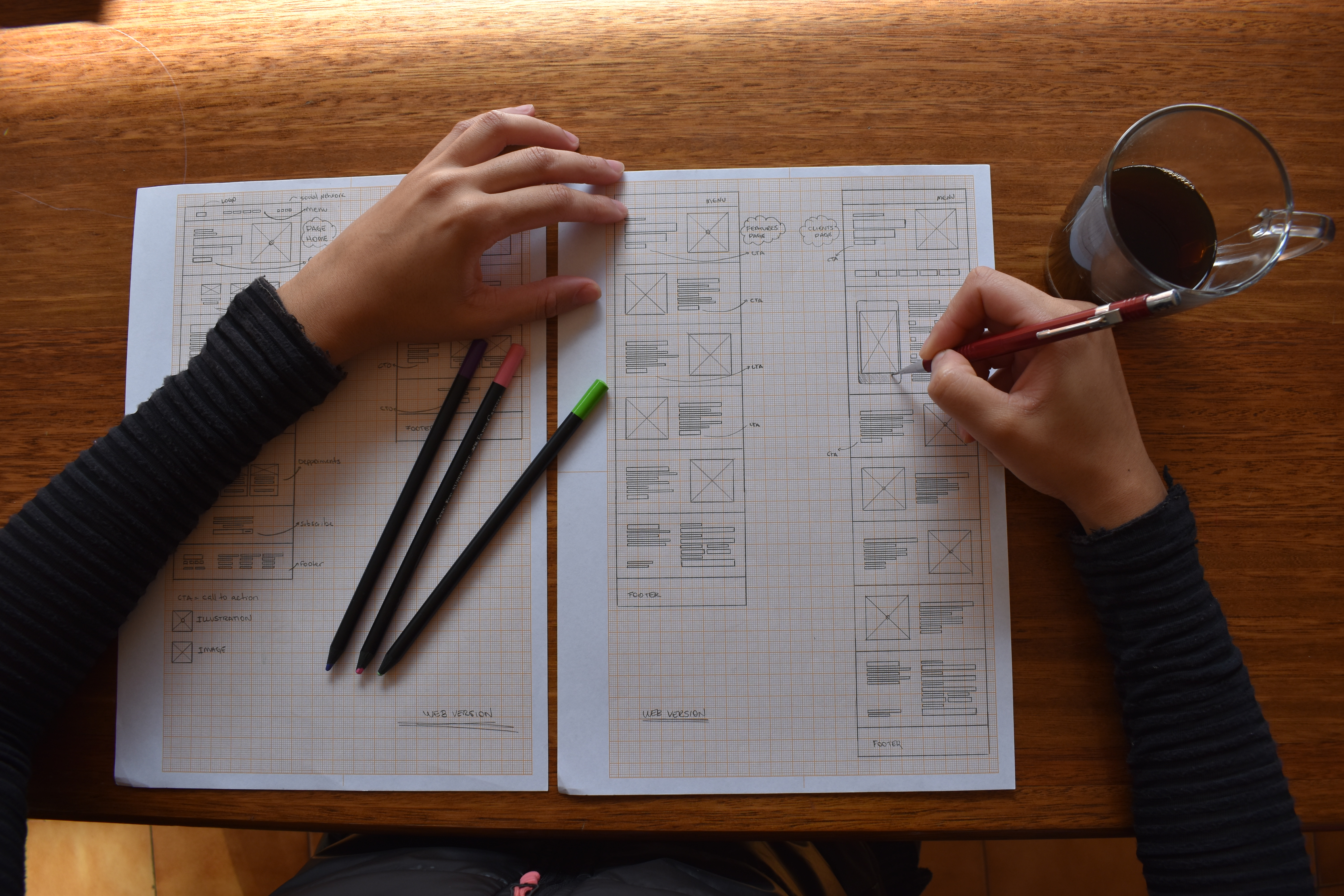
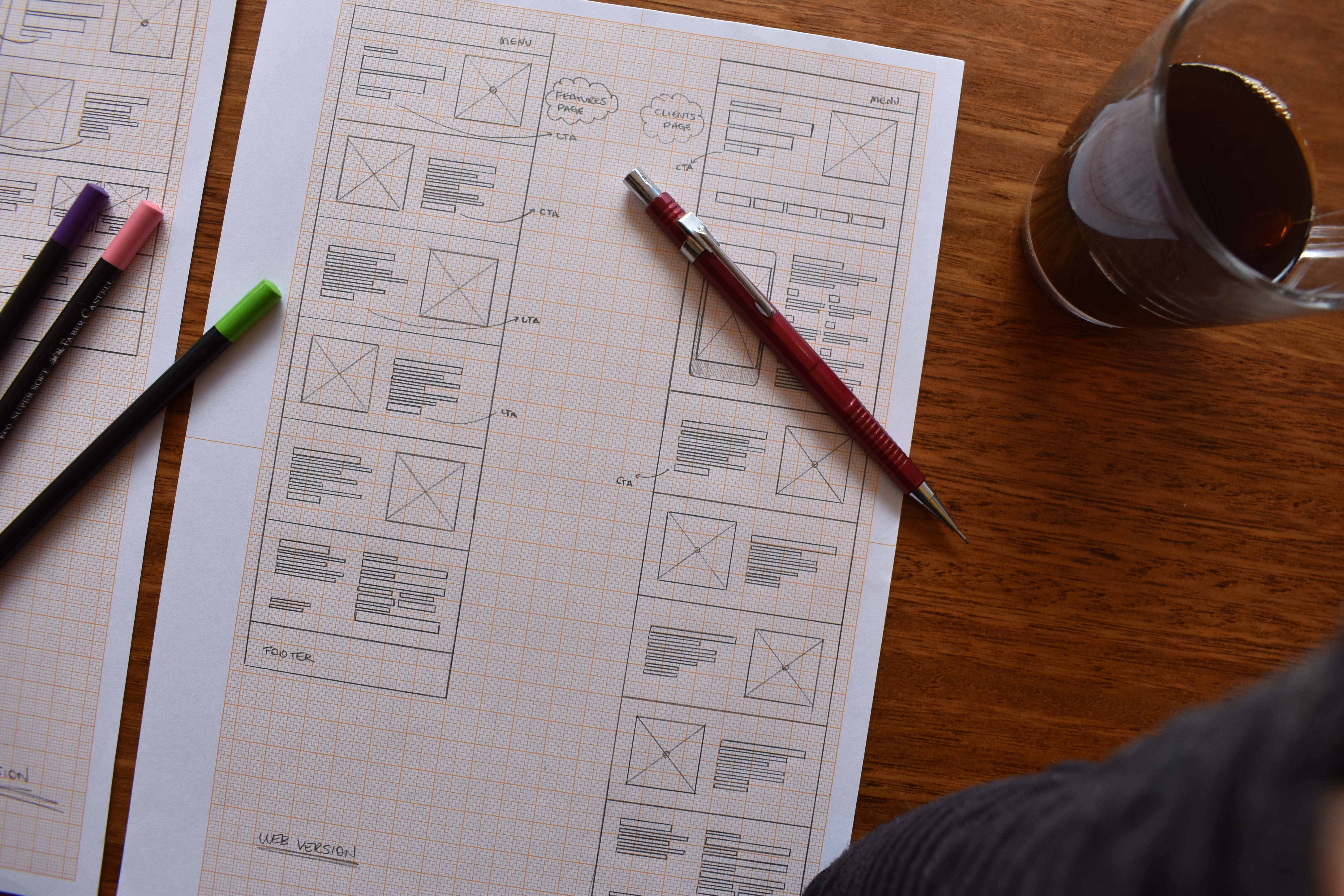
Wireframe
The development of the wireframes allows the previous visualization of the website, facilitating the interaction and understanding of the ideal sequence for each function, as well as the conversion buttons, which follow the correct path.
It is extremely necessary that the flow is easy, light and does not interfere with the user having an incredible navigation experience.
It is extremely necessary that the flow is easy, light and does not interfere with the user having an incredible navigation experience.


–
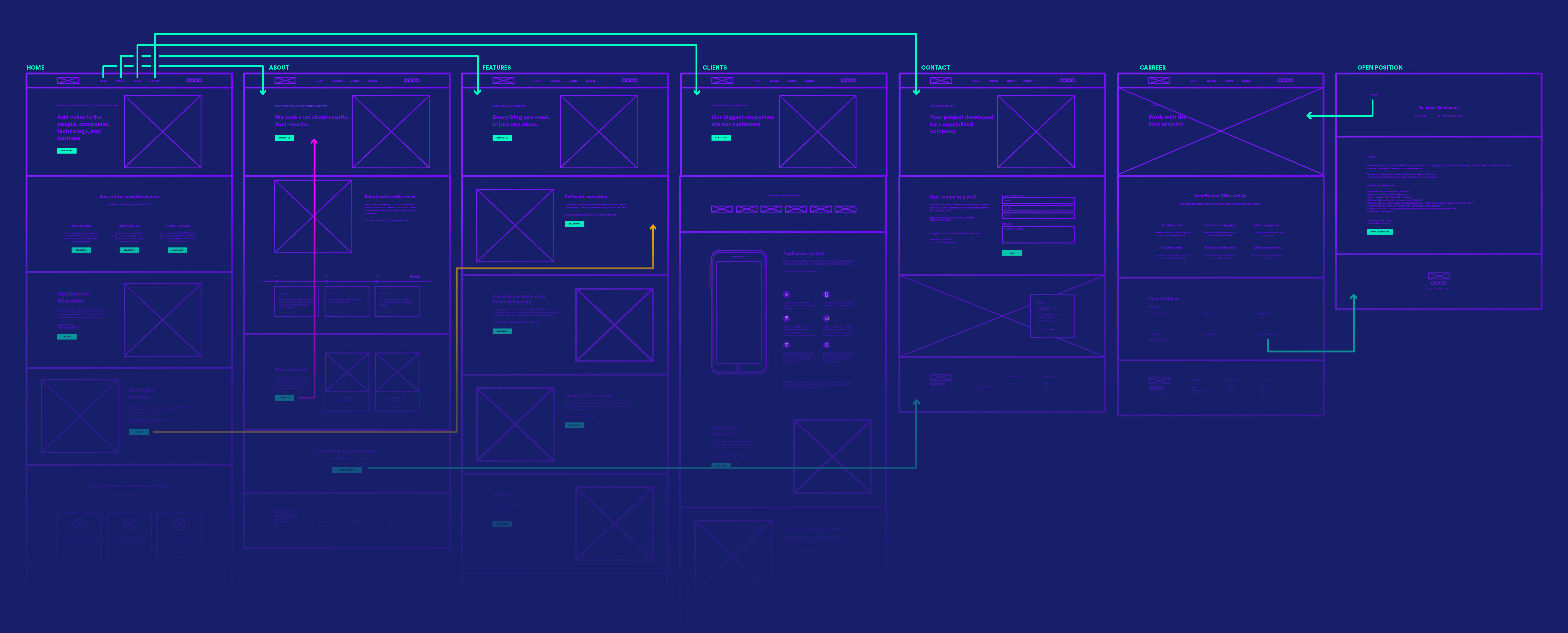
User Flow
The user flow was necessary to map the user’s behavior from a point A to a point B. The traced routes allow the understanding of the time spent in each step, as well as the navigation’s efficiency.
–
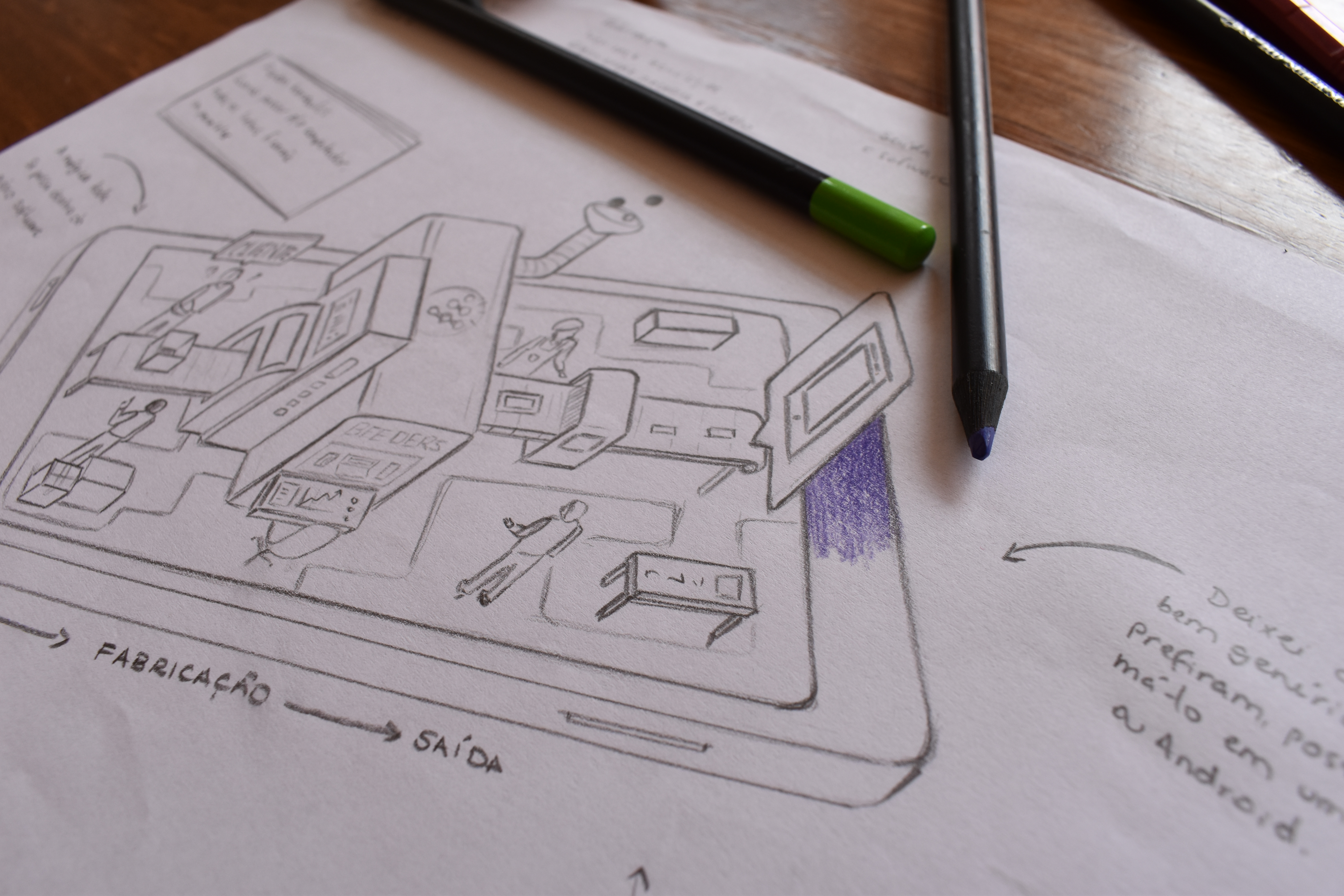
Illustration
I s o m e t r i c .
The main illustration was developed to represent the development process of a software factory, allowing the easy understanding of the input, being the idea of the client, without mold, until the end, which is the solution presented by the company.
The main illustration was developed to represent the development process of a software factory, allowing the easy understanding of the input, being the idea of the client, without mold, until the end, which is the solution presented by the company.
For this reason, the isometric style was used, so that the illustration brought an air of technology and fulfilled with its role, the understanding of modernity by the client.
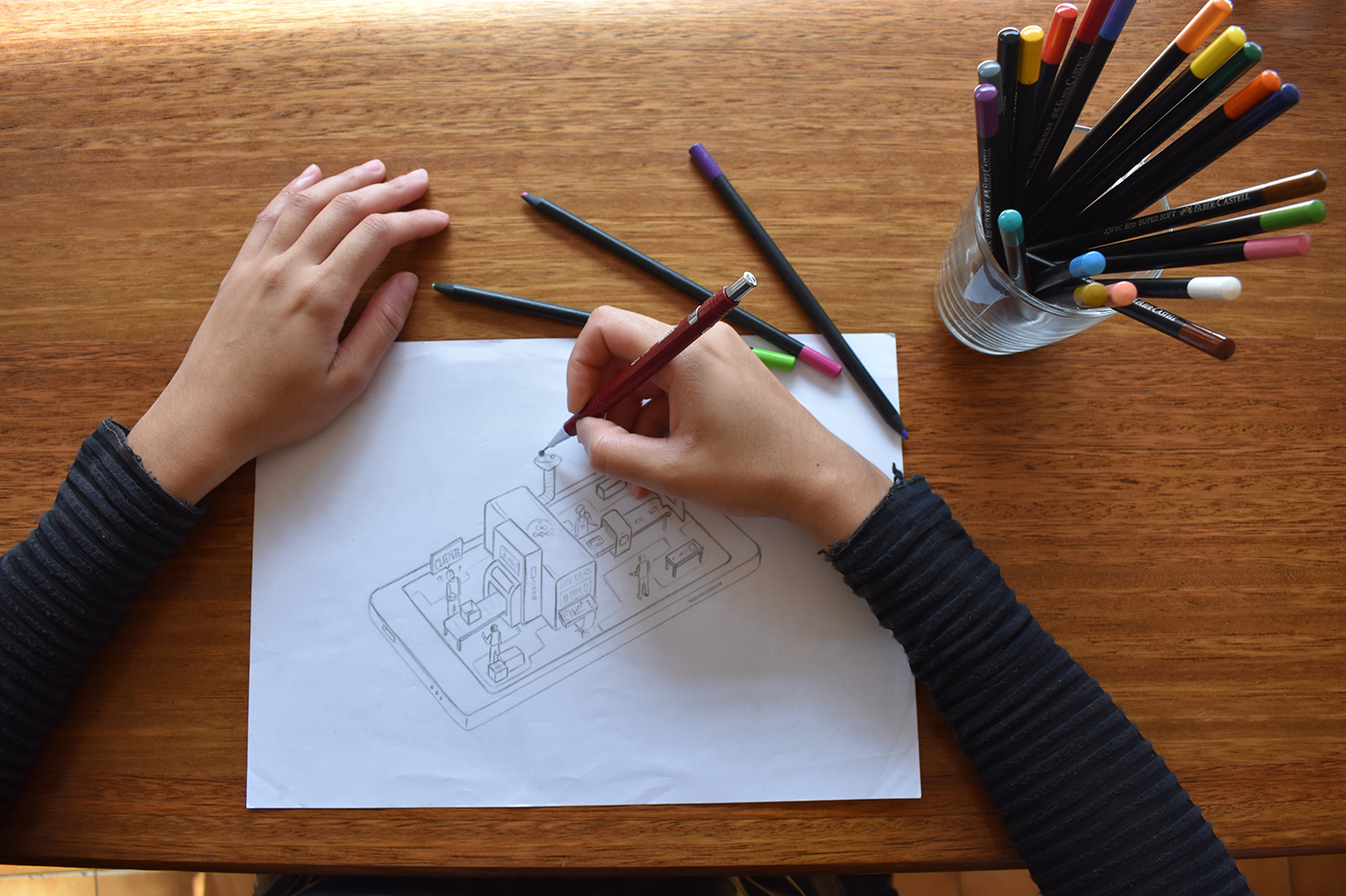
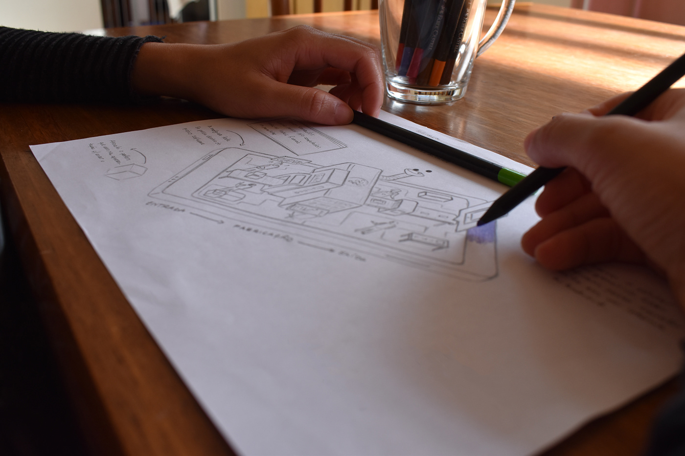
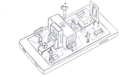
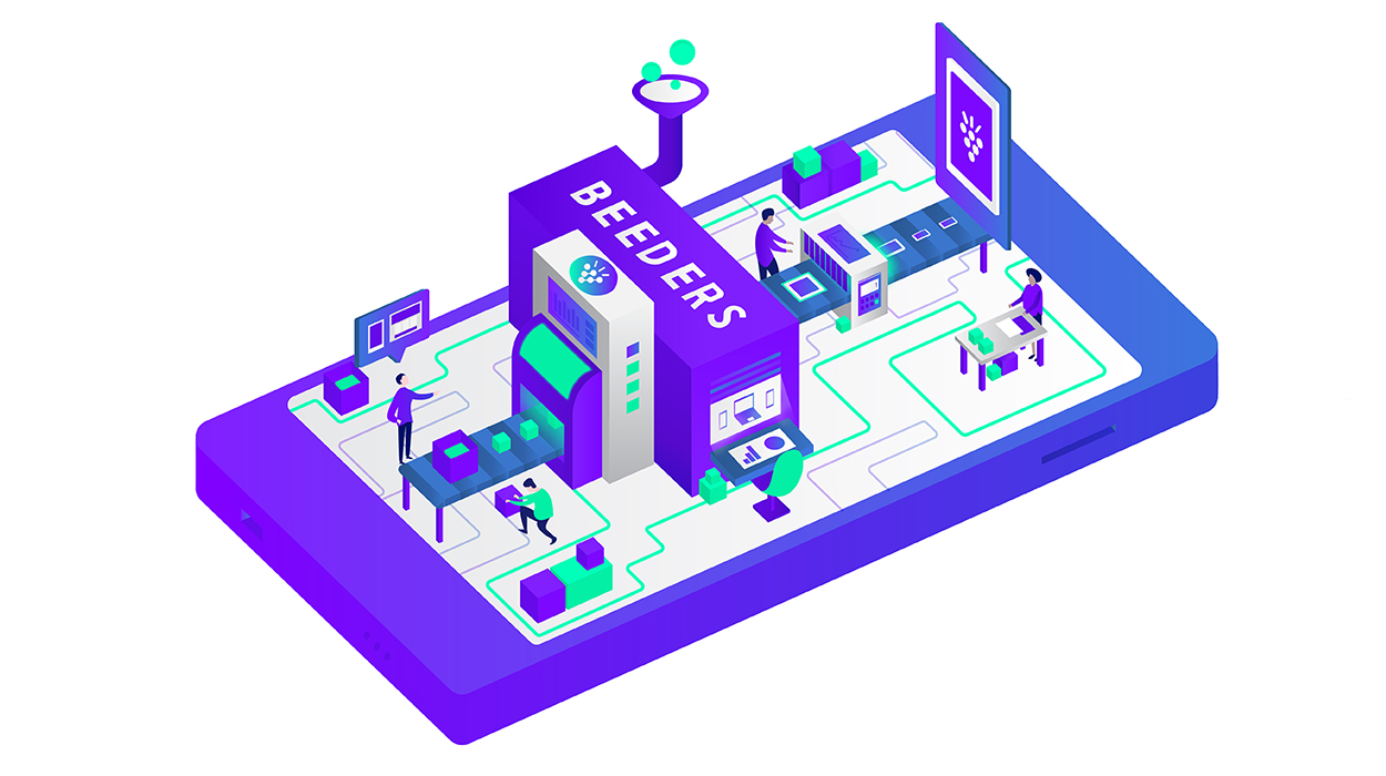


The other illustrations help in the NEW interaction’s website.
–
UI Kit
The standard User Interface Style Guide is designed to assist in creating other pages for the website, application, and any online parts that the brand is submitted for.
This Style Guide provides information about icon elements, typeface & typography, buttons (small and large option), text inputs (regular, hover, active + validation), dropdowns (normal, hover and active), slider, tooltips, nav bars & menu and alerts.
This Style Guide provides information about icon elements, typeface & typography, buttons (small and large option), text inputs (regular, hover, active + validation), dropdowns (normal, hover and active), slider, tooltips, nav bars & menu and alerts.

–
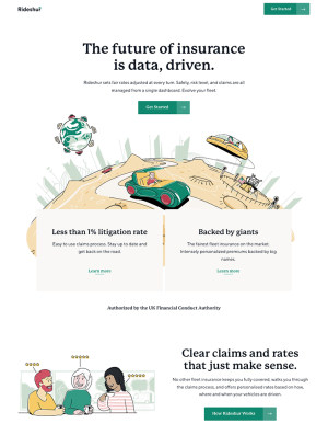
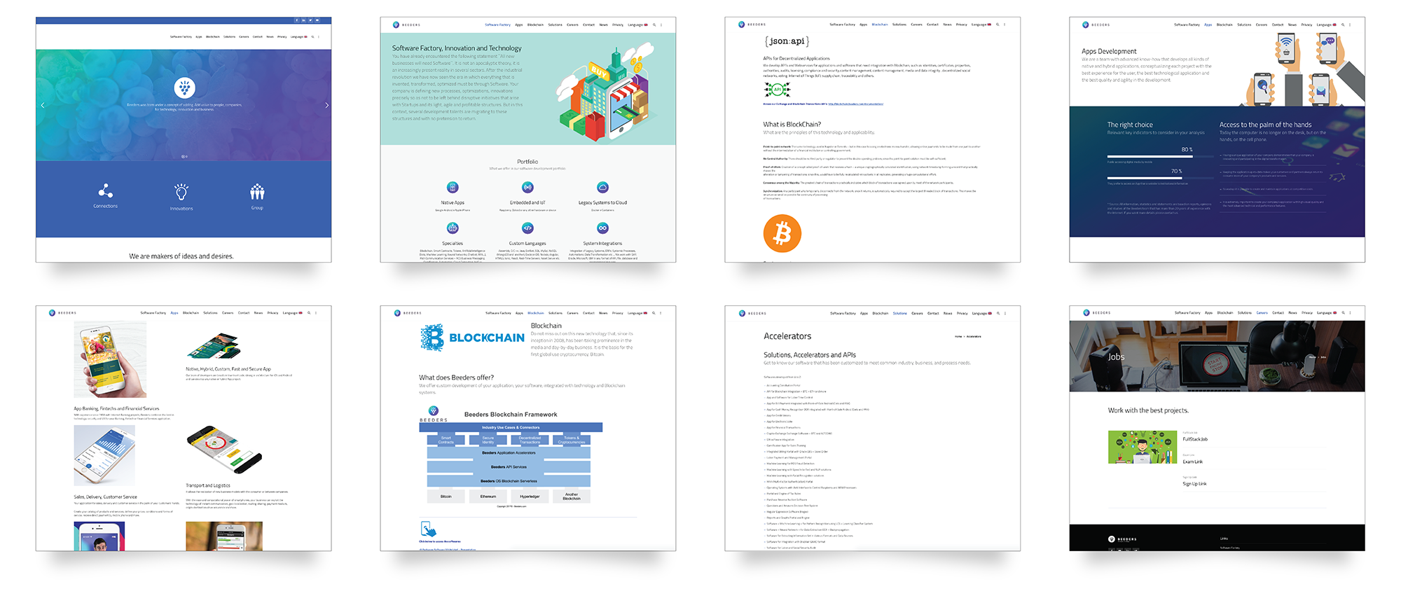
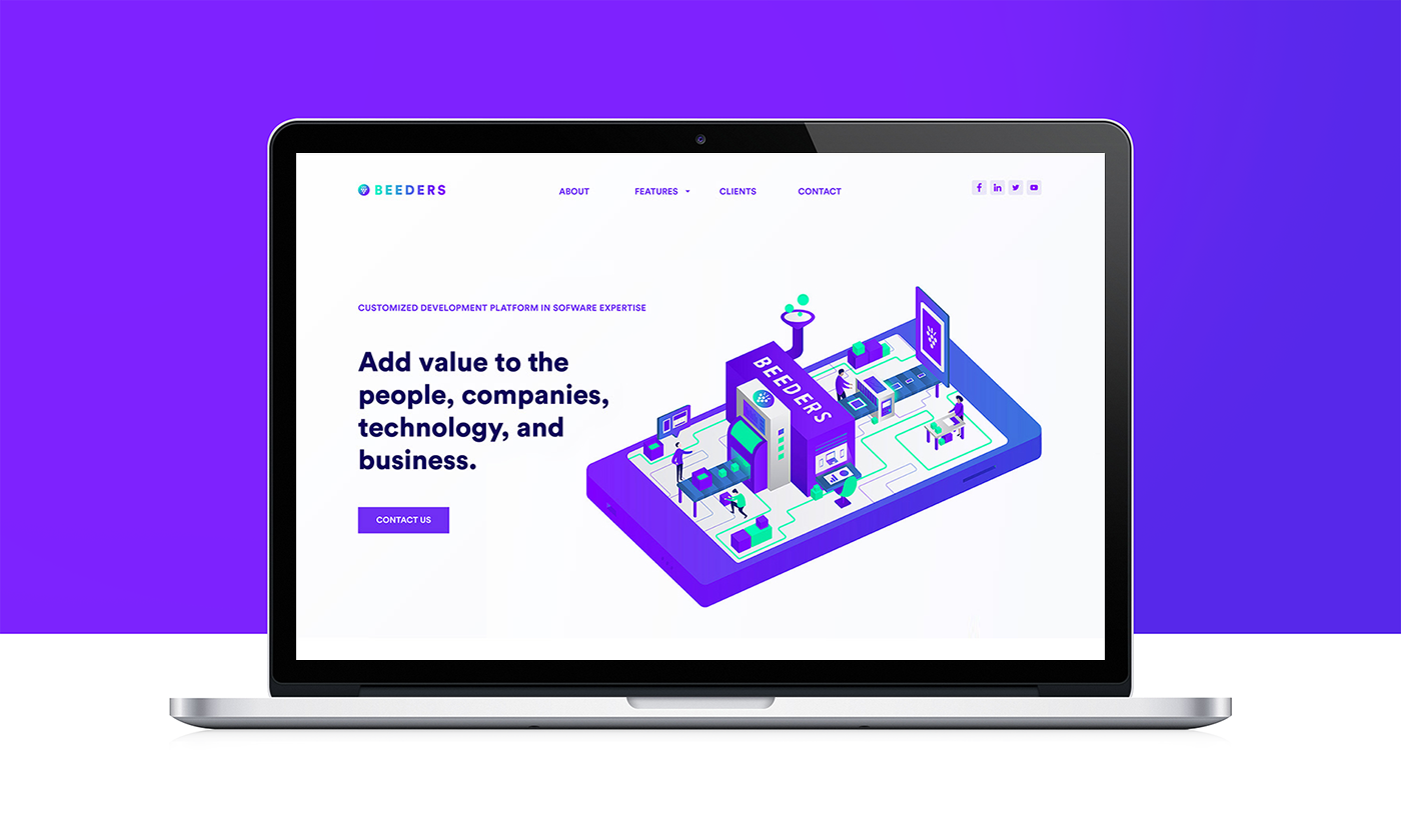
Website
The website redesign can be checked below, in some screens.
For more information, please visit the actual company’s website.


Thanks for watching!
It would be incredible to know your opinion. =)
Website Redesign | Beeders